VitrA
Bringing bathroom ranges to life in style
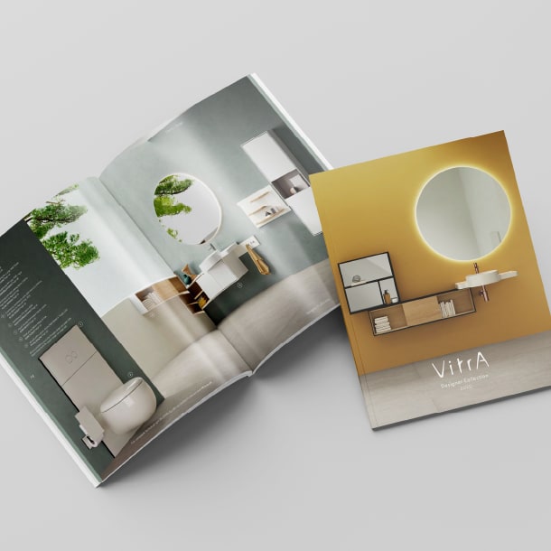
A fresh, focused, lifestyle-led revamp of VitrA UK's product and technical brochures, showcasing the brand's bathroom ranges in a new light, with enhanced targeting of their varied audiences.
The challenge
VitrA is a global bathroom manufacturer based in Didcot, with roots in Turkey. They approached us to redesign their Bathroom, Signature and Designer collection brochures, with the aim of giving each a distinctive yet complementary look and feel.
As well as appealing to the needs of their primary consumer and corporate audiences, we were also asked to consider how we could make the brochures more eco-friendly, streamlined and lightweight so they’d be easier for prospective customers to handle and take away.
All the new designs had to align with the brand’s current guidelines including using existing photography, and we also had to make sure the brochures supported all retail and sales teams effectively.

The solution
Although the existing brochures were extensive and informative, with over 1500 products included, we felt that they could be better targeted and reflect the brand’s creative and innovative spirit in a more inspiring way.
With this in mind, we recommended giving each of the brochures more of an editorial, lifestyle-inspired aesthetic to engage a consumer audience. The design approach required distinct strategies for the Bathroom and Designer Collections, which have very different target markets.
To reduce duplicated product information, we suggested merging the Signature Collection into the Bathroom Collection. In addition, a separate technical brochure would make it easier for sales teams, retailers and corporate buyers to find full specifications and schematics for each product.


Designed for consumers buying for their own home, as well as builders and architects looking for ranges to fit into their housing projects, this brochure made use of engaging visual storytelling to enhance the appeal of existing imagery.
By reorganising and revitalising the content, we crafted a more user-friendly and aspirational experience, while reducing overall page count.
Targeted at wealthy consumers, interior designers and architects, this brochure needed to have a high-end, luxury look and feel. We presented each range in a different way, introducing lead designers and their inspirations and drawing out the strength and richness of the photography. The result was a brochure that performs both as an aspirational lookbook and a functional catalogue.
Supporting the sales teams, builders and fitters, the new technical brochures were designed as distinctive companions to the main brochures. They provide functional information in a clear and easily navigable way including a comprehensive product breakdown with schematics and compatible parts, handy references such as a colour and size matrix and a complete icon guide.

The results
The new brochures were extremely well received. The client was particularly impressed with how we had elevated the Bathroom Collection brochure, to reflect the essence of the VitrA brand.
As well as reducing page count, the client can adjust print runs to the needs of their sales teams and customers, giving added flexibility and cost-effectiveness.


Margaret Talbot Regional Marketing Manager - EuropeWe wanted to elevate the design and refine the content of our product brochures but mark-making* brought so much more to the brief. The new layout of our technical brochures creates a more professional look, achieving a greater impact from far fewer pages, while the consumer version now has the magazine style and image treatment we were hoping for. The feedback from our team has been overwhelmingly positive. This is the strongest suite of brochures we have ever produced and we’re delighted with them.