Gatehouse Investment Management
Transforming a unique skillset into a distinctive identity
A compelling yet complementary identity helped Gatehouse Investment Management to leverage its unique position as a full-service investment manager.
The challenge
Gatehouse is a Shariah-compliant bank who was named ‘Best Ethical Savings Provider’ by moneynet.co.uk for three years running. Social responsibility and transparency lie at the very heart of their value system and underpin every aspect of their operations.
When they approached mark-making*, Gatehouse Bank realised that there was one area of the business with untapped potential. Their Build to Rent (BtR) offering – manned by a team with a distinctive skill set gained from years of experience – needed to be elevated and marketed in its own right . This provided the foundations for our work with them.
With the UK residential property market suffering from a chronic supply/demand imbalance, Gatehouse are in a unique position to offer good quality sustainable homes, that deliver highly desirable renting experiences whilst offering stable, long-term returns in a resilient asset class to major global real estate investors.
Gatehouse Bank saw the chance to create a standalone, wholly-owned subsidiary that could utilise both the skill of the team and the reputational strength of the parent company.
We were tasked to create a new identity and a website that would house the Gatehouse Investment Management proposition while complementing the Gatehouse Bank look-and-feel.
![]()
The solution
Our discovery phase led us to the insight that now, more than ever, investors are looking for opportunities which not only yield returns but also serve a real social or environmental purpose.
The Gatehouse Investment Management identity needed to reflect this, so we took a very human approach. This, in a sector which was traditionally corporate and functional, marked a break with convention and laid the foundations for both our strategic and creative propositions.
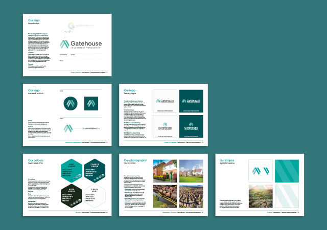
Strong strategic foundations
During the Define stage of the project, we adopted the brand values of the parent company: Responsible, Can-do and Open. A fourth brand value – Knowledge – was also added. This last value focused on the unique expertise of the team and positioned the brand as an authority in the sector. Personality traits were also established, further emphasising the human qualities of the brand and giving it characteristics that an audience could identify with.
Once our four personality traits – Pioneering, Straightforward, Dependable and Bright – were in place, we were able to begin creating a verbal and visual identity for this subsidiary brand.

Speaking a language that investors understand
Our insight told us that investors were looking to put their money toward a cause which was not only financially reliable, but also socially responsible. As such, we developed the strapline “Building for Better” which encompassed the end benefit for investors, tenants and the wider community. The line has a progressive feel to it which reflects the pioneering spirit of the brand while speaking to the reliability that’s at its heart.
The verbal identity was further crystallised with a brand narrative which referenced the benefits offered to a wide range of stakeholders:
“Gatehouse Investment Management has spearheaded Build to Rent (BtR) developments in the UK, delivering on investors’ goals through the provision of sustainable homes, highly desirable renting experiences, and the creation of thriving communities”.
Gatehouse became the investment management company that was looking to build not just bricks and mortar, but a far-reaching stable future that benefitted all involved. The development of this aspirational tone of voice positioned the brand as the benchmark in the sector, making it appealing to “socially and environmentally conscious investors” who were looking not only to reliable returns but also, “to support a sector in need, and affect lasting positive change”.
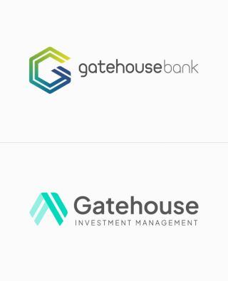
Making a marque
While it was important that Gatehouse Investment Management had an ownable visual identity, it also needed to be recognisable as part of the parent company. To do this, we derived the brand marque from the counter of the G in the Gatehouse Bank logo. It symbolises both the roof of a house – under which the Gatehouse end-to-end services are offered – and an upward trajectory for investor profits. As such, it reflects the ultimate purpose of Gatehouse Investment Management – “to realise the full potential of the UK residential sector” for investors, residents and communities.
The typography we used – whilst different from that of Gatehouse Bank – retained a conservative style which reflected the dependability that’s integral to the brand and ensured that the subsidiary’s look-and-feel complemented that of its parent.
The colour of money
Research showed us that investment management companies predominantly used a blue and grey colour palette. To help us create differentiation with these brands, we opted for a more vibrant trio of greens which also helped reinforce the Bright and Pioneering traits of the Gatehouse personality. What’s more, the tints were developed from the main Gatehouse Bank colourways, allowing us to create a synergy between the two identities.
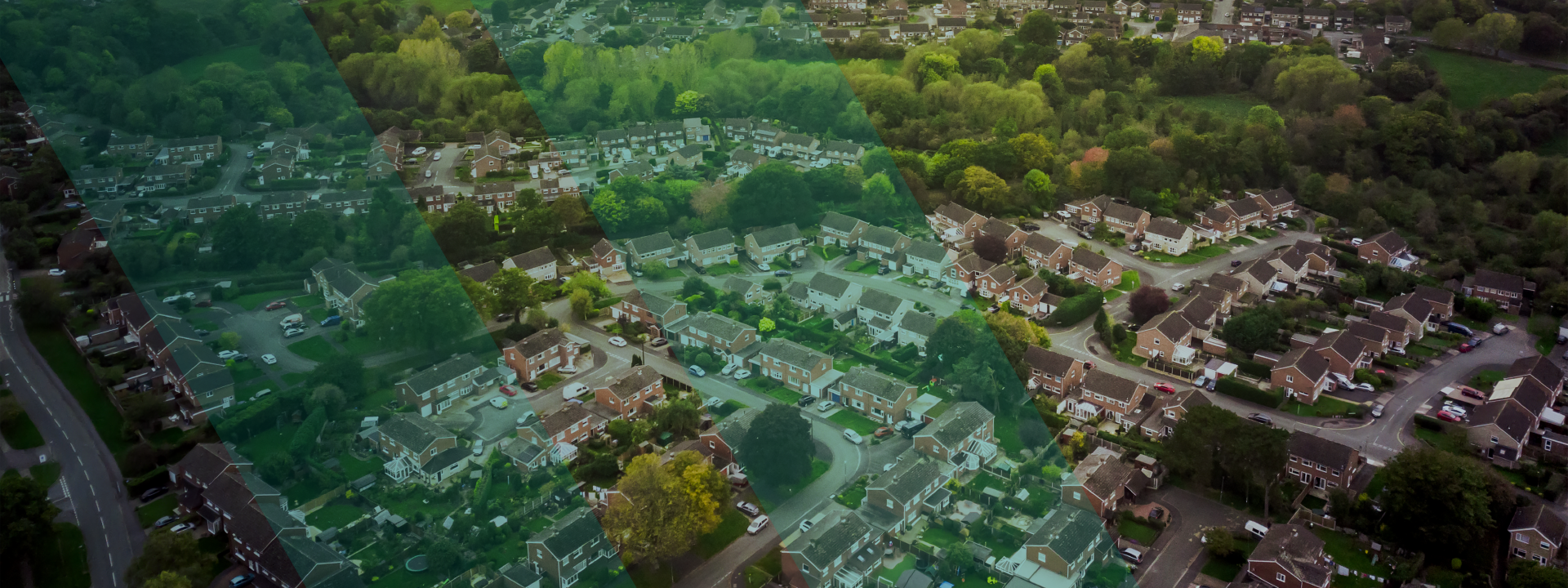
Picturing a brighter future
The brand marque and palette were complemented by a photography style which epitomises the vision of Gatehouse Investment Management. Our “bigger picture” approach to photography features heavily on the website and these sweeping aerial shots capture the thriving communities which Gatehouse are ultimately looking to build.
By taking inspiration from the Gatehouse Bank identity and introducing new elements which were uniquely Gatehouse Investment Management, we created a website which both housed a distinctive proposition and remained true to the values of the parent company.
The results
“Creating a new identity that complements an existing brand can be a tricky proposition, but the approach, expertise and ideas of mark-making* delivered something that was truly bespoke to our needs. Our audience is a very specific one, and thanks to mark-making* we have a marque, palette and website that truly differentiates us from our competitors.”
Paul Stockwell – Managing Director