The Mortgage Works
Bringing to life a new positioning
The challenge
Part of Nationwide Building Society, The Mortgage Works is a long-time leading player in the buy to let mortgage market, with a mission that goes way beyond simply lending:
To be a force for good in pursuit of shaping the UK rental market for the better, by championing landlords through everyday support and tirelessly advocating on their behalf.
Until this point, The Mortgage Works had operated as two separate brands; one focused directly on landlords, the other on mortgage brokers – each with individual identities. To fully deliver on the brand’s mission, The Mortgage Works recognised this needed to change. Our challenge was to create a single compelling identity with one voice and universal appeal.


The solution
At a brand strategy and narrative level, the new direction was aimed firmly at the end consumer – the landlord – and articulated most succinctly in the line:
Landlords. We’re with you all the way
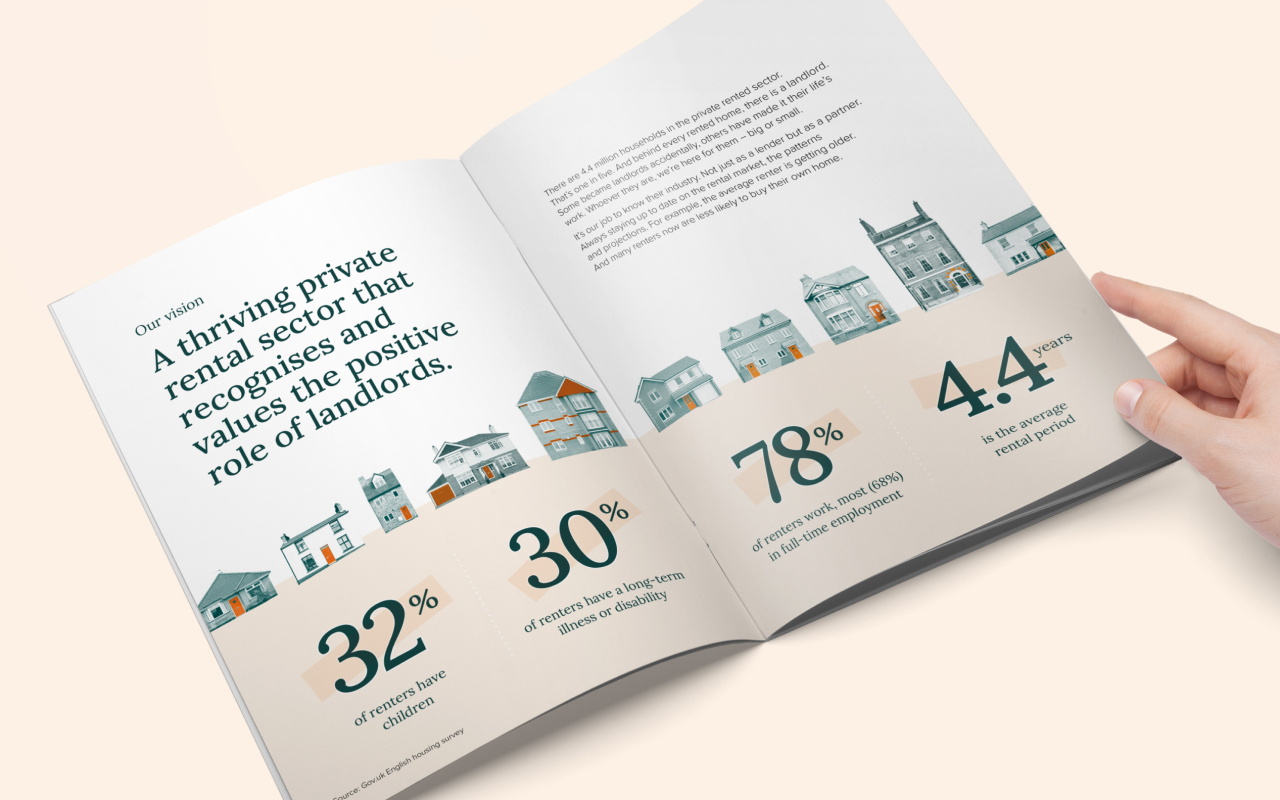
Supported by a vision statement that speaks to a thriving private rental sector (recognising the vital role landlords play) and a set of refreshed values and personality traits, the foundations were set for us to craft a meaningful and distinctive visual identity.
As part of the makeover, a new logo was created. With an emphasis on simplicity, the refined font seeks to balance professionalism with a welcoming tone.

Colour plays an important role in the new identity, too. ‘Rich Green’ conveys a sense of authority and confidence worthy of an established market leader with big ambition. The ‘Bold Orange’, arguably the most distinctive asset from the previous branding, is used sparingly to provide a spark of energy whilst retaining some equity. The addition of ‘Warm Shell’, a 10% tint of our Bold Orange, brings a calming tone to communications where required.
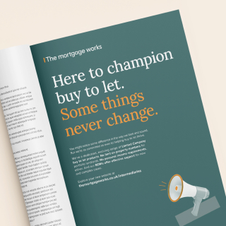
The collage-style illustrations work hand-in-hand with the messaging to capture attention and convey meaning at a glance. Photography, icons and infographics complete the visual language to ensure a consistent and coherent presence across all touchpoints.
As a visual identity system, the new look is sophisticated and confident, yet approachable. The distinctive suite of assets evokes a premium professional service for both landlords and intermediaries, whilst bringing to life a personality that’s empathetic, authentic, passionate and supportive.


The results
The initial reactions have been extremely impressive – with nearly 40,000 additional visitors to the new-look website. Combined with other activity there have been c.1 million engagements with the rebrand in total.
The intermediaries have spoken out too, providing feedback that reflects the intention of the project:
“Great, very grown up”
“Much more professional”
“Like the new website – more modern look”
With such quantitative and qualitative feedback (always nice to have both!), it’s fair to say that the rebrand is making the intended impact – and some. We can’t wait to see how it grows along with the fabulous contributions the team at The Mortgage Works make to the industry.
