Creative insights: brochure refresh
Copy Intern Marianne interviews Designer Meg about her recent project for F.Hinds.
Q. Tell me a bit about the background to the project?
F.Hinds is an independent, family-owned jeweller established in 1856 with 115+ branches. They pride themselves on their expertise, quality and value – with a full range of jewellery, watches and gifts, both instore and online. Each year F.Hinds produce a Christmas store brochure, along with a smaller magazine insert for wider distribution. The Christmas store brochure is then revised and printed for spring.
We’ve been working with F.Hinds to create these brochures for the last 15+ years. The project is an involved and ongoing one – with the Christmas brochure project starting around February and continuing until the brochure is printed around September time each year.
This year, there were a couple of differences in the process in line with a change in strategy, which resulted in new opportunities and challenges.
Q. Can you tell me more about the change in strategy?
There is a growing concern around the threat of online advertising and whether print advertising is still effective in the modern digital world. In our own experience with the F.Hinds brochure, we have seen that there has been a reduction in the number of brochures people pick up instore over the last few years. So, we decided to undertake some research to investigate and address this…
We’re constantly surrounded by advertising, The Guardian found that “in one 45-minute journey, the average London commuter is exposed to more than 130 adverts, featuring more than 80 different products. Only half of that information makes any impact”.
However, our research showed that retail brochures are still a key driver to sales and that they are capable of breaking through the “noise” of online advertising.
Furthermore, people can spend upwards of 20 minutes looking through brochures compared to seconds online. This is because brochure content is seen as being more engaging and inspiring; it creates a personal experience for the customer. The U.S. Postal Service reported that only 15% of people are likely to ignore direct mail compared to 50% who say they ignore digital ads.
Research by Workfront also revealed that brochures are at their most powerful when they are the first part of the omnichannel journey: “64% who first saw an item in a catalogue ended up completing their purchase in store, and 32% went to the retailer’s website to buy it. So, when retailers analyse the buying information as a whole, catalogues are increasing business”.
Previously, we hadn’t used direct mail for the F.Hinds brochure, but our research suggested that it would be beneficial to post the brochures directly to customers earlier in their purchasing journey – when they are just starting to think about Christmas.
We decided to advise an alternative distribution of budget to F.Hinds to make room for DMs to engage customers more directly: instead of having two versions of the brochure – one for spring and one for Christmas, as in previous years – we decided to make the brochure season-neutral, so it could be used all year round.
Q. What did the new strategy mean for the logistics of this project?
The season-neutral brief presented us with a unique challenge: we needed to produce a brochure that could run for the whole year with relevant content and remain engaging, but also still communicate the concept of the Christmas gift guide – we needed to balance the two. We decided the best way to do this would be to design two covers – one for the brochures being sent out for Christmas via post and one for those that would remain instore until the summer.
Another change we wanted to make was to reduce the size of the brochure to A5 to make it more “pick-up-able”. This had various other benefits including that the smaller size meant that the brochure fit into the lower postage bracket, was more economical to print and more environmentally friendly.
Q. Tell me about the final design…
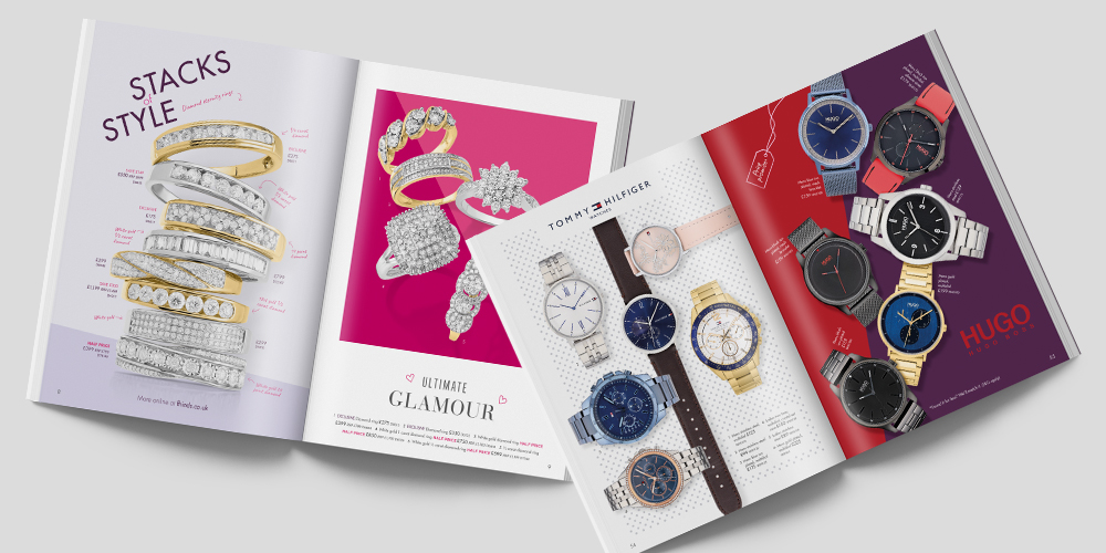
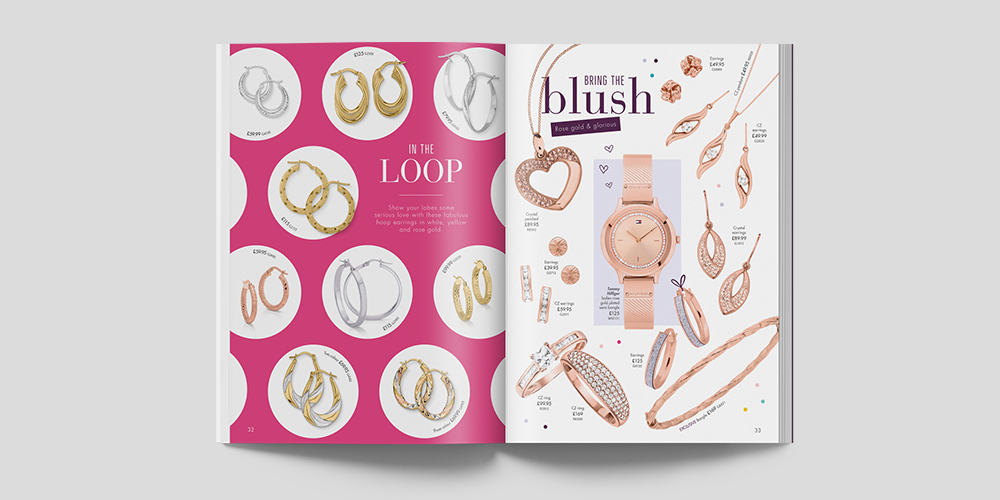
This year’s brochure was the boldest design so far. We pushed the boundaries of the brand to give a more editorial feel: each page presented the product in such a way as to tell a story.
In previous years, the brochures had an underlying theme (usually inspired by the season) running throughout. This year, we went for a more general gifting theme using subtle wrapping paper inspired backgrounds and ribbon/gift tag doodles with annotations to complement the design. We created an overall colourful pop look while still remaining true to the feel of the F.Hinds brand: developing and adding to brand assets, such as their purple colour theme.
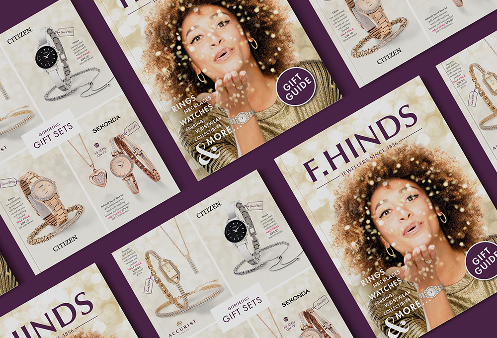
We designed two covers, one for the Christmas mail out and the other for the all year round store version. Often we feature products on the cover, but this year we decided to go for something a bit different and use lifestyle imagery. Initially, I thought that the cover design would be constrained by having to feature a small gift, but upon trying various designs and imagery, I realised it could work very effectively without being quite so literal. The aim was to produce a more aesthetically pleasing cover which created the feeling of celebration – the chosen design was sparkly and celebratory, and not so explicitly product-centred. This was really effective and, in fact, F.Hinds liked it so much we used the design for both covers, editing the copy to reflect the change in seasons.
Q. How has this process evolved over the years?
Each year we start the process with research: I gather inspiration and create mood boards to inform the page layouts and spark off ideas. At this stage, we don’t know which products will be going into the brochure (although we know approximately how many products and have a rough idea of the structure and general categories). So initially I approach this by going through a spreadsheet of last year’s chosen products to get a sense of what needs to go into the brochure.
Creating mood boards this year was quite different to previous years: usually, I’d have a Christmassy one and a spring one (we’ve previously had seaside and floral themes), but this year the overall theme needed to be more generic.
I create paginations, which provide an initial design visual of how the 68-page brochure will look. This is then used as a guide for the selection of products. The design is in flux at this stage: the choice of products can influence the page layouts quite considerably, which means as the products are chosen changes need to be sketched into the page layouts.
Next is the photography – an involved process in which each product is photographed at the specific position and angle it needs to be to fit into the page designs.
Then comes the post-production editing and lots of proofing. Given our experience in this niche area, we pride ourselves on putting our expertise to work to get things just right down to the smallest detail, such as manipulating the shadows, which can have a big impact on the overall look and feel of the page.
The brochure is proofed multiple times to allow us to assess whether things look just right visually once printed: are the colours the intended shade? Are the diamonds bright enough? We can then tweak anything which needs doing.
This year Google Sheets was our saviour: having a shared document with the whole team who were collaboratively working on the project meant that we could keep up to date with which amends had been addressed and which still needed doing.
The cover gets designed last, it evolves out of the feel of the brochure, a bit like a book cover does out of a book.
Year on year, the process has become even smoother and more streamlined, with developments depending on each year’s requirements.
We have gradually developed the brochure to have a more editorial feel each year – think magazines style – we still have a uniform look, but are led by the content and eclectic design. The colours and page designs have become increasingly bold, rich and playful to give individual stories, texture and personality to each page.
This year there was also the additional collateral around the brochure, for example, the direct mail pack and POS (point of sale) banners and animations, which needed to be designed in line with the brochure refresh.
Q. Any stumbling blocks or particular hurdles we had to get around?
The new smaller A5 size meant weighing up how many items should be included in the brochure. Ideally, we wanted to try and fit roughly the same number of products in. This meant we had to get creative with the layout. Initially, I was concerned that this would result in very overcrowded and busy looking pages, but actually, it meant that I came up with some really interesting page designs which were very effective.
Creating a theme which doesn’t overwhelm the product is something I need to be aware of when designing the layouts. The page designs need to avoid distracting from the detail of the jewellery but have an interesting visual effect overall. In the end, we went for bold colours with hints of wrapping paper in the background, without being explicitly Christmassy – it was all about getting the right balance.
Also, I was working alongside branded products like fashion brand jewellery and watch brands, all of which have their own set of guidelines.
It’s important to remain sensitive to the products (including any brand guidelines), retain a consistent overall flow to the brochure by having an awareness of how the pages link together and produce an aesthetically pleasing design – which can seem like a bit of a juggling trick at times (but one we’ve got very good at!).
Q. How do you feel about the final result – what aspect of this project are you especially proud of?
It’s very satisfying to see the evolution of the brochure and follow the process from start to end: from the initial concepts to the finished brochure.
The fact that this year the initial page layouts I designed before the product selection didn’t change dramatically proves that we’ve got really solid foundations with which to build upon, right from the very first visuals. It’s great to know the process is working really effectively and see each of the different layers being built upon until we get to the final result!
There were quite a few new challenges with this brochure, but it also gave rise to a lot of opportunities which we really took advantage of, for example bringing in the gifting theme and developing the personality of the F.Hinds brand (pushing it a little further through the annotations, doodles and additions to the colour palette).
For me the cover was a great success – the design worked really well and had a new sparkly feel. Also, the animations we created for the promotions really brought them to life – making them much more eye-catching than a static image.
I’m also proud of how the new smaller size of the brochure worked out, and am really looking forward to seeing how it is received by shoppers and the effect of the Christmas mail out.
You can see the final brochure for yourself in one of F.Hinds stores or request one from their website here.
About Megan
Megan Williams
Senior Designer