Our brief was to create a consistent and coherent design language to present WBBS in a more credible and professional light – one that would instil greater confidence in its customers – all within the parameters of the current brand identity.
The biggest challenge was that very little existed in terms of a defined brand proposition and positioning, and in turn any definitive brand identity guidelines.
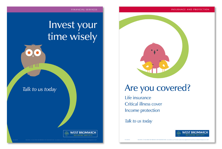
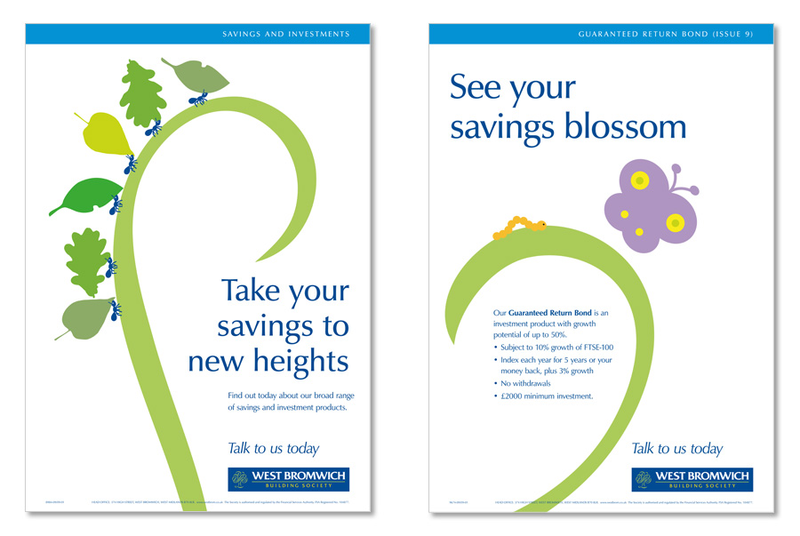
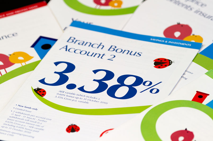
Our start point was to conduct a full audit of existing marketing collateral to identify any opportunities and help establish where the focus of the design effort should be. In conjunction, we carried out a low-level competitor audit to gain insights and identify potential conflicts. Armed with that understanding, the resulting creative solution built on the ’tree’ – an underplayed graphic element within the logo, and yet a symbol of strength, longevity, wisdom, security, trust – everything WBBS stood for. Our approach was to bring it to life in a way that would engage customers and that WBBS could own.
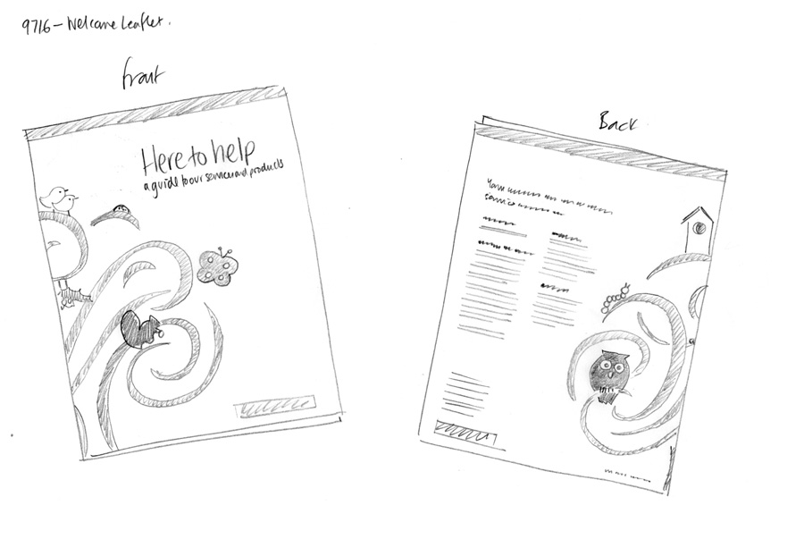
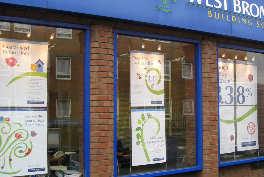
The result was truly refreshed design language that captured the essence of WBBS and could be rolled out across all media consistently and coherently, from branch posters and POS material, to marketing literature and digital advertising.