
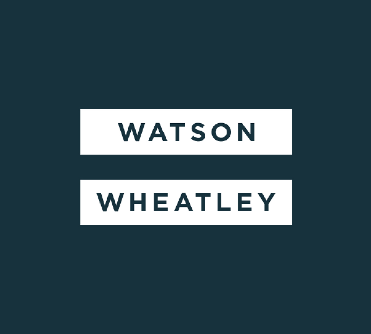
Watson Wheatley
simplicity = success
Rebrand successfully captures the essence of Watson Wheatley’s proposition and brings it to life with a level of simplicity that delivers genuine stand out in a highly competitive space.
The challenge
Reconciliation software for the financial securities industry is a highly competitive space. Although well-established and with a strong reputation, Watson Wheatley recognised that in order to drive further sustainable growth, a brand platform and identity that truly differentiated the business would be fundamental to success.
The solution
Watson Wheatley’s niche is in reconciliation. Sophisticated products take incredibly complex financial data and process it at speed according to each client’s very specific requirements. In essence the objective is to ensure that two sets of records agree.
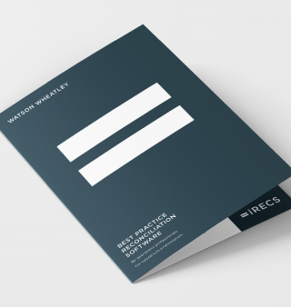
Acknowledging this as Watson Wheatley’s sole focus inspired the exploration and ultimate adoption of an equals symbol. Simple and bold, it’s a marque that acts as a visual summation of business’s core proposition: Watson Wheatley =
This marque is central to the new brand identity, forming part of the logo and providing a flexible device that clearly communicates the offering in an impactful and memorable manner.
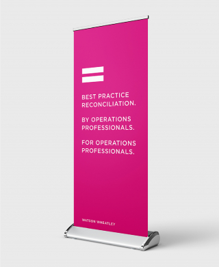
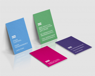
The simplicity of the marque allows for creative application of supporting imagery and a bold colour palette, to deliver a degree of standout rare in the reconciliation space. Combining the equals marque with short, meaningful statements, provides a creative platform for distinctive brand messaging across all communications.
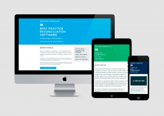
As part of the initial new identity rollout, we also addressed the Watson Wheatley website. The existing site was comprehensive, but complicated – rich in detail, but sometimes jargonistic or repetitive – with content spread over many pages in a multi-tiered structure. After a process of distilling, simplifying and restructuring, the site not only reflects the new aesthetic, it also delivers relevant content in a more straightforward and easily accessible way.
The results
The rebrand immediately helped galvanise and energise the Watson Wheatley team and drew positive comment from clients and prospects alike. Since then, the meaningful and distinctive brand platform has been instrumental in establishing Watson Wheatley as a leading force in reconciliation software, cementing an already enviable reputation, and driving commercial growth.
Tom Wheatley COO, Watson WheatleyOur new identity is a step change from what we had before and has been well received by clients and prospects alike. We found the mark-making* process very thorough and it really made us think about how we are perceived and how we get across the company values. We are really proud of the final product and would certainly recommend the mark-making* team.