SMA Europe
All together. One goal.
Rebrand successfully captures the spirit, values and professionalism of SMA Europe, to bring greater clarity and credibility to the organisation’s role in empowering its member organisations at a national level and influencing healthcare decision-makers at a European level.
The challenge
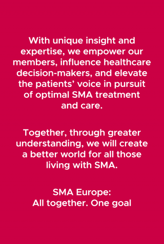
SMA Europe represents over twenty different national member organisations in its role to bring effective treatments and optimal care to everyone affected by spinal muscular atrophy. Run by volunteers, SMA Europe’s raison d’etre is to create a better world for all those living with spinal muscular atrophy.
In pursuing this purpose SMA Europe recognised it was being held back by a lack of clarity and coherence to its story, and in turn, a brand identity that neither added value in terms of expressing their story, nor at a more basic level, conveyed the professionalism vital to inspire confidence amongst the organisation’s wide-ranging stakeholders.
Our challenge was to distil the historically convoluted and overly complex SMA Europe story into one that was compellingly simple, then bring that to life through a brand identity that reflected and reinforced what SMA Europe stands for, in support of achieving its long term strategic objectives.
![]()
The solution
With two primary audiences – national member organisations and European healthcare regulatory decision-makers – and numerous messages at play, the SMA Europe story was suffering from a lack of single-minded focus. Additionally, it was missing a key component. In order to bring optimal treatment and care to all those affected by SMA, the patients’ voice needs to be heard and central to the process, from drug development to therapy.
We worked to shape a story built on a promise of commitment, collaboration and progress, with three strands at its heart; elevating the voice of the patient, empowering member organisations to advocate and campaign at a national level, and influencing healthcare, pharma and regulatory decision-makers at a European level.
With the brand story defined, we created a visual identity direction of equal simplicity and carefully designed to build on the message of patient-centricity.
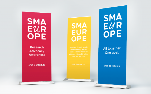
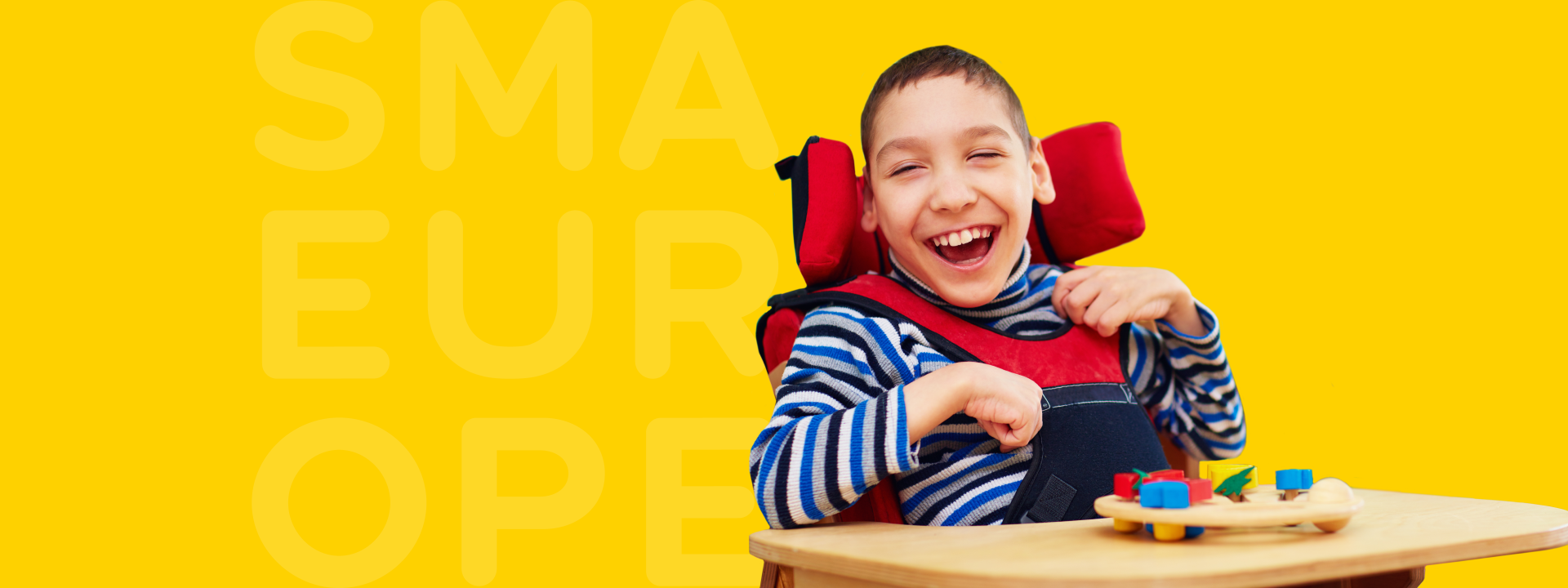
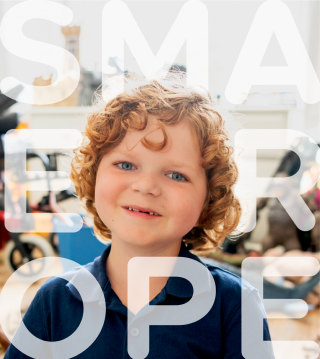
The new typographical SMA Europe brandmark features the letter ‘U’ at its centre, representative of (and speaking directly to) the patient. The visual metaphor may be interpreted in two ways. On the one hand, ‘U’ (you, the patient) is at the heart of everything SMA Europe does and critical to all developmental processes that seek to bring optimal care to those affected by SMA. Two, as a patient, or indeed anyone affected by SMA, you can be sure you will be supported and cared for, with the letters around the ‘U’ reflective of a ‘huddle’ commonly associated with sports teams.
Additionally, ‘U’ is for unique. No two individuals affected by SMA have the same experience or share the same journey. By allowing the ‘U’ to be presented in limitless variants, and even replaced by photographic imagery, the diverse and highly personal nature of experiences of living with SMA is importantly represented and respected.
The wider design language features a colour palette and typographic approach created to convey optimism and inclusivity, whilst providing standout amongst the national member organisations and European regulatory bodies.
The results
As our focus turns now on the expression of the brand online with the website redesign, the rebrand is due to be launched officially at a major event in February 2020. However, the response from the national member organisations to the more defined story and new visual identity has been overwhelmingly positive and already had an impact in terms of providing a clearer understanding of the role of SMA Europe and instilling greater confidence in the organisation. Internally, the rebrand has enabled the individuals within SMA Europe to more easily and confidently articulate the organisation’s positioning and purpose, in turn galvanising and energising the team.

Vanessa Christie-Brown SMA Europemark-making* is a highly professional, approachable, flexible, friendly and fun agency. We were overwhelmed with how quickly they not only understood, but managed to distil the essence of our very complex, multi-national, non-profit organisation which looks after the interests of people living with a complicated and rare medical condition. mark-making* very successfully got to grasps with our different cultural sensitivities and varying views on what is a highly personal and emotive subject, to find us the perfect solution.