
Seerist
Forging a new brand in global threat intelligence
A positive brand story and dynamic look and feel create a distinct identity for this new name in threat intelligence, successfully differentiating Seerist from the overriding market narrative of crisis, chaos and fear.
The challenge
Threat and risk intelligence professionals have a common goal: to protect their organisation’s people, assets and interests, wherever they are in the world. They need to be able to take decisive action and, to do this, they have to be in the know. From social unrest and political changes, to extreme weather and natural disasters, they require objective and reliable information on the things that matter to them, fast.
![]()
But with typically small and resource-constrained teams, they can’t be everywhere and see everything – especially those with a global remit – so will often use a combination of third-party data feeds to get the information they need.
The challenge, though, is that information alone isn’t good enough: it must make sense of the ‘noise’ and answer the all-important ‘so what?’ question to be truly useful.
Recognising the opportunity to fulfil this demand, Seerist was born. The result of a partnership between two established leaders in their fields, Control Risks and Geospark Analytics, Seerist fuses leading-edge AI technology with best-in-class human risk analysis to deliver threat intelligence with greater foresight, accuracy and relevance than any alternative.
Our brief was to establish a brand story that heroes the Seerist difference, and brings it to life with an identity that sets the brand apart in a saturated and indistinguishable competitor pace.


The solution
The process began with an extensive consultative phase, interviewing people from across the two businesses, as well as key clients from within the threat and risk management community. We sought to understand client wants and needs, the attributes of the Seerist proposition that best satisfy those needs, as well as how the competition position and present themselves to the target audience.
Through this process of discovery we uncovered two critical insights: that our target audience want to be known for their ability to add value to forward-looking, strategic decision-making, as well as immediate, tactical response; and that the well-trodden narrative of crisis, chaos and fear used by Seerist’s competitors is at odds with the proactive mindset and strategic aspirations of our audience.
Embracing these insights, we developed a positive and energising brand positioning that emphasises the benefit of the solution: By accelerating better decision-making, Seerist empowers threat intelligence professionals to convert risk into opportunity and enable their organisations to thrive. Supported with a comprehensive brand strategy, comprising values, personality traits, and key message pillars, we provided Seerist with the key building blocks of their story, and our creative team with the foundations on which to build an identity that is both meaningful and distinctive.
From verbal to visual assets, our next step was to establish a comprehensive identity toolkit.
In an industry where a red and orange palette, and disaster-centric imagery often brings threat to the fore, we set out to establish a confident look and feel that centred on stability and positivity – visually reflecting Seerist’s purpose to help their clients successfully navigate risk and meet their potential.
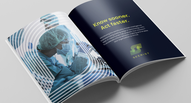
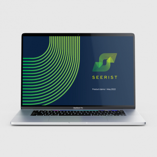
Central to the identity is the logo, where the ‘S’ brandmark symbolises the continuous feedback loop that drives the Seerist platform. The arrow pointing down to the left represents the past and present ‘Context’ – the collection and analysis of millions of datasets from across the globe. The arrow pointing up to the right represents ‘Forecasting’ – the prediction of likely outcomes and foundations for strategic planning. The shape is formed of many lines, representing information streams, and the reciprocal human and machine feedback loop, weaved together to form a distinctive stylised ‘S’ for ‘Seerist’.
Beyond its use within the logo, the ‘S’ brandmark is also employed as a dynamic graphic device – creating striking branded backgrounds with bold crops, or framing or directing the eye to subjects when used over photography or film footage. The lines of the mark can also be animated in digital applications to further reinforce the impression of Seerist as a business in constant motion – tracking and keeping up with an ever-changing world.
Offset against bright white or the brand’s deep charcoal blue, the vibrant green palette represents positivity, zest, opportunity and success. The changing tones of the brand’s green gradient also represent the continual flow of intelligence gathered and analysed by the Seerist platform.

The brand’s photography and film footage play a key role in communicating the global nature of their business and the sorts of environments, events and conditions of significance to their clients. We created guidelines for curating a rich library of authentic and compelling imagery, to capture life across continents and cultures, and tell the stories of evolving events and their impacts on commerce and society. While some photography may indicate an element of ‘threat’, showing positive outcomes that result from successful risk management is at the heart of Seerist’s visual narrative.
The results
While still in the early stages of building brand awareness, initial feedback has been hugely positive. Since launching, Seerist have been successful in developing new client partnerships and are on track to meet ambitious first-year targets. Internally, the project has supported the coming together of two teams with a clear and motivating brand positioning, and helped galvanise and energise employees around a shared purpose and set of values that represent the culture of this dynamic organisation.