Paysteam’s literature suite details their services and the benefits for users and acts as an important sales tool for the business development team. When the time came for a design refresh, mark-making* was on-hand to lift the feel and inject a little character.
The brief was to update the literature, bringing it in line with the current look and feel used on advertising campaigns and across the website, whilst injecting some of the PayStream personality through a friendlier tone of voice.
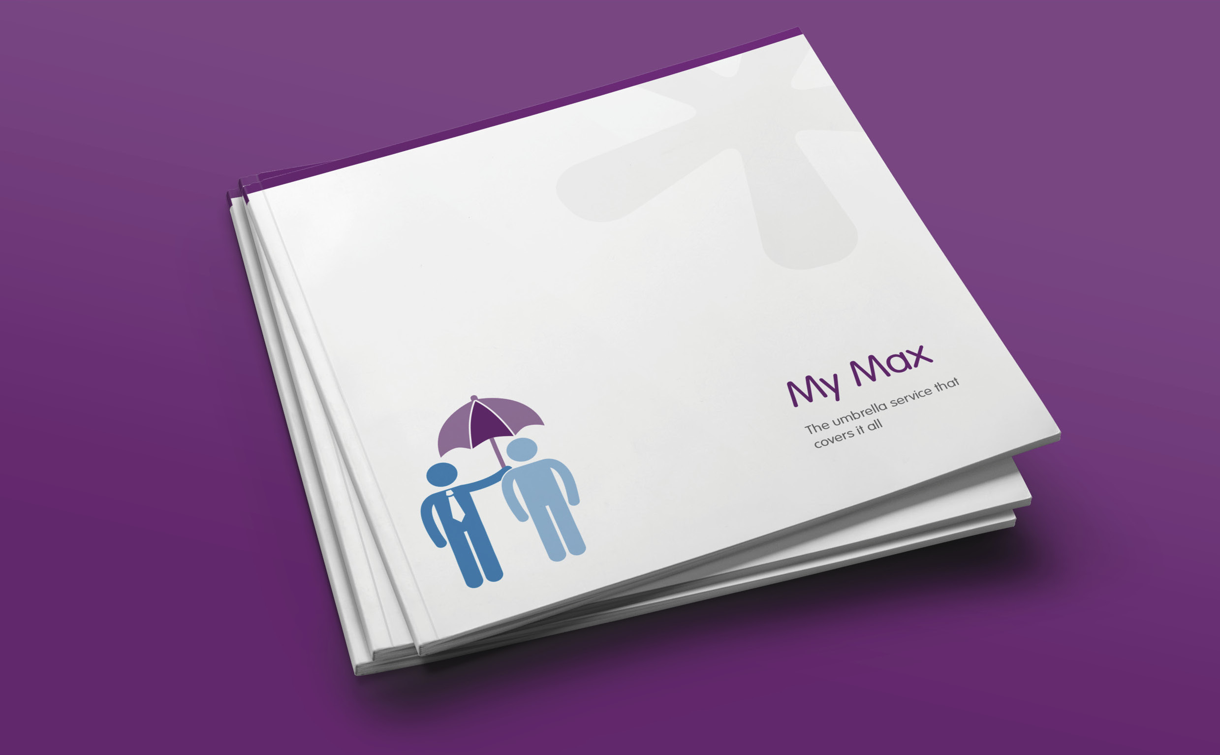
Each of the three service offerings (My Max, My PSC, and My CIS), retained their existing colour coding to aid product recognition, but the amount of overall colour used was reduced to create a cleaner, more contemporary feel.
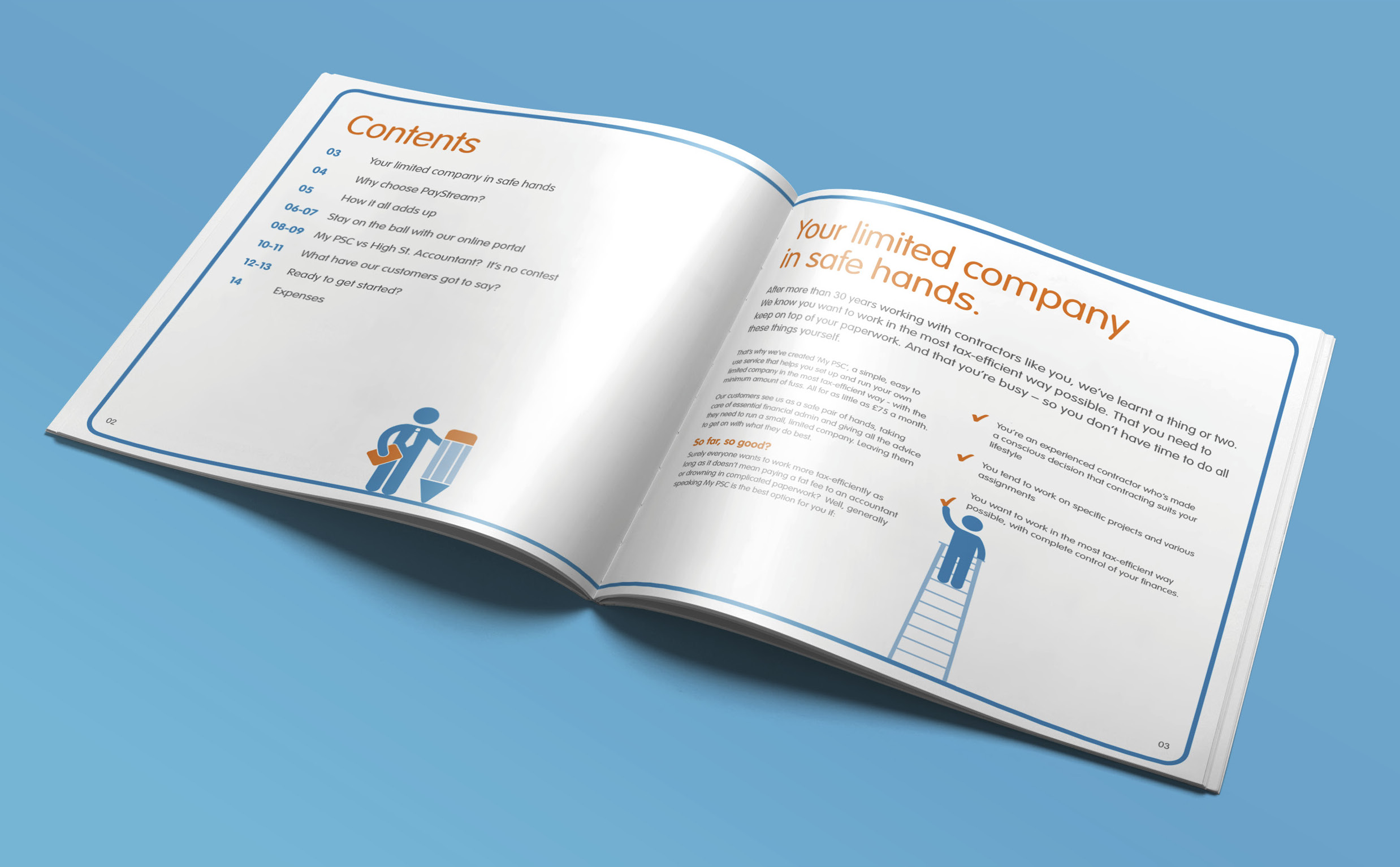
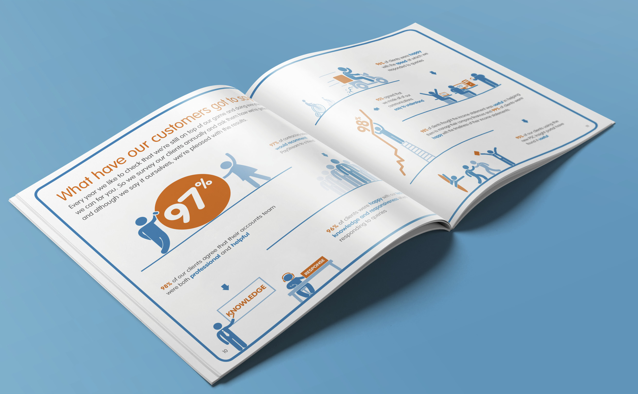
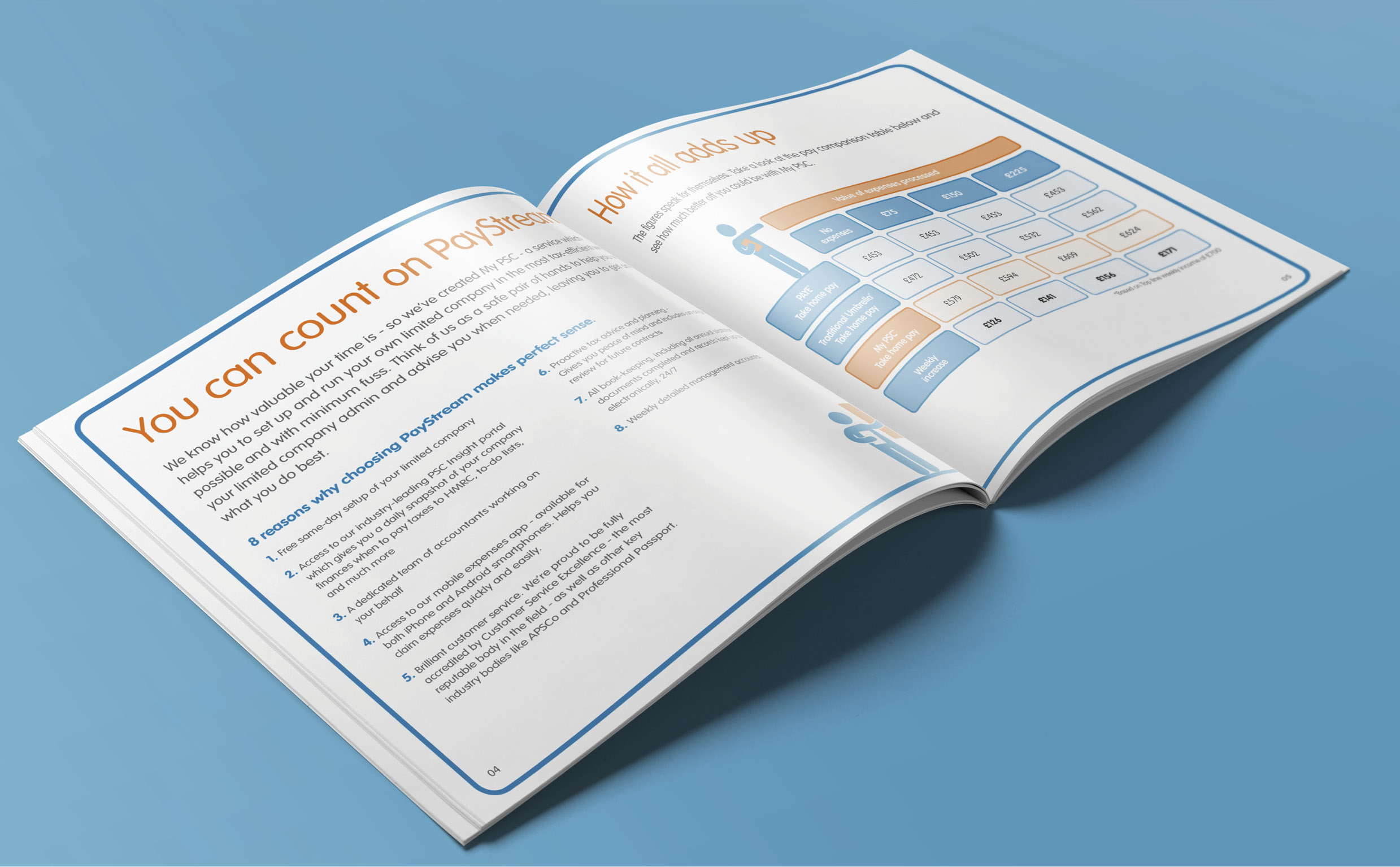
The content delivery was readable, and visually accessible. In the copy, we made things simpler and clearer, without compromising on depth of detail. The tables, too, were optimised for friendliness and readability, with clean rounded corners and contrasting colour schemes.
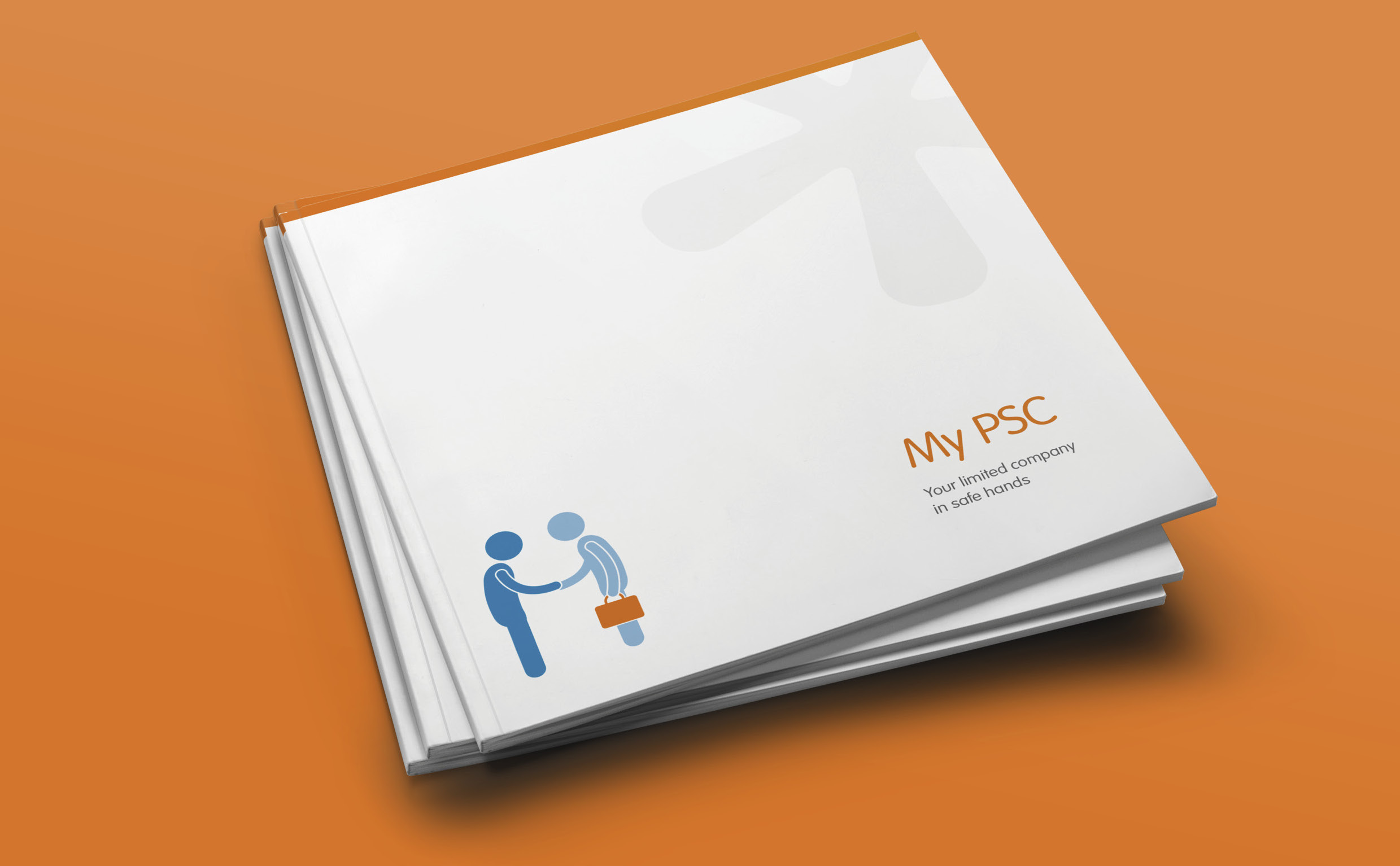
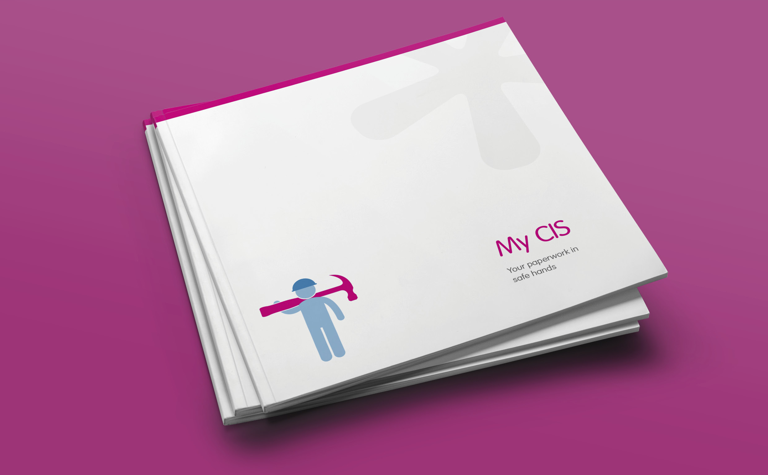
The covers feature the PayStream asterisk as a subtle, clear varnish to ensure brand recognition, with the full logo moved to the back page of each brochure. This also allowed us to introduce the Paytream characters used elsewhere, to help bring complex financial subjects to life visually and inject personality.
The increased use of white space created a more legible document, coupled with simpler and clearer copy and table to describe the products, without compromising on depth of detail.