The Little Book of Protection (LBOP) is designed as a light-hearted yet informative guide to insurance protection. It’s a subject most of us would glaze over discussing so the book aims to help brokers engage and spend time with clients when dealing with this sometimes sombre topic.
At a broader level, the LBOP also needed to increase awareness of LV= protection offering, raise brand awareness and help develop a reputation for innovation and broker support.
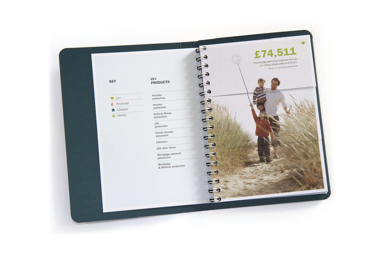
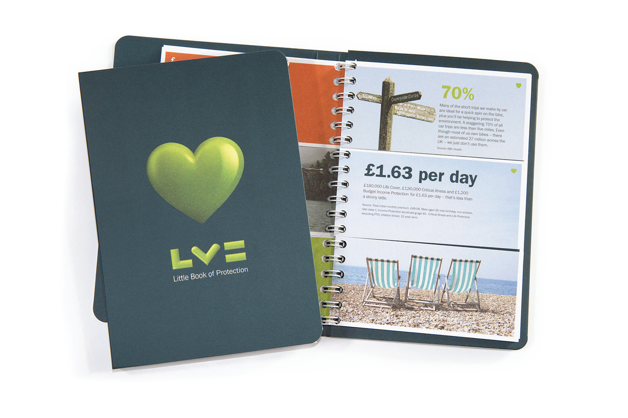
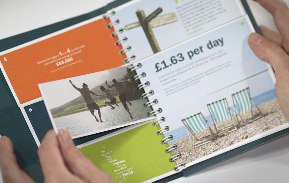
Our solution drew inspiration from classic split-page children’s books. The mechanic softened the subject matter and broke up the statistic-heavy content into easily digestible chunks. In short: the solution was fun, warm and accessible – and as such, was very much in the spirit of the LV= brand.
The book itself is an oversized A6 format, wirobound with 15 text leaves trimmed into three equal sections. What it lacks in size it’s easily made up for in performance… The uptake of the LBOP by brokers broke all records. Previous incarnations of the book had taken six months to shift. Our LBOP flew off the shelves in just seven hours. A reprint of a further 5000 copies was ordered immediately.
Liz Sands, LV= Marketing Controller described the response to the LBOP as “phenomenal” adding “everyone is really, really pleased. The book has gone down exceptionally well. We’re having unexpected requests for copies from internal teams and even corporate partners asking about the possibility of producing co-branded versions.”
The LBOP is a finalist in the Marketing Design Awards 2011 which take place in November. “We’re delighted the LV= Little Book has been so successful from a business perspective, and now to be recognised for creativity is fantastic. It’s a case of marks made all round” said Ali “which is our objective with any project.”


