Link
Creating a partner for brands that want to do better
A new strategy and identity positions ASL (renamed as Link) as the outsourced marketing partner of choice for global brands committed to positive change.
The challenge
Asian Sourcing Link (ASL) was already an established name in the field of outsourced marketing when they approached mark-making*.
With ambitious growth targets, ASL wanted to position themselves as an organisation that adds value by elevating a brand’s connection with their customers.
In an industry that is known for its copious merchandise – often throw-away items that are detrimental to our environment – ASL wanted to be seen differently. They aspired to be the true brand partner, delivering ideas and initiatives that would help brands behave more responsibly, all while meeting their own ESG targets.
The task was complex and needed a leap of faith from the ASL team, as they challenged industry-accepted norms. They would need to embrace a disruptive narrative that truly reflected their ambitions and urged brands to think differently about how they promote themselves and engage with target customers.
![]()


The solution
During the discovery phase, key themes emerged, and it became clear that both internal and external stakeholders saw value in investing in a sustainable approach to the sourcing of branded merchandise. Beyond this, there was a focus on the value of relationships, trust and expertise – things which competitors typically underplayed in this production-driven industry.
The “positive-change partner” positioning was developed. A clear statement of intent to do things differently for beneficial outcomes. The industry appeared ripe for a brand that stood for something better, and brands were onboard for a partner that helped them attain outcomes in an altogether more positive way.
Alec Pettigrew ChairmanThere’s been a paradigm shift. Because the consumer cares, brands are willing to pay more (for sustainable products/approaches).
ASL’s positioning evolved to mean more than just sustainability. Positive change stood for doing everything in a better way: from speed to market, to value for money. And becoming the positive-change partner in a more holistic sense led to a clear articulation of who ASL’s commitment was to and why:
“….for the brands that want to do better. For the brands committed to being global responsible citizens, creating value for all”.
From ASL to Link
Creating wider appeal and better reflecting the ambitions of the organisation called for a move away from both the name Asian Sourcing Link, and the legacy perception of procuring products from just one region.
And so Link was born.
The name suggests collaboration and connection, encompassing what it means to be a positive change partner. As well as being short, punchy and memorable, it’s directly taken from the old name which provided a clear connection to the organisation’s heritage.
Making a marque with positive change
The development of the Link logo hinged heavily on the name itself and the idea of being a progressive partner for the industry sector.
![]()
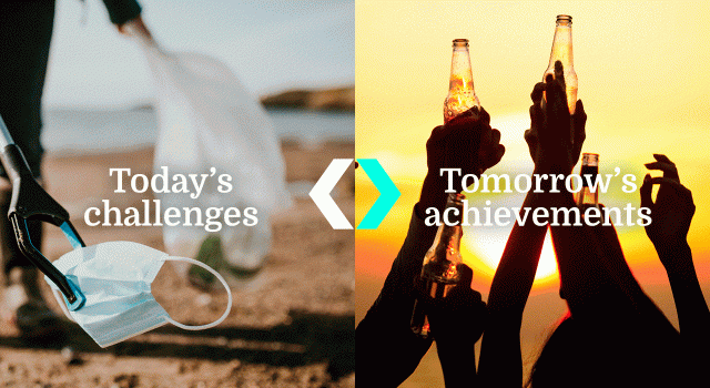
The new brand marque comprises the name, set in a clean, lowercase font and an arrow, set in a bright cyan colour and reflecting the arm and leg of the ‘k’ character. The resulting symbol, named “The positive change arrow” reflects Link’s forward-thinking approach and embodies the brand’s values of agility and imagination.
As a symbol, it’s a link itself, denoting that the organisation is key to creating deep connections between brands and their customers.
When used in combination with photography that depicts brand experiences or sustainability goals, the positive change arrow effectively showcases the range of services that Link offers, whilst further reinforcing the brand’s positioning as a progress-driven partner.
The identity comes to life through dynamic animation, the movement of the arrow further reinforcing that Link is what creates meaningful connection between brands, ideas, experiences and customers.
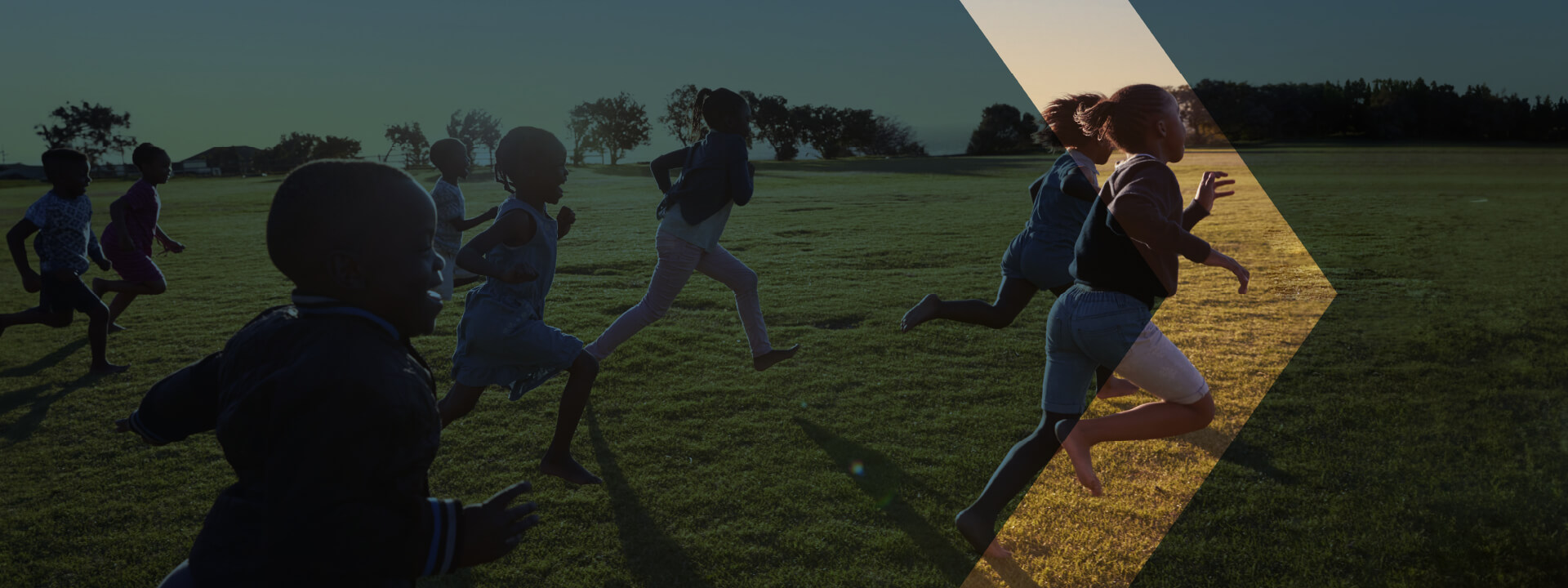
Photography plays a significant role in dramatising the brand’s grounded yet passionate personality. A new image library documents the sheer number of “links” that the organisation facilitates, including those with quality manufacturers, meaningful experiences and reliable supply chains.
In certain communications, the positive change arrow highlights a shift, be it between products and resulting experiences, current challenges and future ambitions or problems and solutions. The overlay of the arrow gives a side-by-side composition which clearly illustrates that progress is facilitated by Link.
Link-worldwide.com
A key deliverable for the newly-named Link was a website that would bring the new positioning to life. As the first touchpoint for prospective and existing clients and suppliers, the site had to be user friendly and provide engagement opportunities.
The clean, dynamic feel follows a simple layout, with opportunities for user interaction designed to add intrigue to the navigation experience.
You can check it out for yourself here: link-worldwide.com
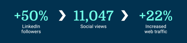
The results
Link unveiled their new positioning and identity earlier this year and, although it’s early days, the brand has already garnered a lot of positive feedback from both internal and external stakeholders. Their Linkedin audience has grown by 50% YTD since the new identity was revealed, and July saw a 22% engagement rate with posts – more than double their average. Teaser, launch and follow-up videos have been popular with users, too – the content clocking up an impressive 11,047 views.
With the website now fully operational and already attracting 14,063 users, (a 22% uplift on the brand’s previous site) we predict that, for Link, it could be positive change all the way.