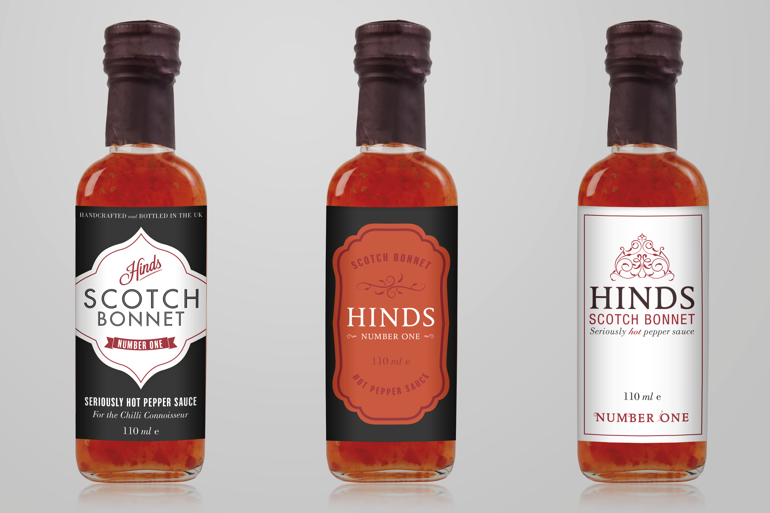
Andrew Hinds* is a real connoisseur of chilli sauce. When this culinary passion coincided with the opportunity to set up a not-for-profit venture, he asked mark-making* to lend a hand by creating the label design for a new brand of scotch bonnet sauce.
We began by creating mood boards, as a discussion tool to highlight various visual themes that are prevalent in this type of food packaging. This exercise allowed us to focus on four themes that helped steer visual directions for our initial concepts.
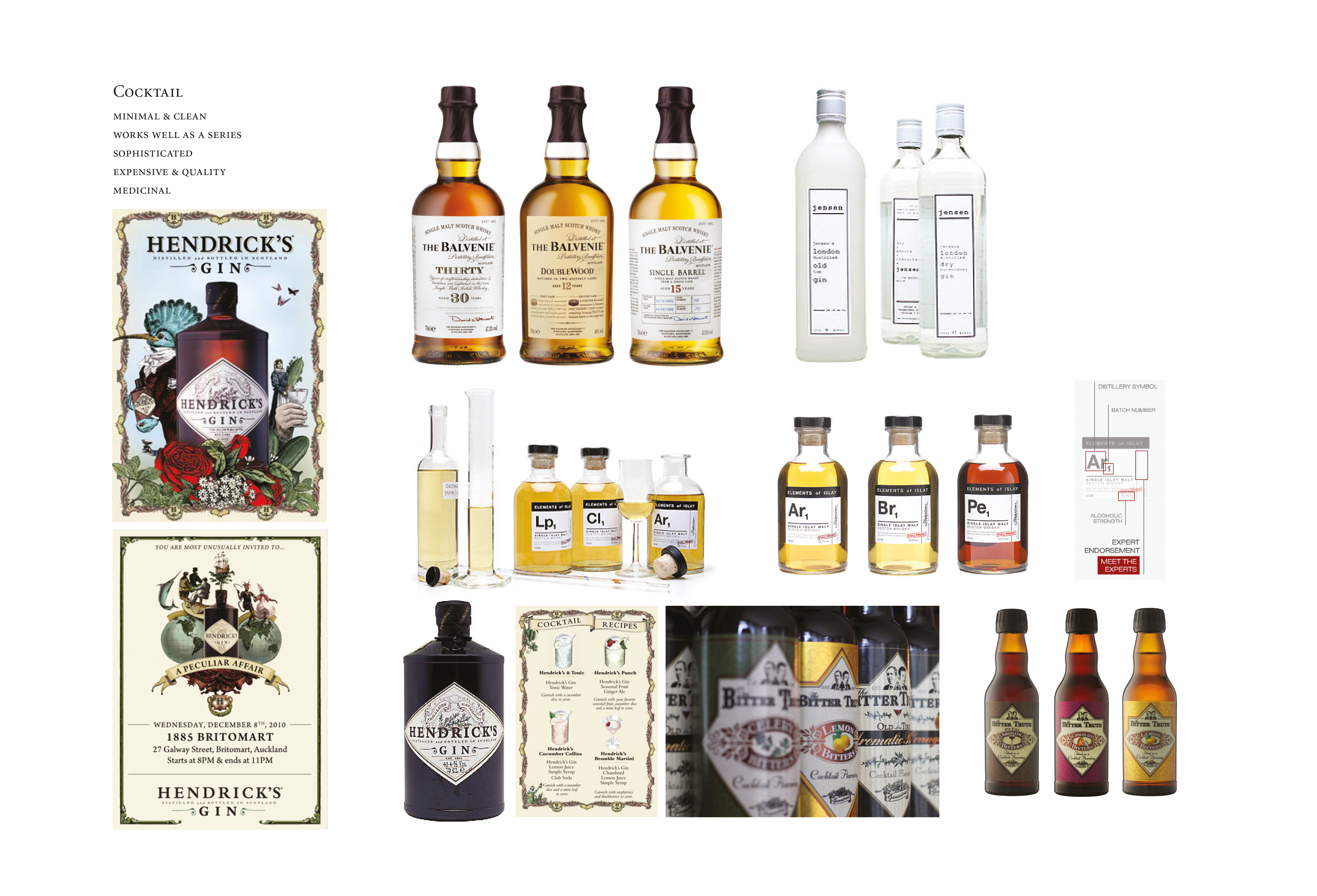
Traditional
Old-fashioned, medicinal-looking labels, as found on premium and heritage cocktail spirits. Good potential for variations, different numbers or strengths.
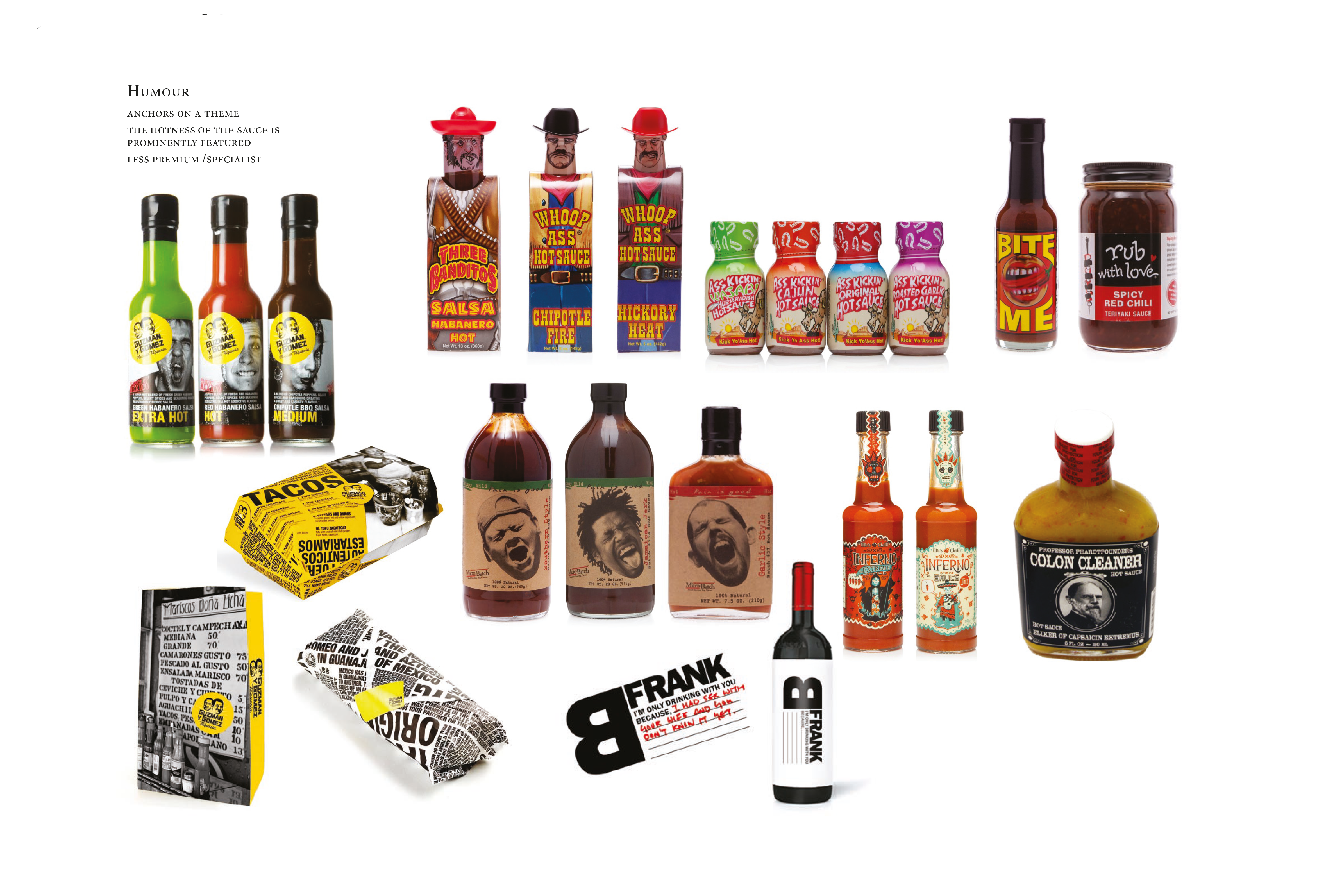
Humorous
The hotness of the sauce and the ‘risk factor’ of its consumption are prominently featured. The overall feel is less specialist, and lower-end.
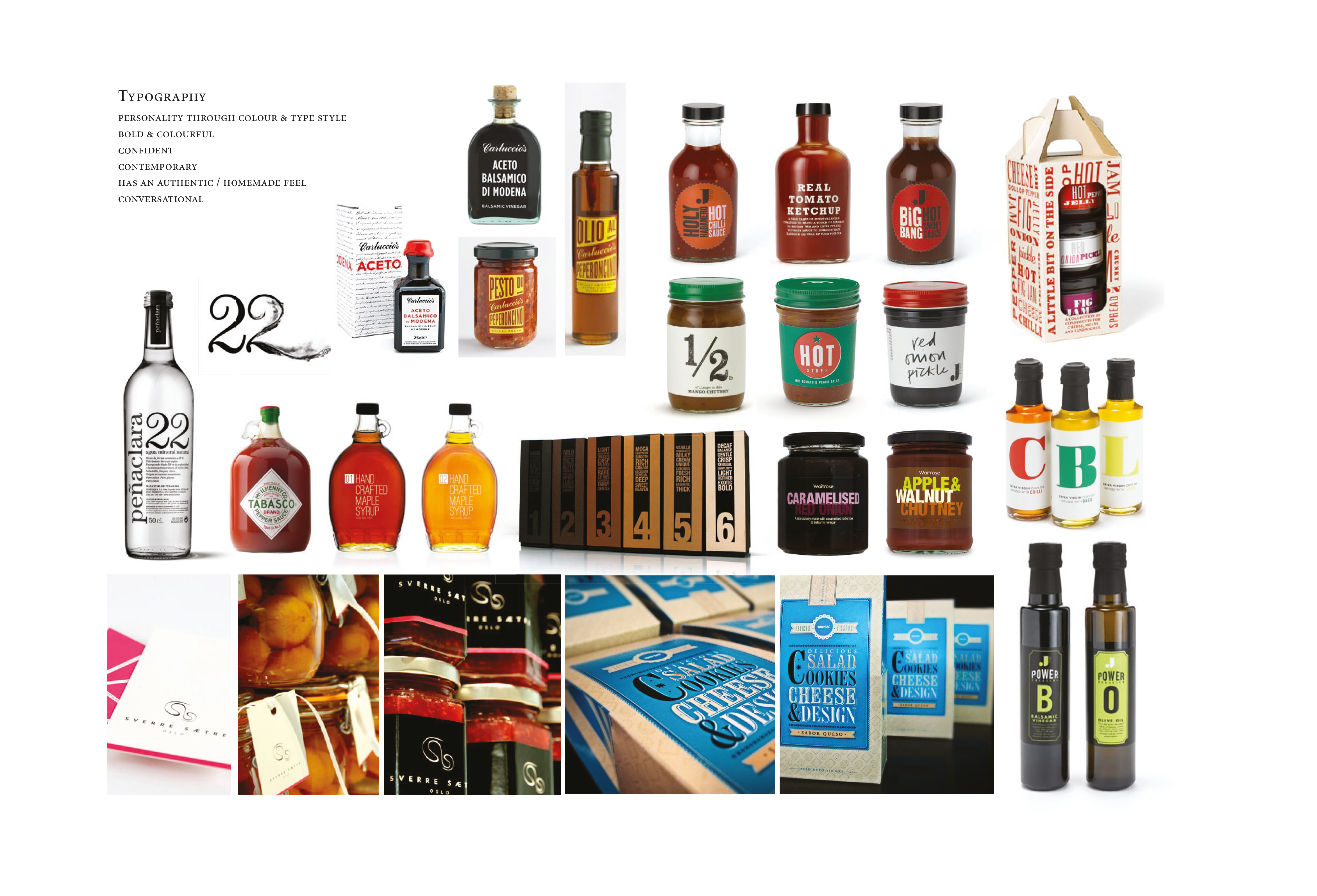
Typographical
Personality expressed through colour and type style, often creates a contemporary, non fussy feel in its simple execution
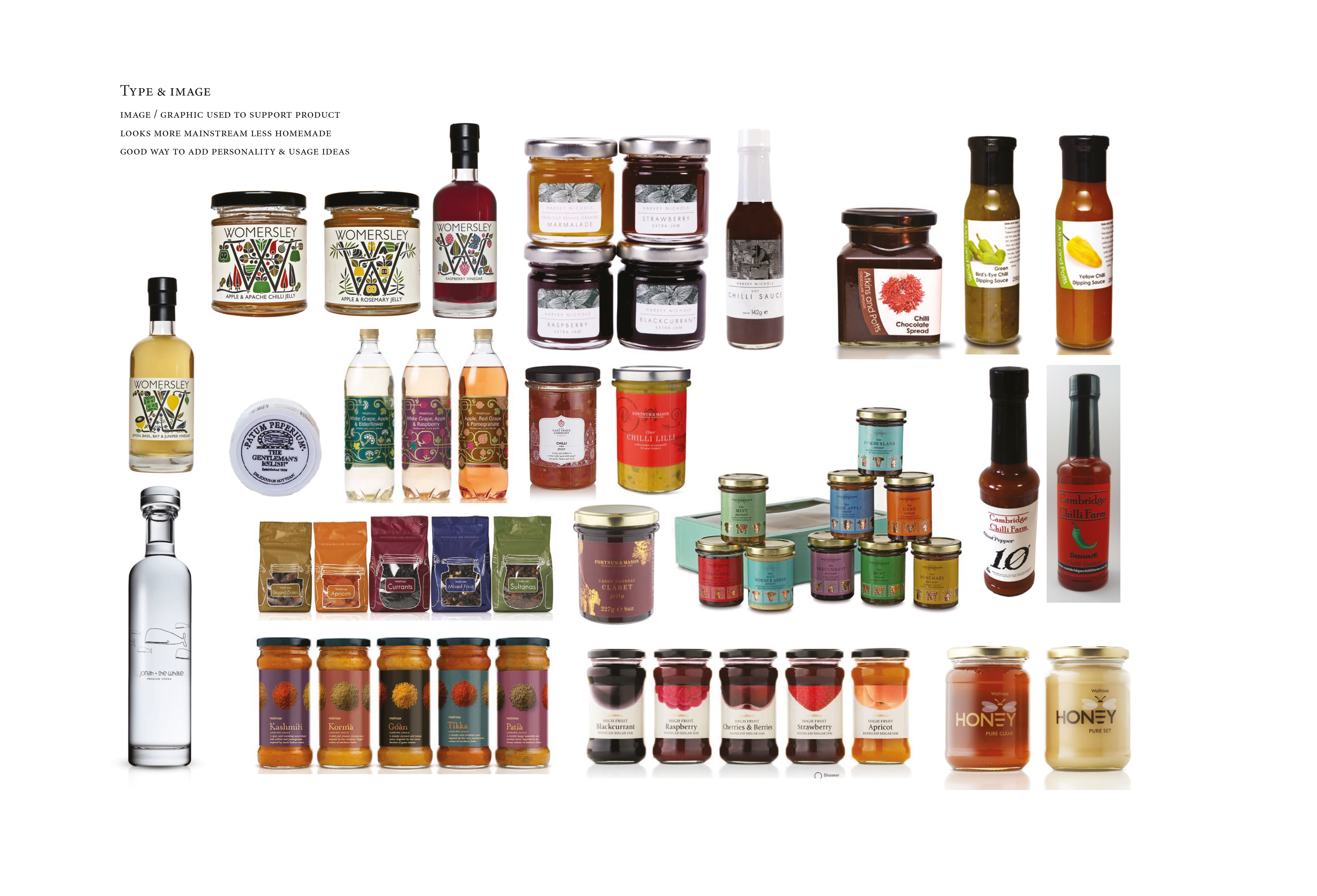
Type & Image
Images and graphics are used to support products, the overall look is more mainstream and less home made. It provides a good opportunity to add personality and suggest usage ideas.
“In a cheeky nod to certain famous purveyors of fine condiments, Andrew expressed his wish to feature his own surname ‘Hinds’ on the label.”
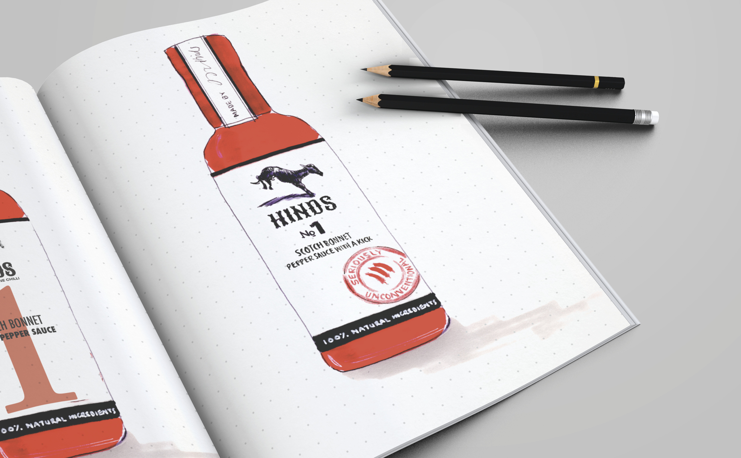
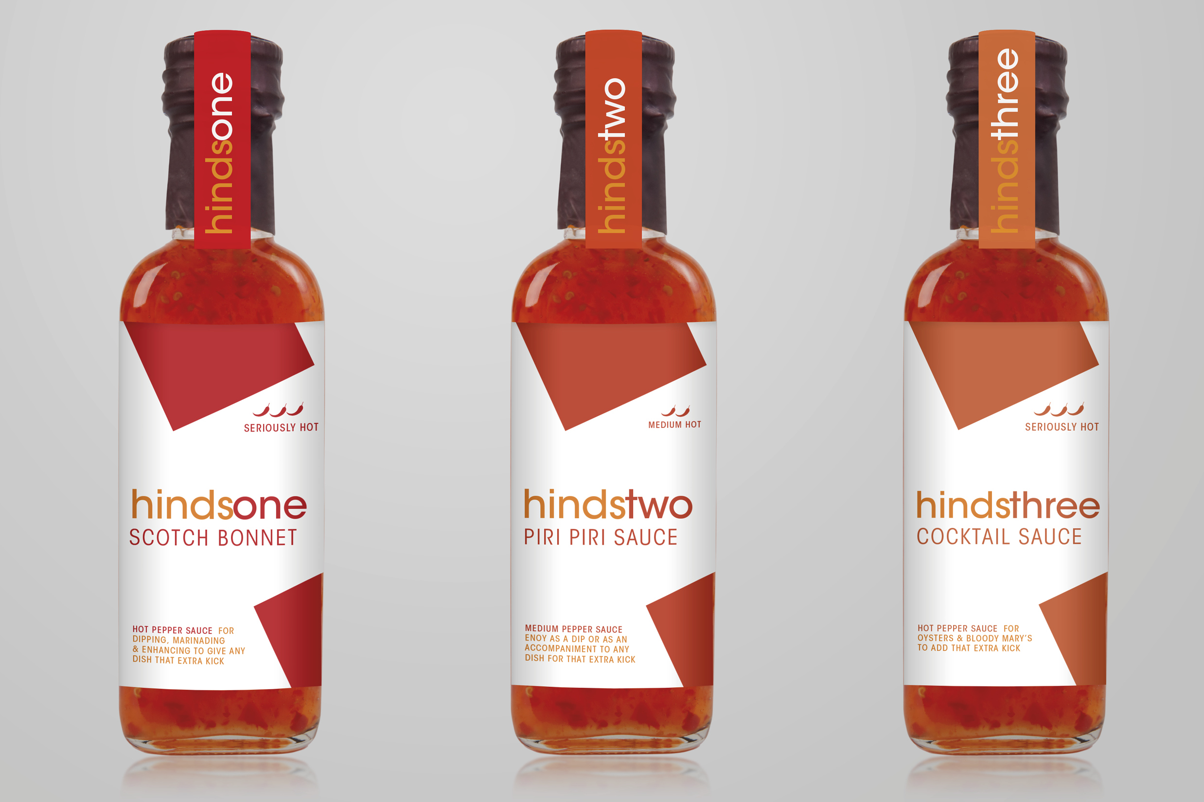
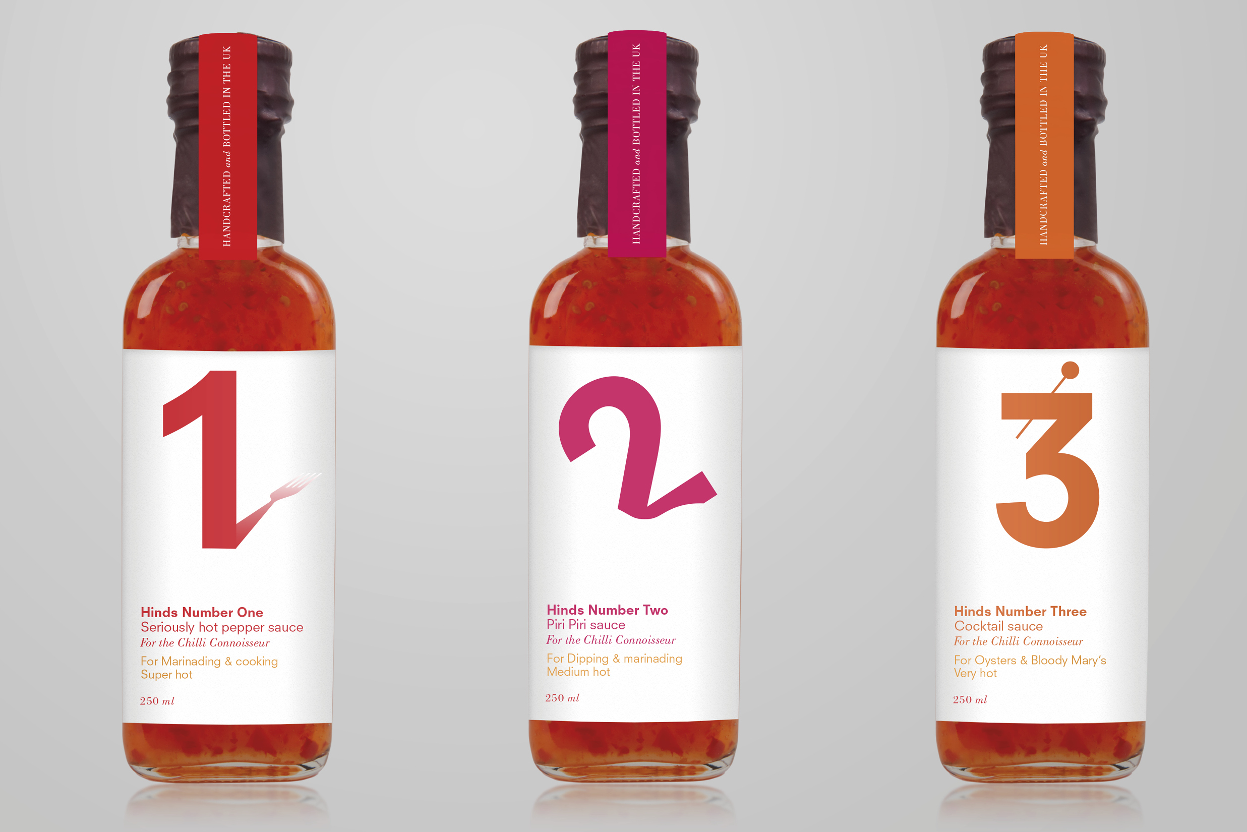
The initial concepts were widely varied in style and execution from simple typography, type-as-imagery, and medicine-style labels, right the way through to illustrative drawings.
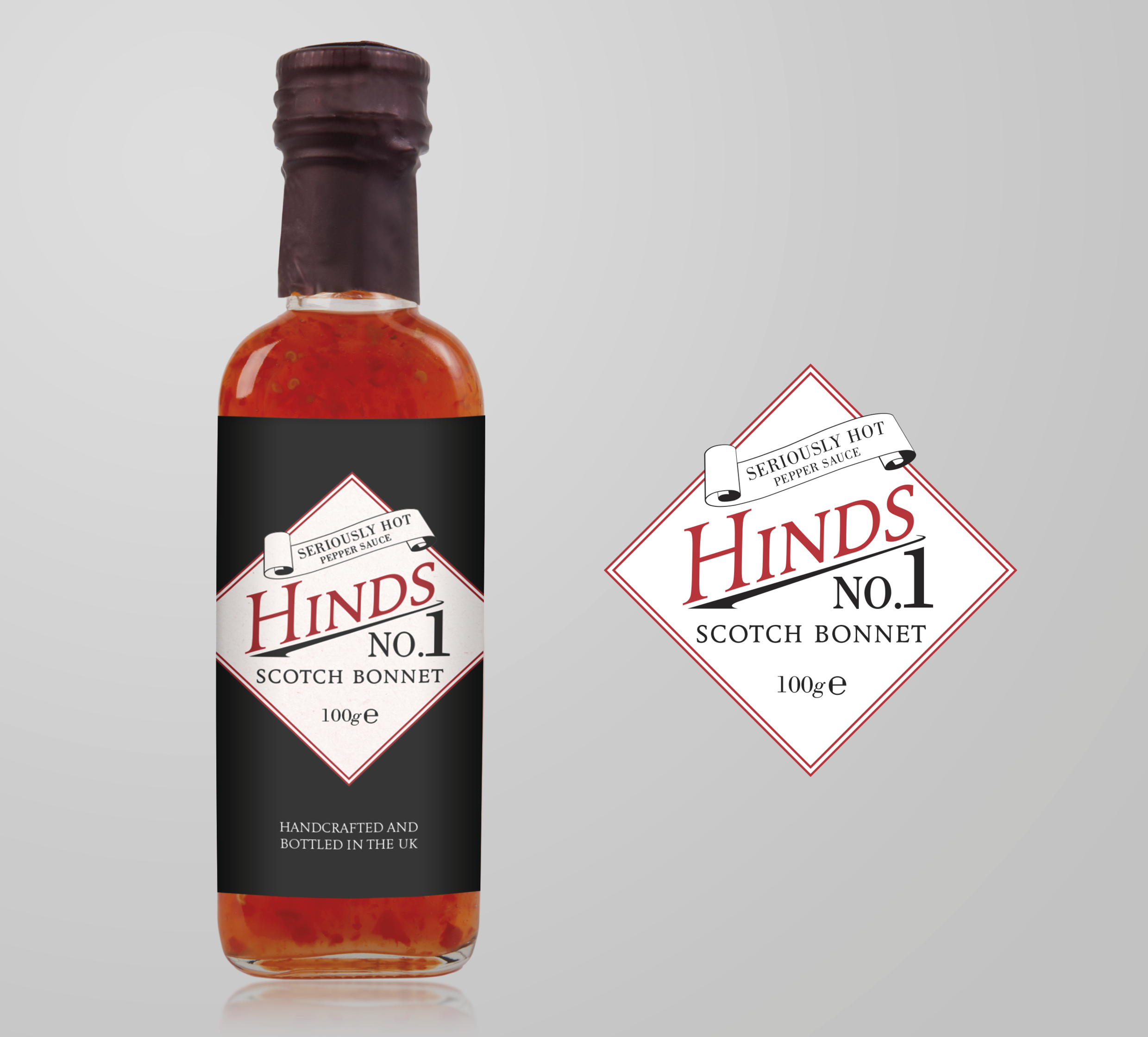
Andrew’s chosen route was the one that he felt reflected his personality as a chilli sauce connoisseur. This design is simple with vintage styling and typography, and subtle decorative motifs inspired by chilli plants and flames. It features a red and black colour scheme, with a warning scroll that reads: ‘seriously hot’.
*Andrew is the director of jewellers and long term mark-making* client F.Hinds.
