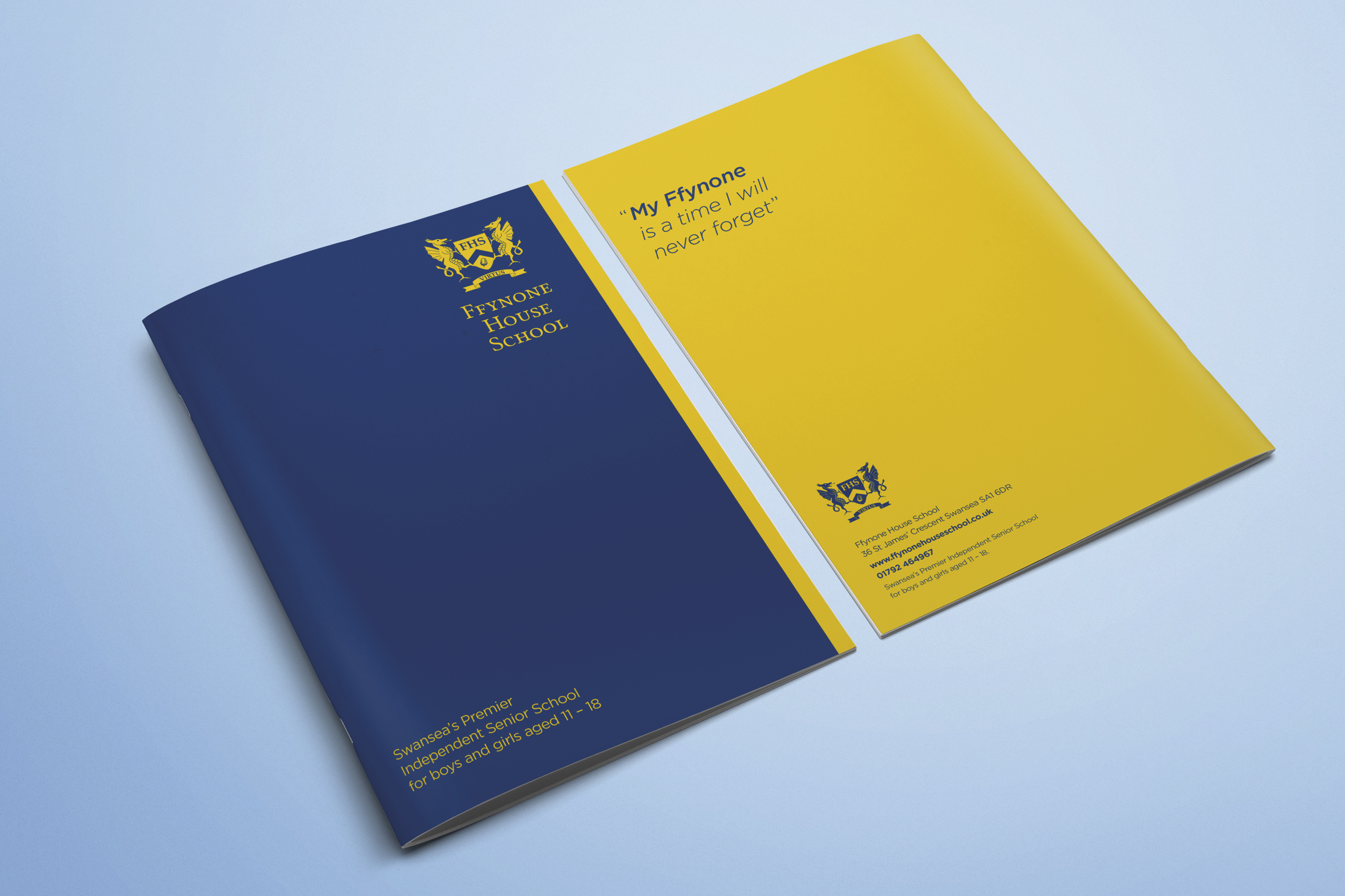
Ffynone House School Prospectus
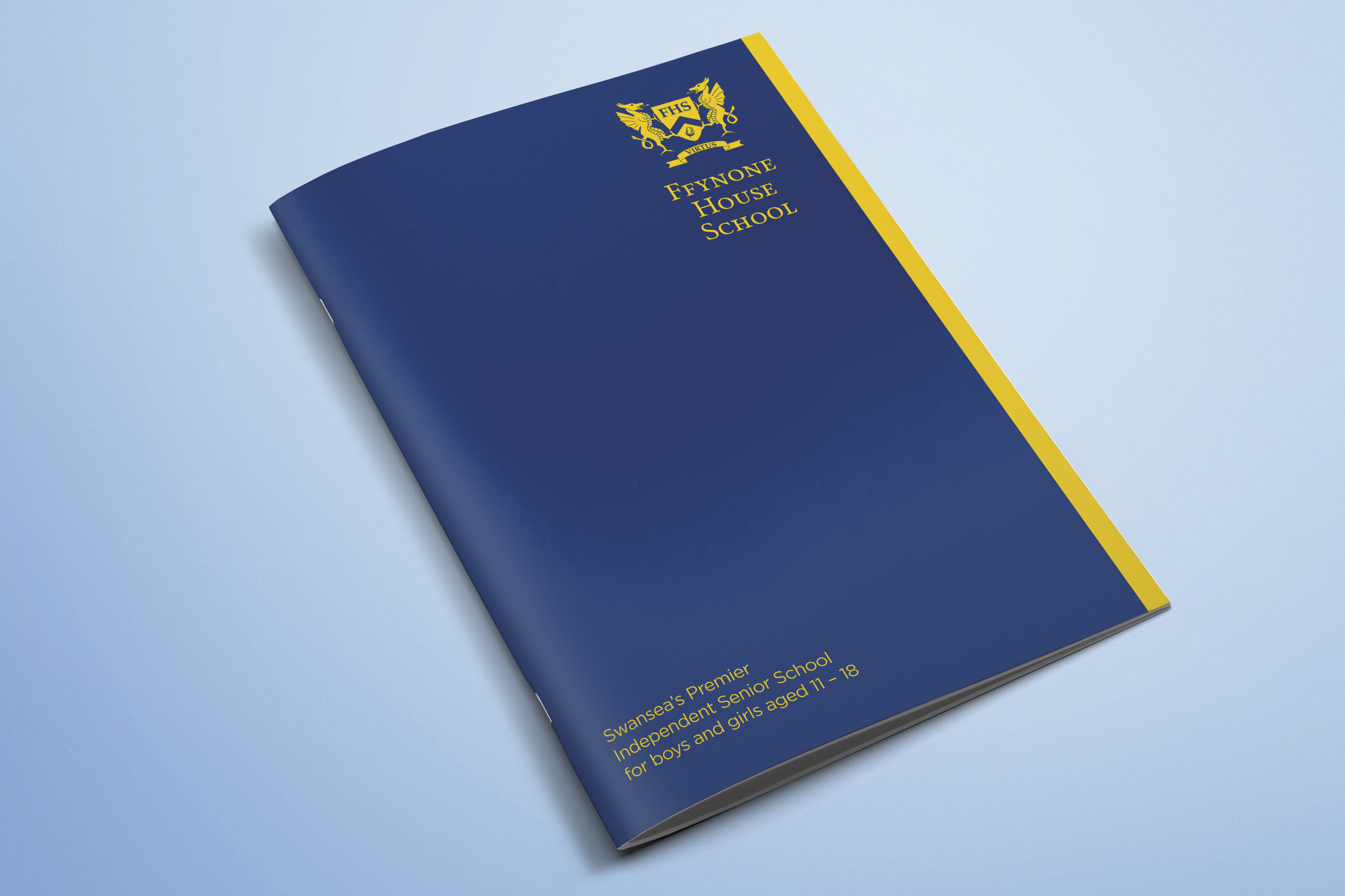
We have been working with Ffynone House School in Swansea for some time, helping them to grow their brand. Recently, we moved into shaping their marketing collateral, starting with a new-look prospectus.
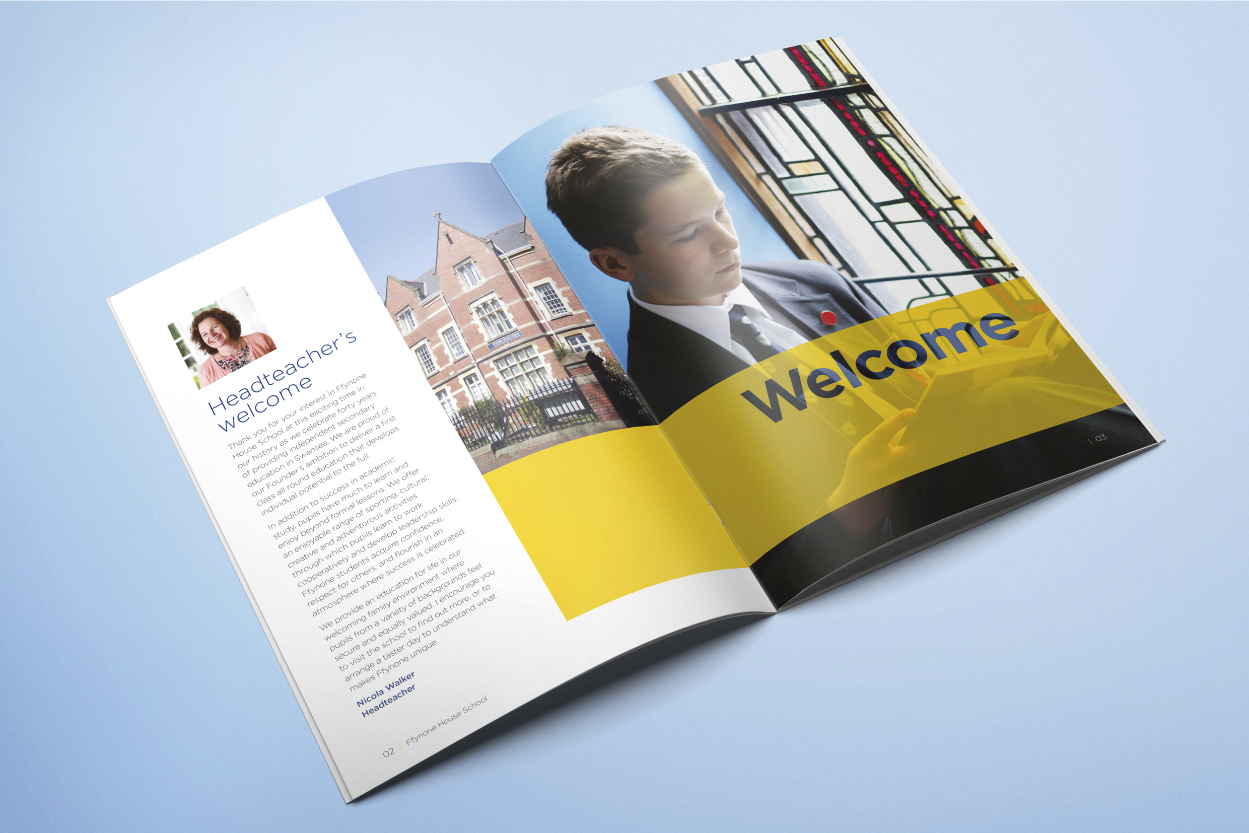
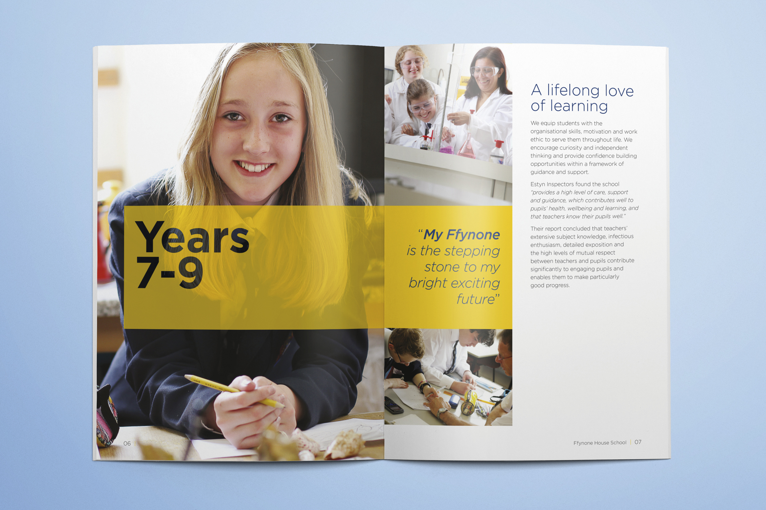
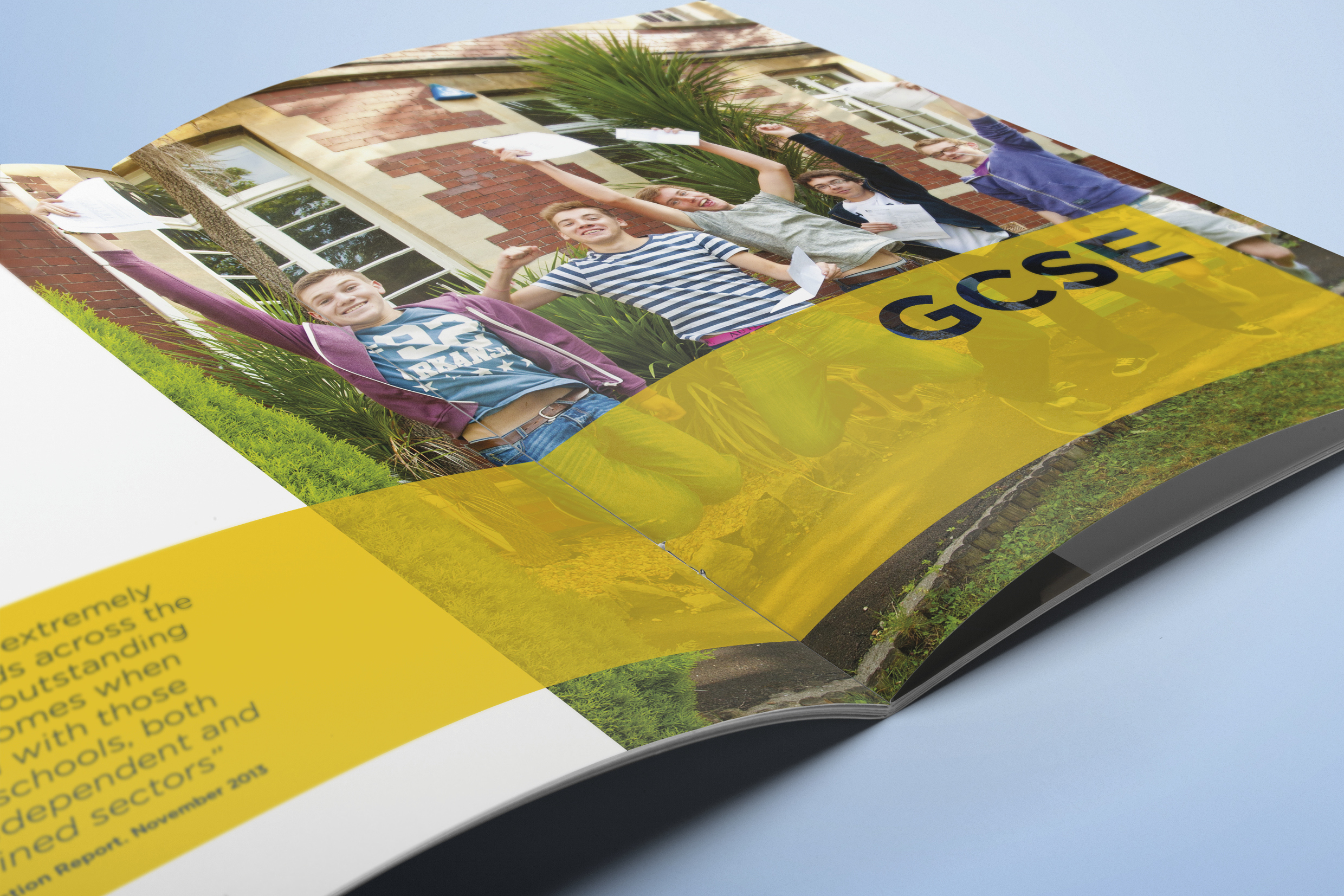
The brief was simple: an engaging design led by emotive images that audiences could connect with and content that captured the spirit and academic qualities of the School. We had a creative meeting with Ffynone to draw out ideas for the prospectus and identify main themes. It was clear that the prospectus primarily needed to convey a sense of belonging with themes of ‘Family’ and ‘Individual’ running through the images and content selected. Having established a running order for the layout and content received from the client, we started to go through the extensive image library, selecting those that best depicted life at the School.
Yellow was the primary brand colour, we used this in selected sections, balancing the brightness of the colour with white space throughout the design layout. Once the design direction had been approved, we were able to complete the artwork and suggest a suitable print stock, for a prospectus that delivered a professional look and feel. From idea to execution, we created a prospectus in two weeks with a timeless design that portrays the individuality, community, and distinctiveness of Ffynone House School.
With a particular emphasis on advertising, mark-making* has helped Ffynone House to articulate its credentials as a high-flying academic centre, whilst demonstrating the important values that make the School special and unique. Creating positive brand awareness, this has helped to spread confidence within the community that the School is very much thriving academically.
View the full project gallery in our Behance portfolio.
