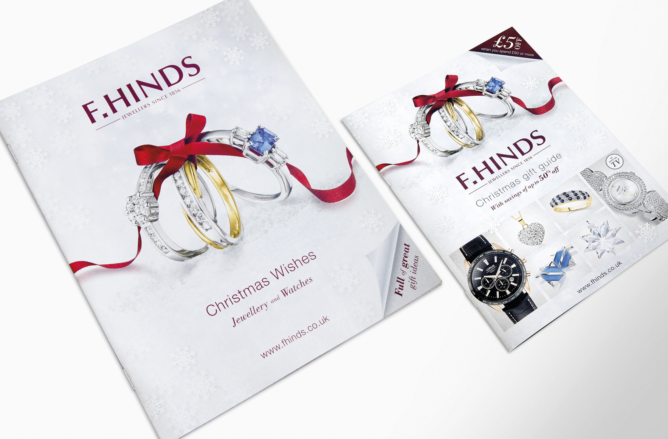
F.Hinds Christmas 2013 brochure and A5 insert
Approach
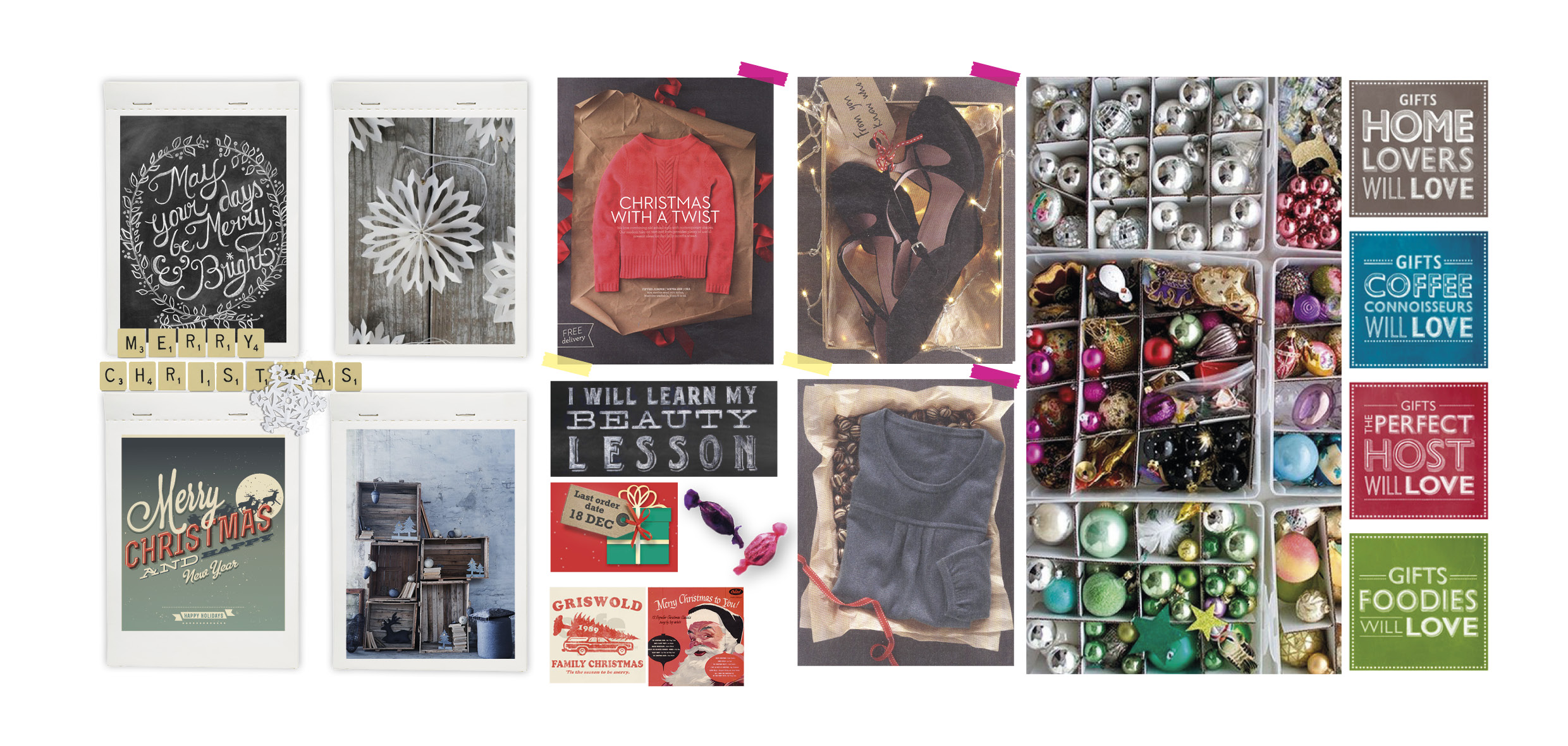
We have been producing seasonal store brochures for F. Hinds jewellers for over 10 years. The focus of the 2013 Christmas campaign was on building F.Hinds’ core brand values of family and tradition, which was supported by a ‘Christmas morning’ theme. We sought to evoke the excitement of the festivities, the joy of giving and receiving presents, and the warmth of family and loved ones.
Design & Layout
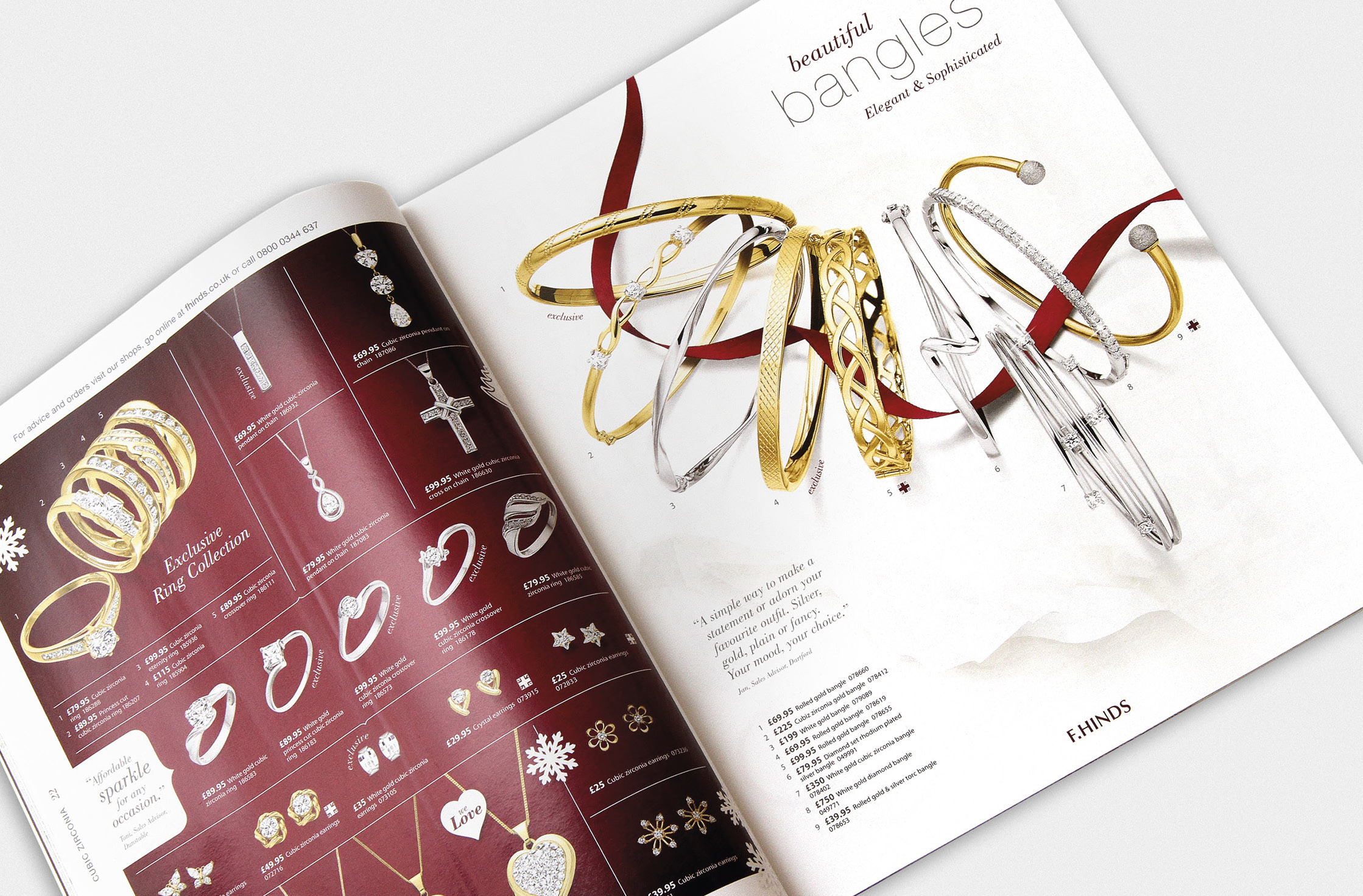
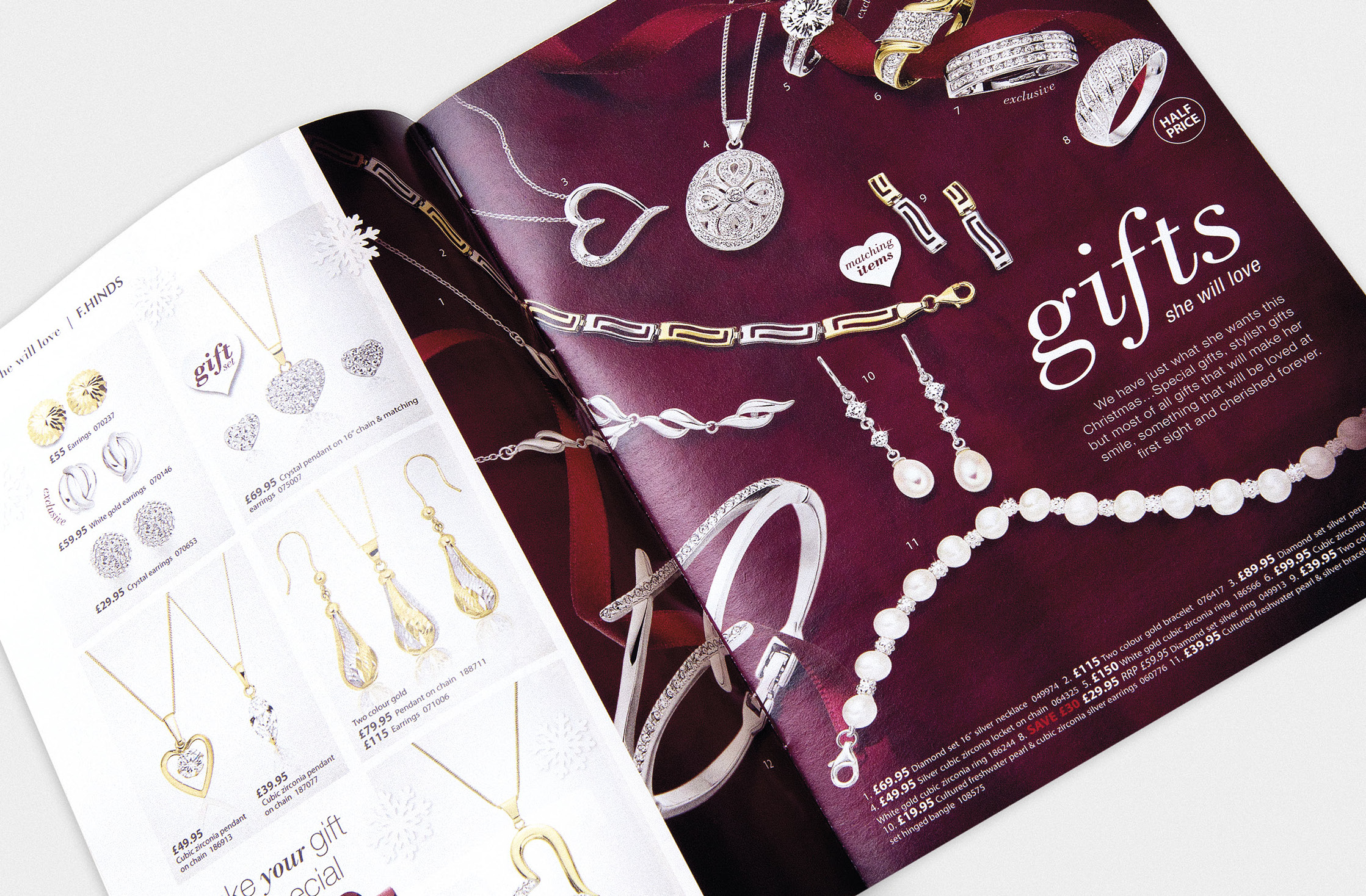
We concentrated on the customer journey throughout the store brochure. The organisation of product types had to be clear, and the categories easily discernible. The content, and how it would flow, was carefully considered as each page was designed. Aesthetically, it was important to reinforce the F.Hinds brand through the use of colour – notably the burgundy ribbon – typefaces, and tone of voice.
The store brochure needed to reflect the fact that F.Hinds are an affordable yet aspirational brand, delivering good service and a wide range of high quality products. One of the greatest challenges with this project is the sheer number of products to be included. The balance was maintained with a carefully curated mixture of hero pages, structured guides, more traditional catalogue-style grid pages, and fullpage ads from selected iconic brands.
“We couldn’t have been more thrilled with last year’s Christmas brochure, ‘our best one yet!’ was quoted by several staff, managers and suppliers. It highlighted the product in a clear and focused way, helping customers choose those all important Christmas Gifts. The theme was perfect in that it combined a Christmas feel with our branding, something we were very keen to promote.”
Karen Rühr,
F.Hinds Merchandising Manager
A5 Brochure
The A5 insert was designed to be a suggestive and inspirational gift guide, rather than a comprehensive brochure. It is a teaser showcasing certain deals and products that can be found online and in store. Here, we emphasised variety, combining selections of products in both hero and grid-style pages.
To view the full project gallery, visit our Behance portfolio.
UPDATE: This project won Best Catalogue Creative and Production in the 2014 ECMOD awards! Read all about it.


