A-Plan Insurance – All Services brochure
A-Plan commissioned us to re-design their All Services brochure to reflect the current branding style, look and feel.
The brochure is an important marketing item used to communicate the offering to both new and existing clients. It had to be easy to understand, in line with A-Plan’s mission to make insurance easy. It was important also to convey the professional and personable nature of A-Plan, and to express clearly their customer guarantee.
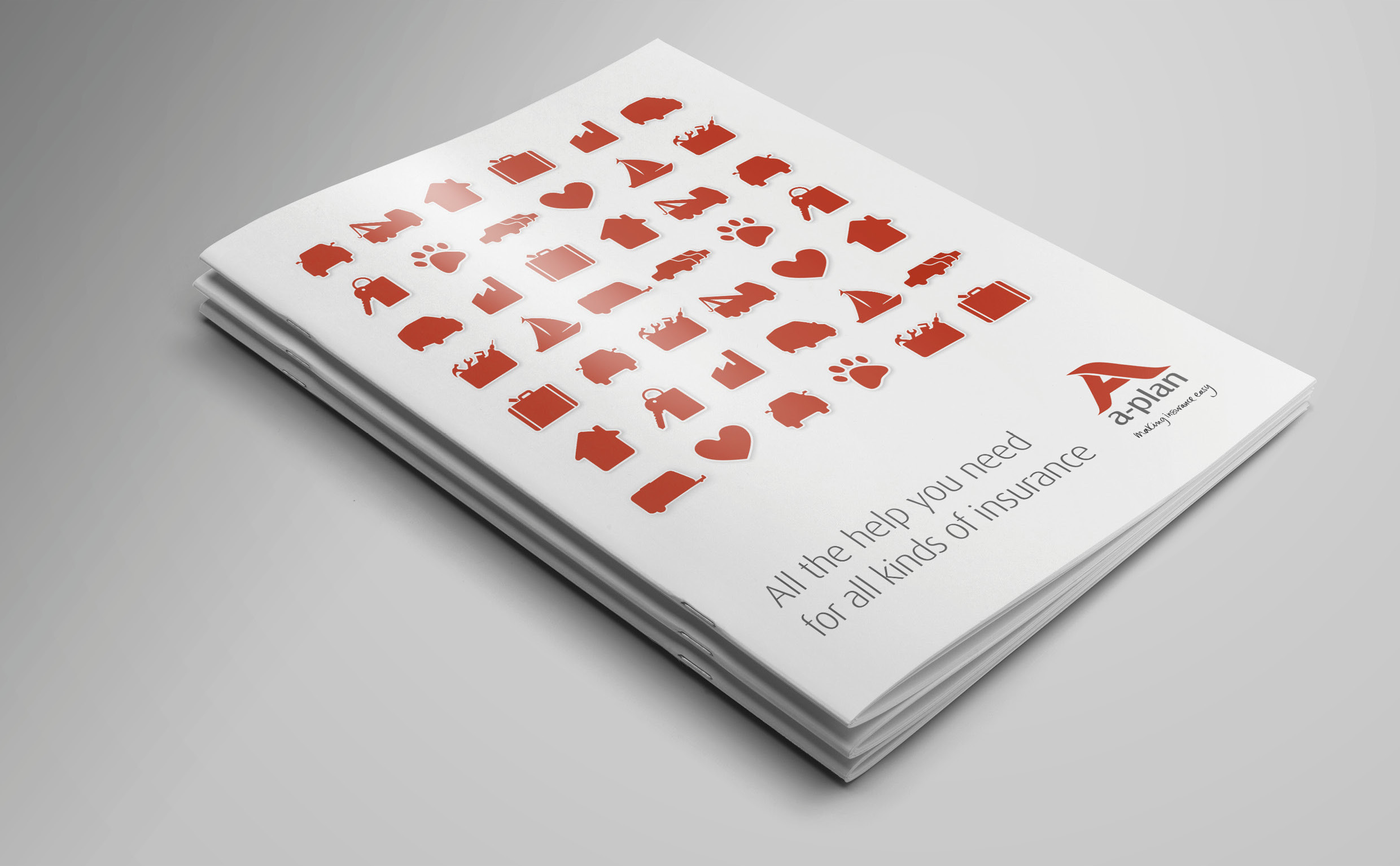
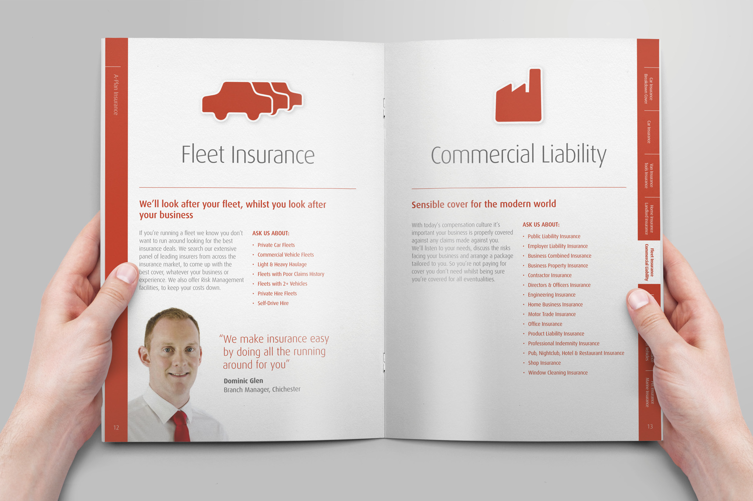
Part of the A-Plan brand is use of graphical icons to represent different insurance types. mark-making* worked on these icons over a period of time, building up a bank of them that covered all types of policy. These are used throughout the brochure to make insurance more approachable.
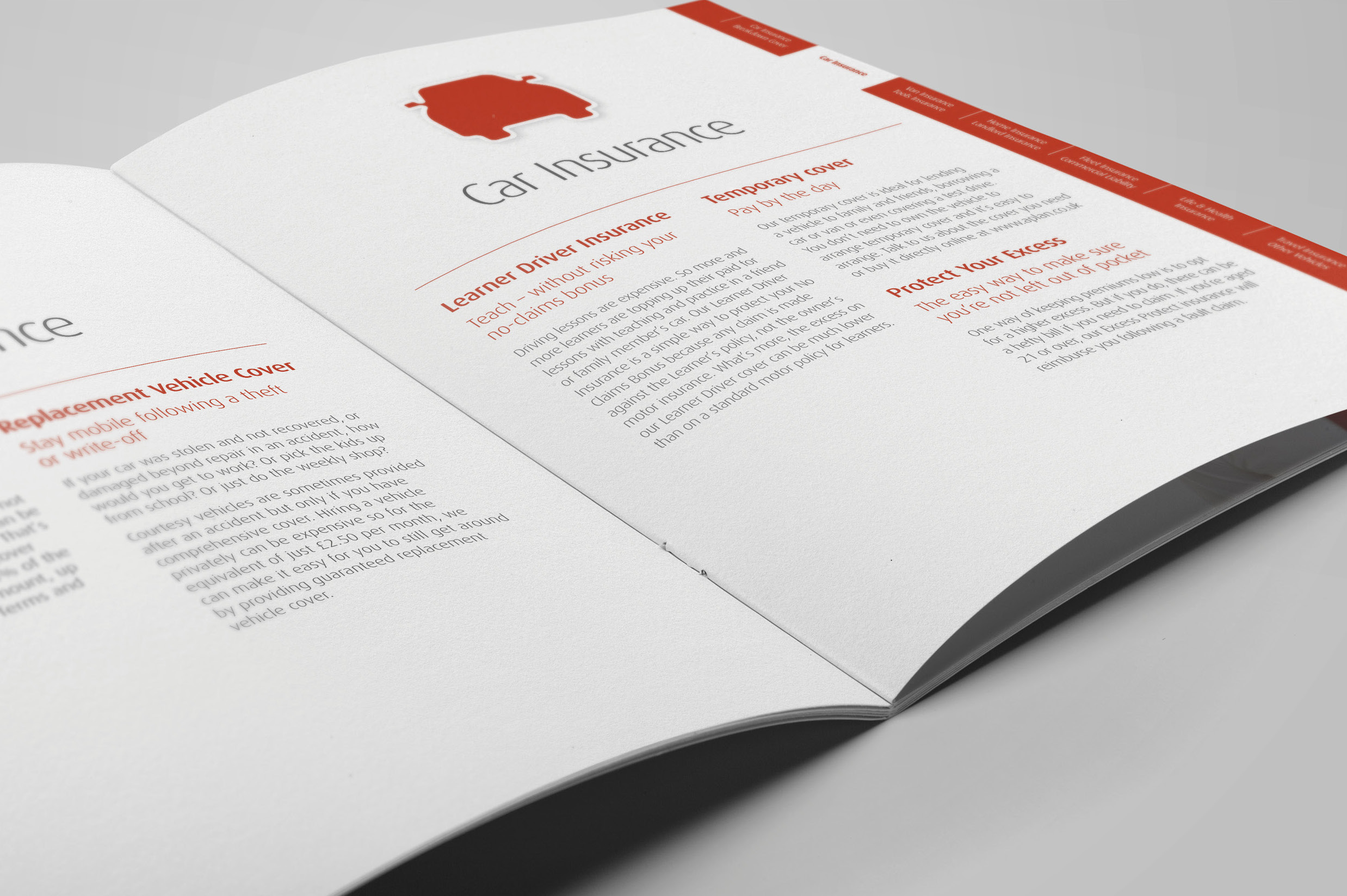
Each page was laid out with the appropriate icon to make the brochure easy to understand. We implemented a tabbed system, for easy navigation between the various sections.
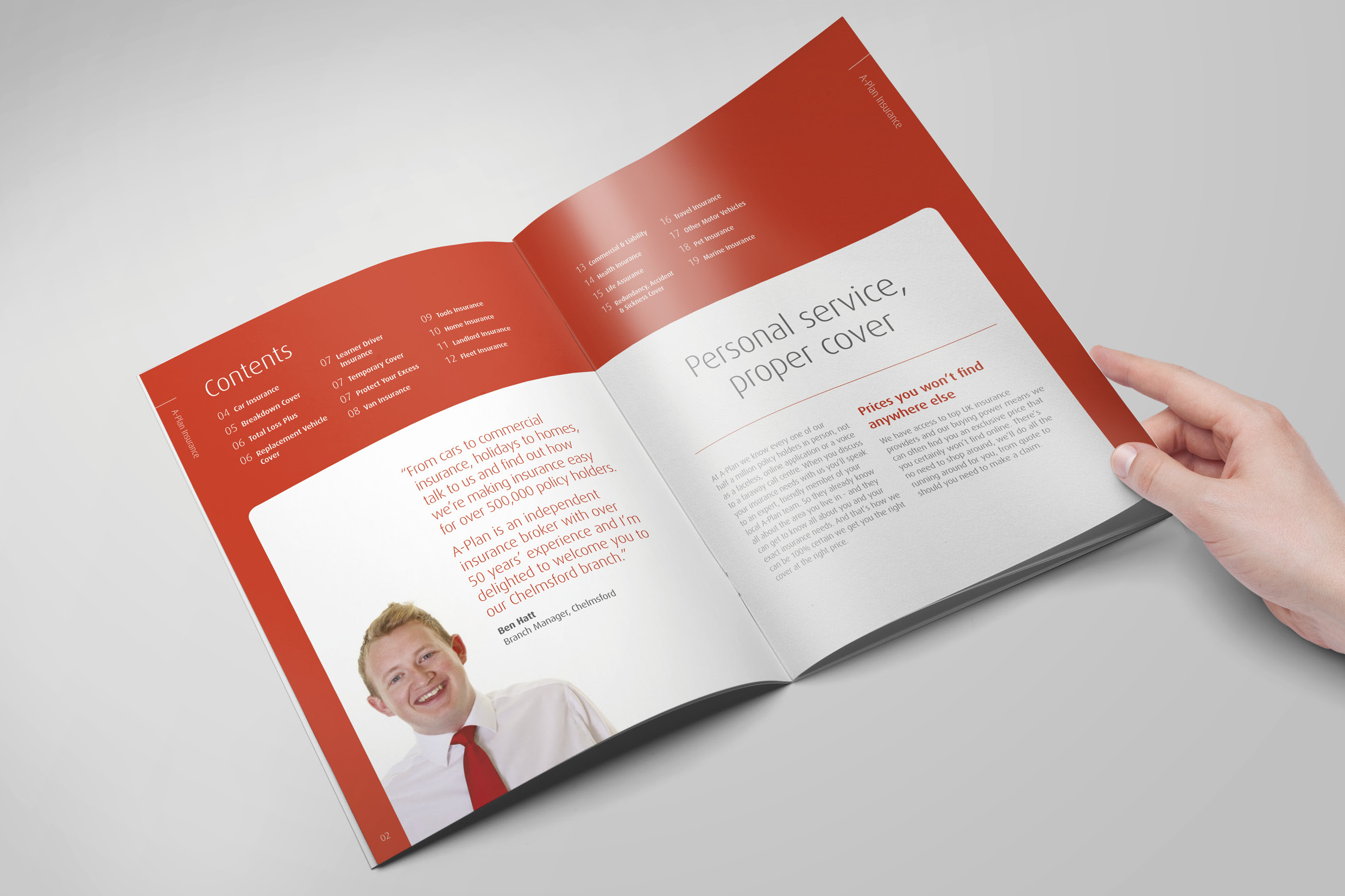
The copy was updated to be more personable, and real branch manager images and names were used to bring home the personable nature of the brand. The completed brochure design is clean and modern, with pages that work hard to make insurance easy, and consolidate A-Plan’s positioning in the insurance market.


