How an improved online experience increased referrals for PayStream

Challenge
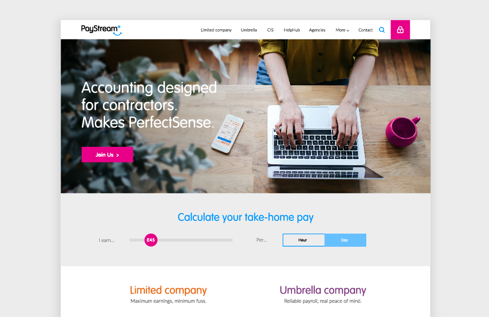
PayStream, a leading contractor accountancy provider and longstanding mm* client, were ready for an update to their website. The existing site was over six years old and no longer reflected them as a business. They needed to engage users with an improved user journey to generate more enquiries and conversions.
At the start of the project, we had a good set of conversion benchmarks, and were looking to improve these by around 25% with the help of a fresh look, updated navigation and user journey analysis during the design phase. There were also specific target metrics around the number of peer-to-peer referrals (an important source of new business), time on site, number of pages visited, and bounce rates.
The update covered pretty much every aspect of the way the website worked, and how it was used by both customers and internal teams.
Key improvements included:
- a single responsive design to replace separate mobile and desktop sites and improve user experience for busy contractors
- a modern back-end platform that would work smoothly in as many browsers as possible for the foreseeable, as the existing technology was no longer supported
- a visual and verbal update to accurately express the brand as it has evolved over the last six years
- a taste of the real world. PayStream pride themselves on great real-world customer service, and the user experience needed an update to reflect this.
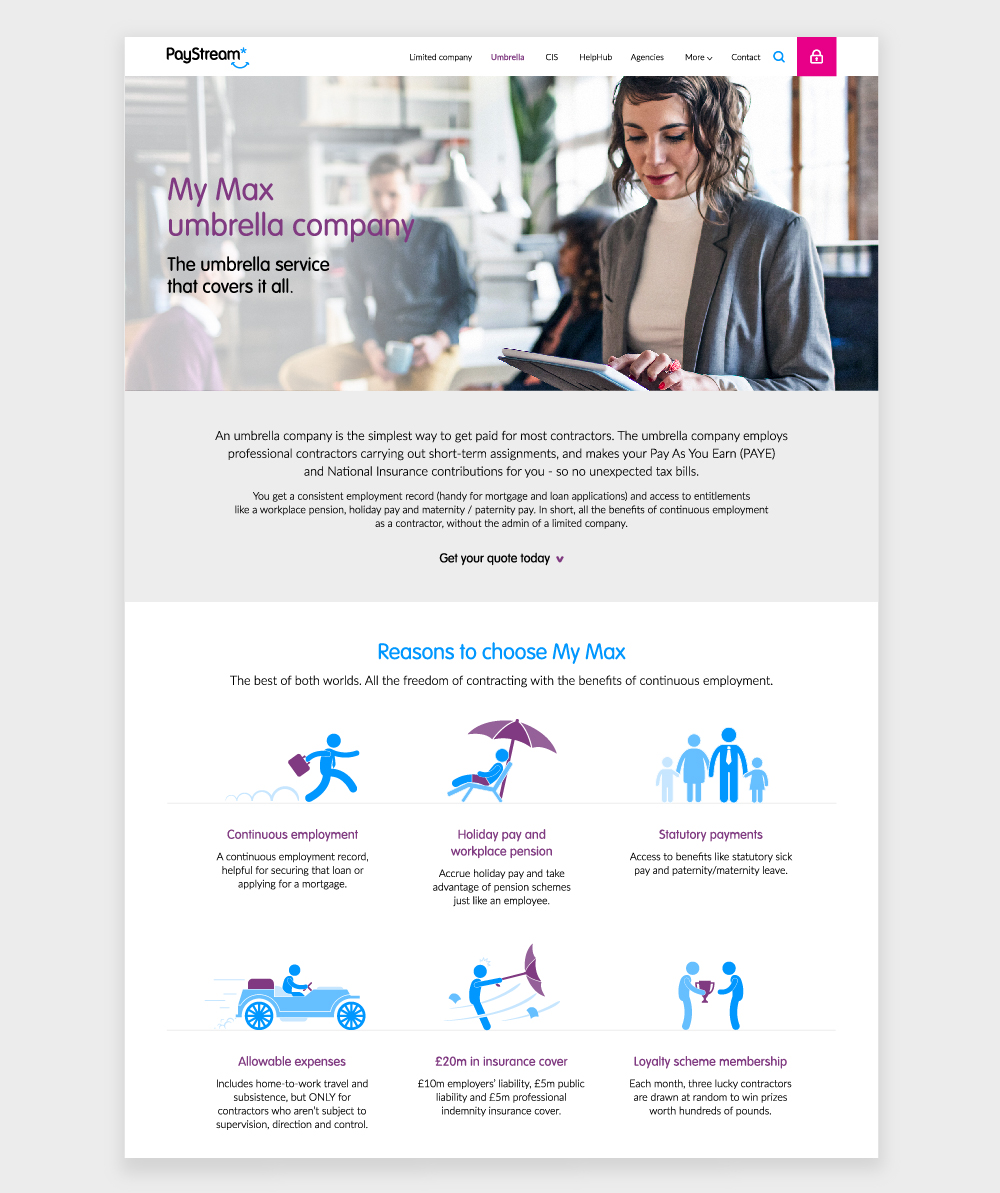
PayStream offer services for umbrella, limited company and construction contractors, and support for the recruitment consultants tasked with finding contractors to fill job roles. The new site needed to function so that all these groups could find what they needed easily.
However, limited company contractors – particularly those earning above a certain daily rate threshold – are an area of focus for business growth. As such, we prioritised the needs of this user group in our approach to the interaction design, user journey and flow of content.
It all came back to the whole reason PayStream exists: to make contractors and consultants’ lives easier.
Insight
Our research and workshops revealed some key finding that would propel this financial services branding.
A holistic approach
The edges of the website, app or portal are not the edges of the contractor or consultant’s experience, and a holistic approach is paramount to maintaining trust and making life easy for the user.
Minimise cognitive load
Contractors and consultants are time poor. It’s important to keep things as simple as possible, and to deliver the right information and functionality in the right places, to minimise cognitive load and fit in seamlessly with people’s everyday lives.
Mobile first = customer first
Starting with mobile was crucial for prioritising content and making the website easy to use. If a contractor can’t see easily how to sign up on their phone browser, or a consultant can’t find the reference information they need quickly, we’re not doing it right.
The psychology of money
An injection of emotion was going to be essential. We don’t set financial goals or make big decisions in a vacuum, so it was vital to communicate a sense that the product is easy to use in the context of modern life, and a hint at what the benefits of the potential time and effort saved could look like.
User journey analysis
Findings from user journey analysis indicated that the navigation needed to be a core area of focus. Working together with homepage content, it needed to be more successful in guiding users through to deeper pages. This would be helped by giving more prominence to PayStream’s main services.
User workshop and content strategy
In a user workshop with stakeholders from across the business, we identified the places where user needs and business goals converged, and used these points to prioritise messages and content across the site.
There was a balancing act between giving experienced contractors quick access to more detailed information, and guiding inexperienced contractors through the basics, so they’d see just how great it could be to have PayStream behind them.
We had to be savvy about separating essential detail from supporting information, and to make sure that supporting info was also easy to find. Plus signposting existing contractors to the login areas, and consultants to the agencies section.
Impact
It’s early days at the moment, so we won’t know about that conversion target for a while yet. But PayStream have already shared some really promising referrals (one of the key performance metrics) results with us – the first full week of the new website delivered almost double the number of referrals the team would expect to see in a “good week”.


About markmaking*
markmaking*