Brand Identity for Chipping Norton Literary Festival
Background
Chipping Norton Literary Festival started in 2012, and has quickly grown into a local institution, attracting nationally renowned authors to its characterful Cotswolds venues. Gearing up for its fourth year, the festival approached us for a new brand identity. We look to support innovative local ventures just like this, and were happy to oblige.
Our Brief
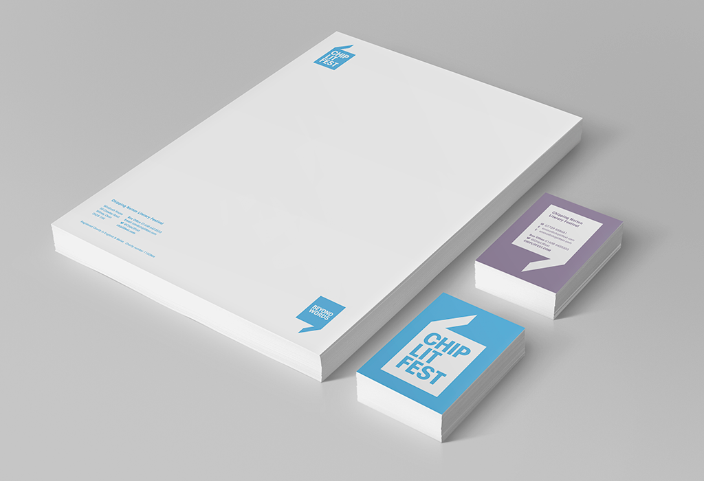
The festival has an excellent reputation locally and nationally: it’s a firm date in the calendar for authors and literature lovers from across the UK. Although run by a small team with the help of volunteers, the festival is a professional outfit, and we wanted to elevate the brand to match the outstanding experience that festival-goers have come to expect. We saw an opportunity to produce a bold, simple, versatile visual identity that would feel unmistakably ChipLitFest.
Our Solution
In keeping with our constant goal to produce work that is grounded in solid foundations, we kicked off the project with a brand definition workshop. To get a sense of the festival’s character and purpose, we analysed and explored the qualities that make the festival exceptional and successful, the characteristics that the organisers valued most, and their plans for the future. Through this process, we defined a clear direction, and established the festival’s ultimate promise: Chipping Norton Literary Festival offers authors and readers ‘an experience beyond words’.
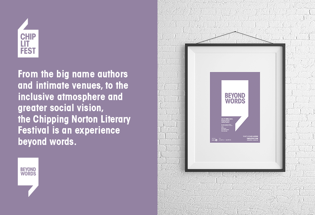
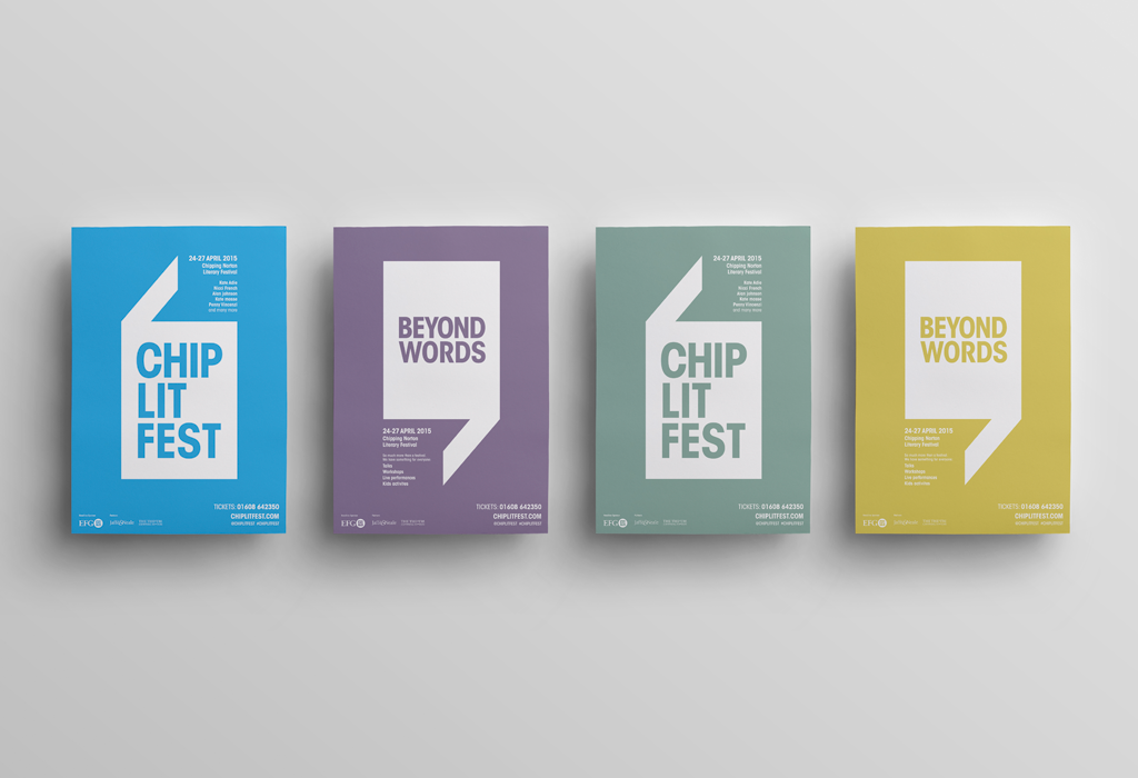
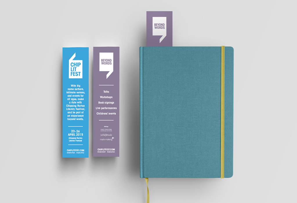
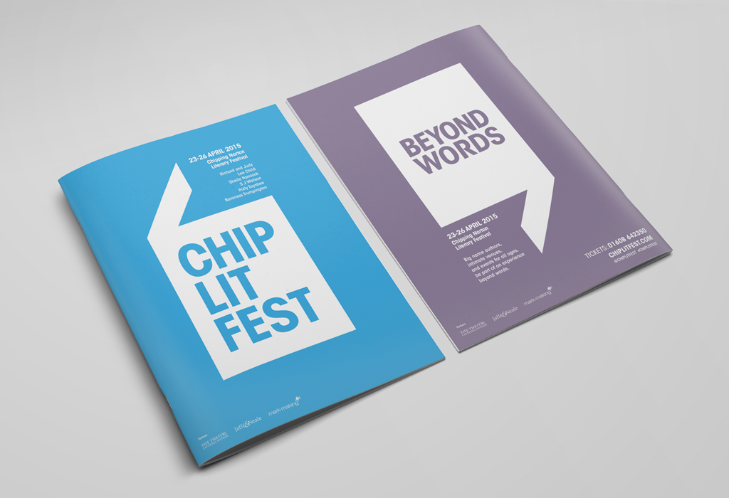
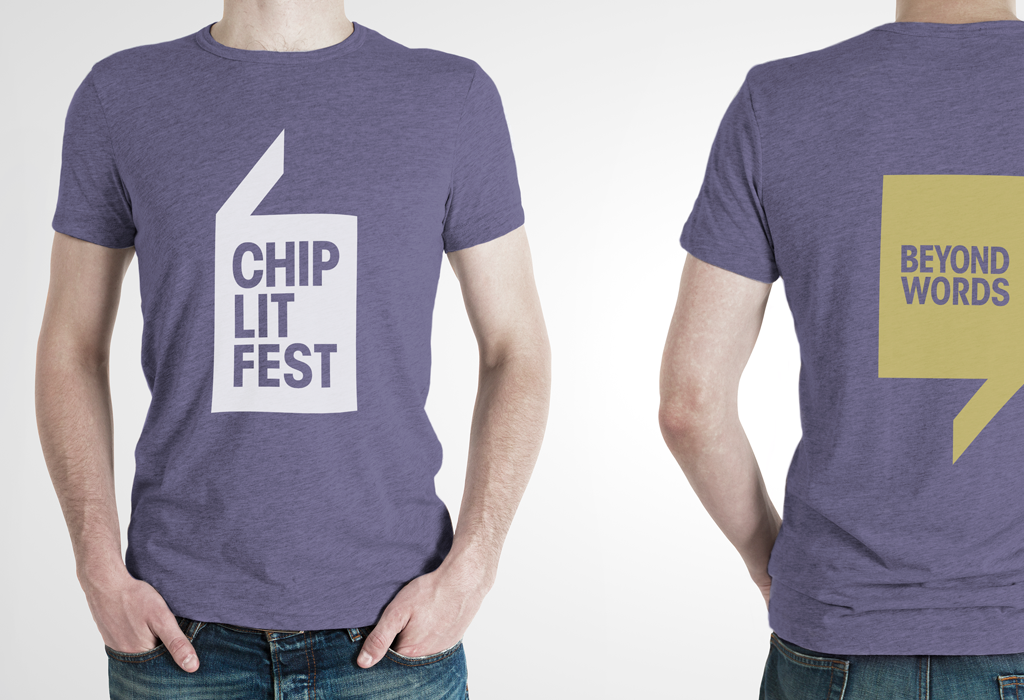
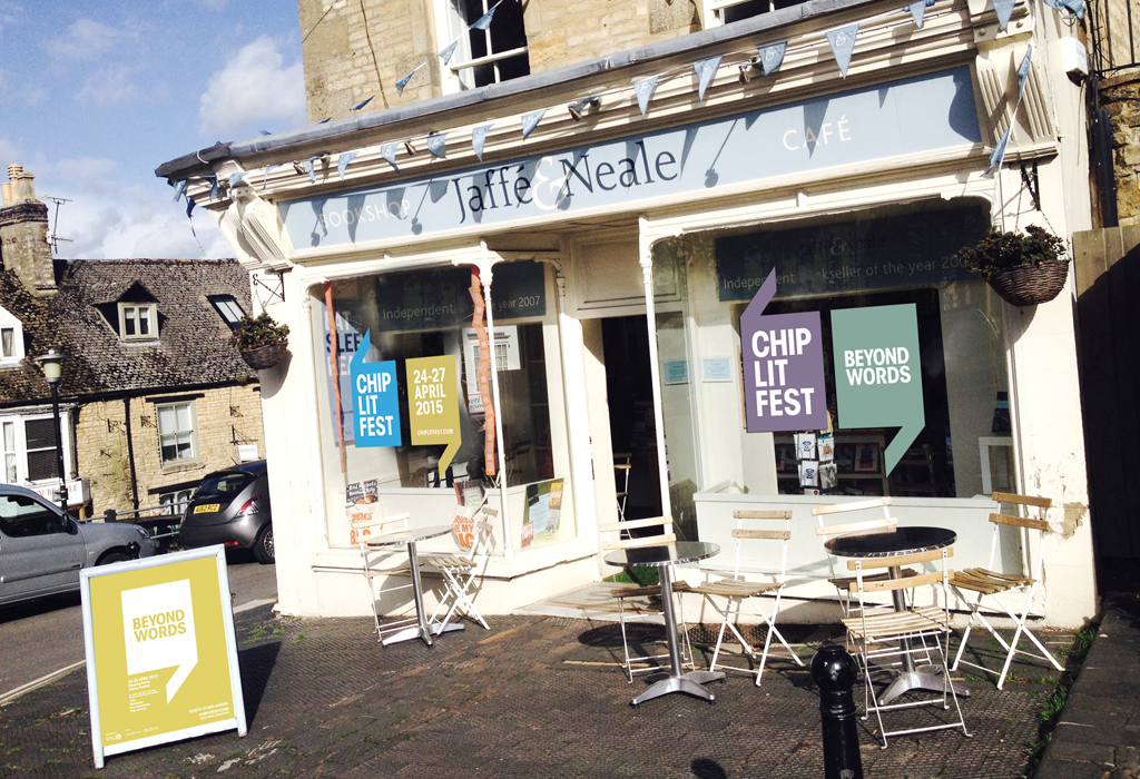
Taking ‘Beyond words’ as an overriding vision, mark-making*s solution is an identity based on a set of speech marks, evoking literary dialogue and conversation. Their shapes also form open books, and are always shown in relationship to the words ‘ChipLitFest’ (as the festival is affectionately known). The opening and closing marks are always used together, to house the festival conversation. The left-hand mark denotes the rational, informative element of festival, and the right-hand denotes: that which is ‘beyond words’.
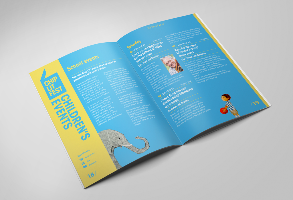
The identity developed to incorporate a palette of colours, used in different ways across the publicity to make the most of their different characteristics. Because the festival is so completely unique to the town, we turned to Chipping Norton itself for colour inspiration. Following a photography expedition, we took swatches from photographs and developed a palette as unique to Chipping Norton as the festival. The colours were named after the locations where the photographs were taken.
About markmaking*
markmaking*
mark-making* is an award-winning creative agency specialising in branding, campaigns and communications