Accessibility for websites & why it matters
Both- on and offline, people with disabilities often get a raw deal, because accessibility isn’t baked into the process. For example with web design, aesthetics often get prioritised and the needs of people with impairments can get lost in the process. Features to improve accessibility have been afterthoughts, resulting in awkward, ineffective, and even discriminatory results.

While a small minority have championed an accessible design approach for decades, now there’s a more substantial shift going on. No matter where you look, it feels like there’s a greater collective awareness of the need to make changes so that people with different abilities can move through physical and virtual spaces as easily as anyone else.
There are also a lot of things that desperately need improving. In this article, I’m going to have a look at some new and not-so-new advancements in technology that could and do make fashion, culture, and the window on the world that is the internet more accessible – to everyone.
In 2016, almost 1 in 5 people (19%) in the UK had a disability. That’s a lot of people. A lot of service users if you’re a public organisation, a lot of customers if you’re a business.
But only 17% of those individuals were born with their disability – most people who will have one develop it later in life.
In a way, we’re all only “temporarily-abled”
“Someone once shared with me this apt perspective, that we are all just ‘temporarily-abled’, someday you or I could need assistive software or hardware to consume information.”
– Andrew Soderberg
Some impairments are simply situational, like finding it difficult to hear in a crowded room or struggling to see because of bright sunlight. Others are temporary, like reduced sight after surgery or limited movement while recovering from an injury.
It might seem obvious, but if you live with an impairment, whether it’s temporary or permanent, you still need and want to be able to access, well, everything, just like someone who isn’t impaired.
While things definitely aren’t perfect yet, some people have been and are doing some really innovative, creative work to make the world a more accessible place.
We’ve gathered some favourite and important examples of innovation for accessibility and tagged them up to indicate which impairments they cater to first and foremost – there’s a key at the bottom of this post if you’d like to read more about each one.
Ideas to make the world – and the web – more inclusive
Fashion
Functional clothes (all abilities)
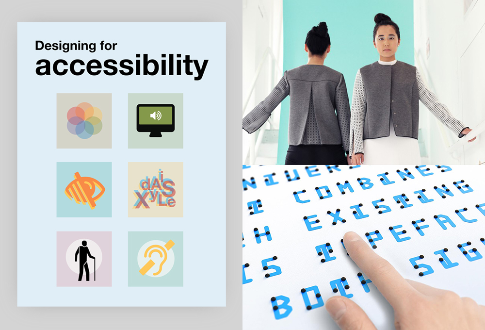
Your average hoodie doesn’t fasten at the back, and your average t-shirt can’t take much twisting, pulling force. That’s why Open Style Lab create technology-driven clothes designs for people of all abilities. They have three basic principles:
- Increase awareness about the importance of clothing accessibility for people with disabilities.
- Equipping our community with the skills to create accessible clothing.
- Aim to develop and distribute clothing designs and technologies that will increase clothing accessibility.
And they run competitions every summer, challenging designers, occupational therapists and engineers to push the boundaries for people with all kinds of impairments.
The Vision Suit (visual)
Back in 1997, the MIT Media Laboratory hosted Beauty and the Bits, a wearable computing fashion show.
One concept by designers Gilles Wittoeck, Rémi Ozello-Brocco, and William Leon and technology collaborator Leonard Foner was really quite prophetic. The Vision Suit enables a visually impaired wearer to navigate their surroundings freely.
It’s embedded with sonar grommets, which detect objects up to four meters away and vibrate to indicate an object’s location and proximity. Vibrations increase as the wearer gets closer, and different pulses tell the wearer what kind of obstacle or object they’re approaching.
The technology to give users haptic feedback about virtual surroundings has come a long way in recent years. It makes virtual reality accessible to visually impaired users in a whole new way. The Vision Suit simply applies this principle to the real world too.
Arts and culture
Microsoft Soundscape (visual)

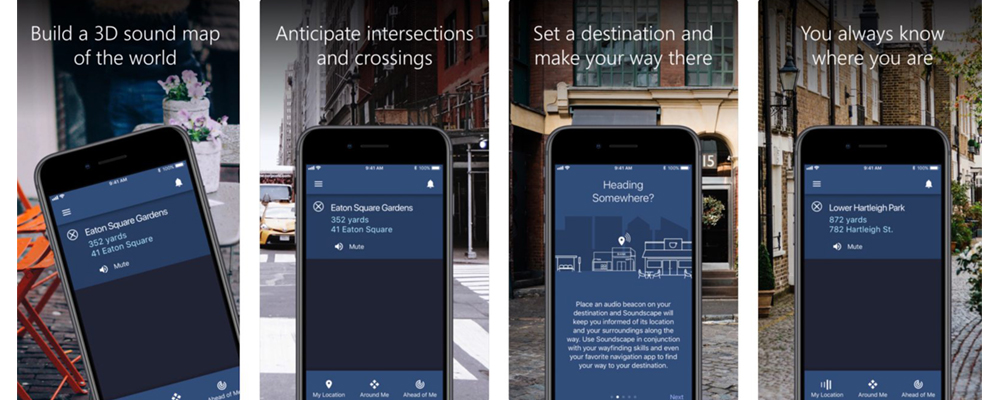
This is a research project that explores the use of innovative audio-based technology to enable people, particularly those with blindness or low vision, to build a richer awareness of their surroundings, to help them feel more confident getting around.
Unlike step-by-step navigation apps, Soundscape uses 3D audio cues to enrich ambient awareness and provide a new way to relate to the environment. It allows you to build a mental map and make personal route choices while being more comfortable within unfamiliar spaces.
While this is a brilliant idea for wayfinding in general, I’ve put this under “arts and culture” because I think it has amazing potential to make exhibitions of painting, sculpture and film accessible to visually impaired people in a new and interesting way.
Baille Neue is a universal typeface that merges existing characters and braille in a way that makes text accessible to everyone. Braille Neue can overlay text in public spaces, transforming it into something that can be read universally.
Online

Just like any other public space the internet is subject to certain accessibility standards for websites.
What are the accessibility standards for websites?
The World Wide Web Consortium (aka W3C) lists all the countries with web accessibility recommendations here, and developments in EU, UK and US legislation are worth keeping an eye on.
Below are ways you can make your website or content more inclusive (accessible to as many people as possible, regardless of impairment). I’m indebted to this Axess Lab article for help with this section. Their post is full of insights from real people, gathered via Twitter.
Caption videos and animations (auditory, cognitive)
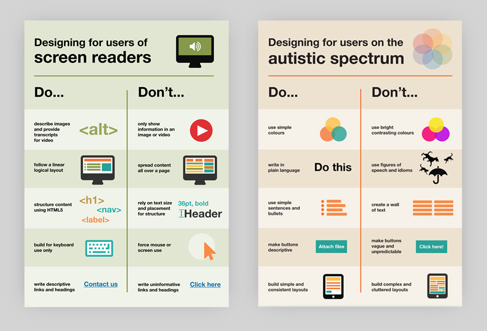
Captions are essential for people who are deaf or hard of hearing – and for anyone in a space too noisy to hear your audio (a situational impairment). There are various captioning services including IBM Watson Speech to Text service and Go Subtitle. You can find W3C recommendations on captions here. Captions are also helpful for people with autism who get overloaded easily. With captions, audio sensory input can come out of the equation without the content being lost too.
Keep animation simple (cognitive)
Keeping animations and movement functional, minimal and (ideally) optional, makes a page more straightforward to use for everyone. For many people with cognitive impairments, it minimises the risk of affecting vestibular system, which detects head movement and helps to control balance.
Don’t use animations, sliders, or rapid movements that start automatically. Indicate the kind of movement that will happen on the site when a user takes action. Give the user the option to turn off any animation and movement (lookin’ at you, parallax scrolling).
Some operating systems allow you to set a “reduced motion” preference. All motion-based animation for the web should be implemented in the “prefers-reduced-motion” media query. Safari and iOS implement this as standard, Chrome has an open issue on the topic, and so does Mozilla (Firefox). Keep an eye on caniuse.com for support.
– Quite a Technical Bit, But Still Important
Go beyond colour (visual)
Use text as well as colour when you’re distinguishing between states of switches, settings or buttons – contrasting colours are no use to colourblind people. Also, if your site has a very light colour scheme, providing a night mode makes life easier for users with migraines for example, who might become temporarily visually impaired or photophobic.
Take the mouse out of the picture (motor, visual)
People with reduced motor function or visual impairment might rely solely on a keyboard, touch interaction, or a screenreader to navigate the web.
The good news is, it’s not super complicated to cater for non-mouse users when it comes to accessibility for websites. Keep focus outlines enabled, so keyboard users can determine where they are on the page as they tab through.
Avoid hovering as the only way to interact with something, because it only works for mouse users, and think carefully about non-mouse users when considering mega menus and tab functionality.
Use native HTML5 semantics to help screenreader users jump to specific points e.g. header, aside, footer. This also helps with SEO – win.
– Quite a Technical Bit, But Still Important 2
Make good text choices (visual, cognitive)
A good baseline font size for the web is 16 pixels (the words you’re reading now are 18 pixels unless you’re zoomed in/out). The best line lengths are thought to be 45-75 characters or 10-15 words. Any longer and any reader gets tired, let alone someone with a cognitive impairment.
Avoid really thin font weights. Apple upped the font weight in their iOS 7 update after various complaints about legibility (including from renowned typographer Erik Spiekermann). Apple have since have moved to a custom font. More about that, and the open-source font specially designed for people with dyslexia, in Tom’s article.
To sum up
The challenge of designing a world that includes people with disabilities inspires real creativity and sometimes illuminates simple solutions.
Technology can change the universe for users like Austin:
To address online design specifically, if your website is inclusive, it’s effective, and more likely to deliver returns on the time and money you’ve invested in it. Although if you think of your brand or service as a socially responsible one, consider this quote from Tim Cook:
“When we work on making our devices accessible by the blind, I don’t consider the bloody ROI.”
Happily, on top of all the examples in this article, issues around online access are being tackled by the everyone from large organisations like Trivago, Microsoft and the UK Government to open-source community projects like The A11Y Project and Inclusive Components.
Let’s hope this is a sign that more creators and innovators will look for ways to make the world accessible by design.
–
For reference: types of impairment
Visual
I am colourblind and can’t perceive the difference between some colours
I have low vision and need to increase the text size in my browser
Auditory
I am hard of hearing and struggle to hear most things
I am deaf; British Sign Language is my first language and I find English hard to read and write
Motor
I have a mild motor impairment so I struggle to use a mouse with fine control
I have a medium motor impairment so I have to use a keyboard
I have a severe motor impairment and am unable to use a mouse or keyboard so use speech recognition software
Cognitive
I have dyslexia and struggle to process written text
I am on the autistic spectrum and have a literal understanding of text
I have attention deficit hyperactivity disorder (ADHD) and find it hard to concentrate
I have a learning difficulty and need things to be simple and easy to understand
Speech
I have a speech impediment and struggle to communicate by speech, I am much more confident and effective when using text-based communication
Seizures
I have epilepsy and my seizures can be triggered by flashing content
About markmaking*
markmaking*