2 creative mobile apps to help you get designing
I’m always on the hunt for any interesting mobile apps as they make my life as a social media communicator so much easier. Nowadays, more than ever, marketers and social businesses appreciate and understand the potential of an image. Although it is so hard to believe that only a few years ago we weren’t doing social media with a mobile phone. Thank God the times and technology have changed, allowing people like myself to be creative in an easy and, more importantly, fast way.
The difficulty with social media is the constant demand for fresh content, which works even better when supported by ‘not seen yet’ techniques and spiced up with something a bit fun. I try to follow trends happening within the social media world, to bring to life some ideas difficult to achieve for non-designers.
Before, my ideas were restricted by a lack of Photoshop knowledge (and pressure – a bit of a challenge when you work with a design agency) and mostly a lack of tools.
Resources like Gimp or Pixlr are great but rather time consuming, plus they can’t always fulfil your dreams. Mobile apps however allow me to move work from the desktop and carry it wherever I want, which also makes it more pleasant as it doesn’t feel like work but more of a pleasure.
Creating cartoon portraits using iMadeFace
 I learn most through research and reading comments. I noticed a long time ago that Instagram (IG) is not just about pretty pics but good techniques as well. There are many people out there who test different apps in order to achieve different features. While browsing through IG photos, I came across a few feeds where the app iMadeFace was being used to create cartoon look-a-like portraits. I loved the idea straight away so without hesitation I started playing with the app trying to create a new photo cover for my personal IG account, but while doing so I thought making the whole family of mark-makers* might be fun as well. My idea was to use this friendly graphic for our Facebook photo cover, but I can also imagine something like this supporting the ‘About the team’ introduction. Not everyone may find it fun having a picture taken of them and having it spread over social media, but this idea can win the hearts of the even the shyest personalities.
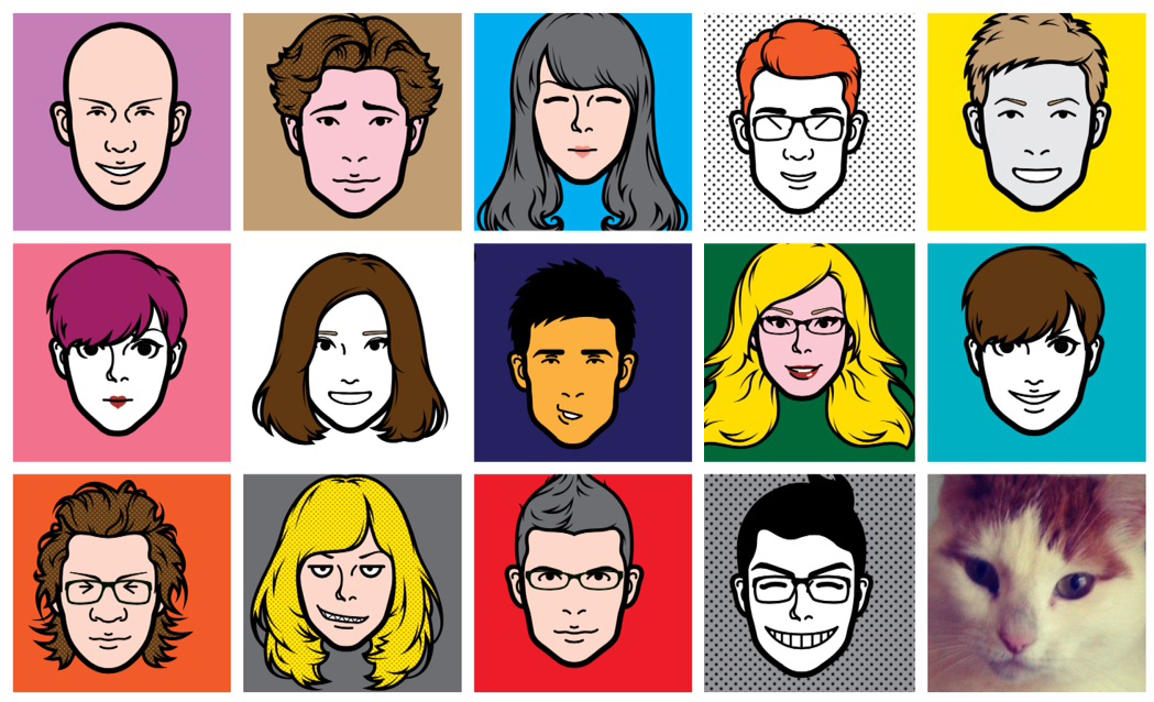
Here is how the idea came to life… I played around with different features of the iMadeFace app – which gives you absolutely everything from eye colour to quirky sunglasses to create the perfect looks. When the image was ready, instead of saving it, I took a screen shot, which helped me avoid having the logo of the app. To achieve the final result I used Diptic, which helped me to combine multiple photos together into a single image.
Getting creative with Krop Circle
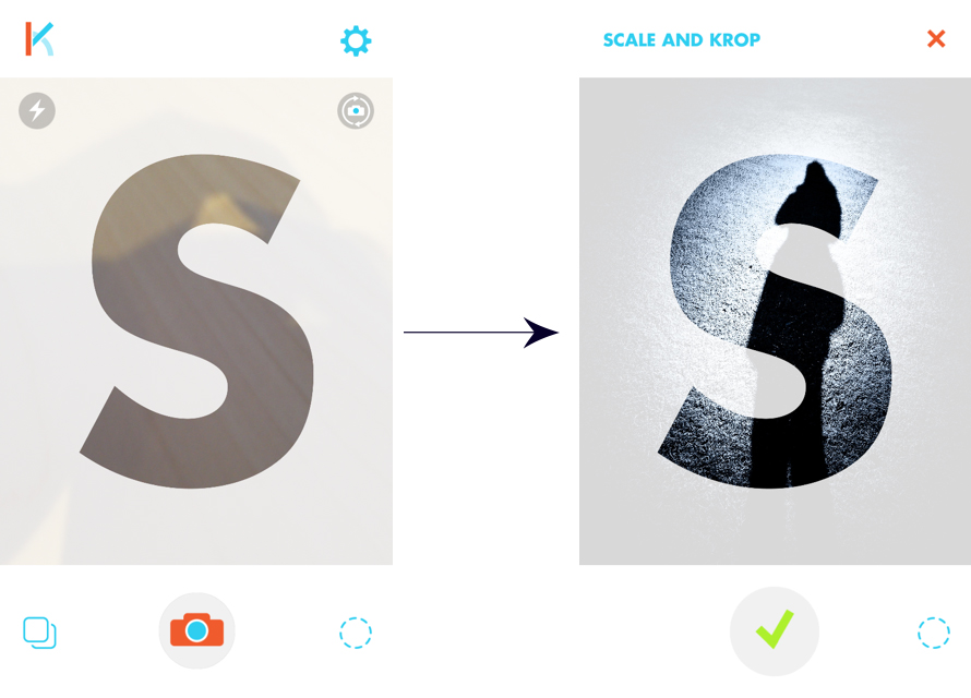
 But this is not the only way to enhance your social media profiles. One of my more recent discoveries is an app called Krop Circle, which scales and crops images into different shapes from letters and numbers to signs and geometrical shapes. For $0.99 you can so easily and quickly transform an image, allowing you to reuse your own photos and create something completely new.
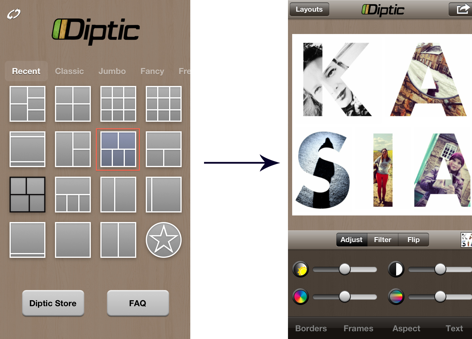
I wanted to make my profile image stand out and show my interest in social media as well as design (and by this I mean apps!). I wanted to find a clever way to help other people remember and recognise my rather unusual name. I thought that a photo image arranged through the letters of my name should help me to achieve this.
Step 1: The app has a nice big screen, which allows you to easily visualise the final result as well as share it via your social networks like Instagram, Facebook and Twitter.
Step 2: I then combined the individual letter images into one using Diptic, choosing the template with two images on the top and three on the bottom.
It is not just for Instagram…
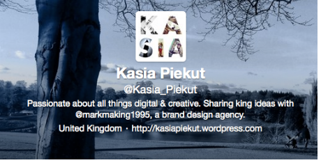 As I loved it so much I decided to add it to my Twitter profile as well. Most Twitter users put a lot of time and pride into designing quirky backgrounds, which unluckily are not visible on mobile devices. What really stands out for any user no matter how they are viewing the profile is the main photo image. I thought that by supporting it with Twitter’s header feature I would be able to achieve an interesting effect.
For me, this exploration has become a great addition to other social networks like LinkedIn which due to it’s visual restrictions, has been enhanced into something more interesting and fun.
I hope this is just the beginning of a rewarding app journey for us!
By Kasia Piekut
About markmaking*
markmaking*