Don’t deflate just yet: Flat design, it’s the “in” thing
All the big companies like Apple, Google, and Microsoft are doing it, so you should be too right, right?
Flat design, summarised into one paragraph is this:
A design focussed around simplifying elements and removing the unnecessary decorations such as textures, drop shadows, and bevels. In doing so, the user experience should be more defined and the UI intuitive.
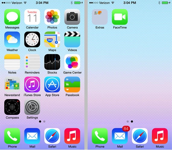
The beta of the new operating system for iPhone’s and iPad’s (iOS7) is a good, recent, high-profile example.
Apple (iOS7 Beta)
Before you jump ship and “flatten all the things” or you hear the dreaded “make it look like the iPhone”, consider a few points first.
- Making everything flat in the wrong way could confuse users and hamper usability.
- Flat design will not fix core issues; if your content is unclear and your processes are unintuitive, you may need to re-work the UI design altogether and perform some user testing with wireframes.
- Is it really right for your brand?
In my opinion, the reason people prefer flat design is down to a few factors.
Less visual clutter
By doing away with skeuomorphism and stripping back all the Web 2.0 effects (glossy, gradients, insane drop shadows with inner shadows, and heavy use of textures) we can clearly process what is in front of us, making for a more simplistic and minimalist view.
Softer palettes
The use of lighter colour schemes and pastel-like colours make the design feel more lightweight and friendly.
Cleaner typography
It seems using the ‘thin’ or ‘light’ versions of typefaces are part of this trend, again lightening up the design.
Is it really right for your brand?
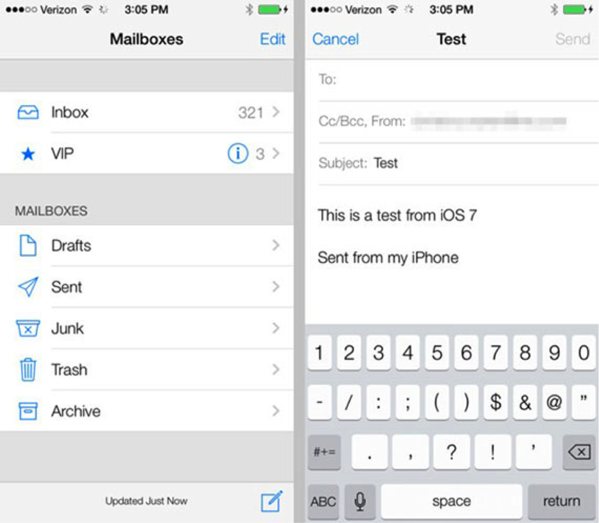
Remember those screenshots above of iOS7?
Here are some reactions to them.
The Bad
“Yuck! Even though i’m an android person now; i was excited to see what Ives could do with a GUI. He should stick to hardware design.”
“Thanks Apple, you’ve made my decision for me. I’m buying an Android phone. iOS7 is ugly and its lost what made the iPhone special.”
The Good
“iOS 7 is amazing….. i know a lot people think that its apple hasnt made any significant changes but i believe these trivial iOS 7 features have significant impact when it comes to user experience”
“Change is definitely needed, I can’t wait to dload. This iOS hasn’t changed looks since 2007, it’s about time for a refresh!”
All comments are taken from this Mashable Article.
The use of Helvetica 25 Light irked respected German typographer and designer Erik Spiekermann.
“There is already a tiny shitstorm on the web that Apple selected an ultralight Typeface like Helvetica 25 that was intended for big font sizes and is adjusted way too tight. If you see a continuous text in 13px it is a nice, but unreadable carpet.”
– http://stellarvisions.com/2013/07/erik-spiekermann-on-ios-7
Apple are listening to user feedback, and Erik Spiekermann will be pleased to know they have changed from Helvetica 25 Light to Regular.
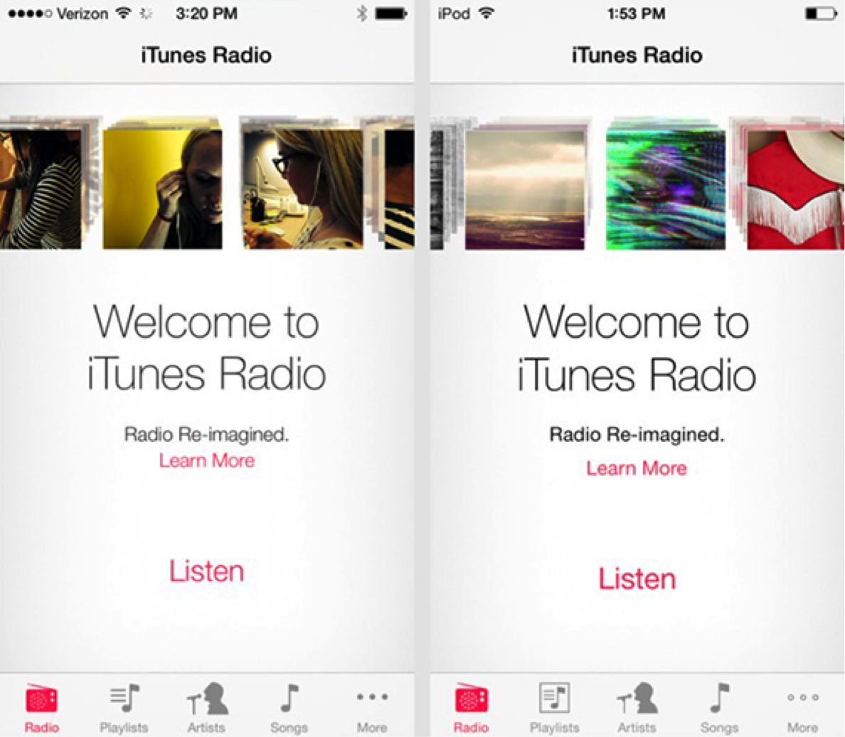
Left – Original Helvetica Light. Right – Updated Helvetica Regular
This is an interesting take on how Steve Jobs would feel about iOS7.
Consider this
On the surface, it may look cool and fresh, but has any consideration been made to how it works, reads, or flows? Only when you start to try and use something do you notice the cracks.
Readability and legibility should not be compromised over a font that ‘looks good’, and a ‘flat’ button that does not look interactive.
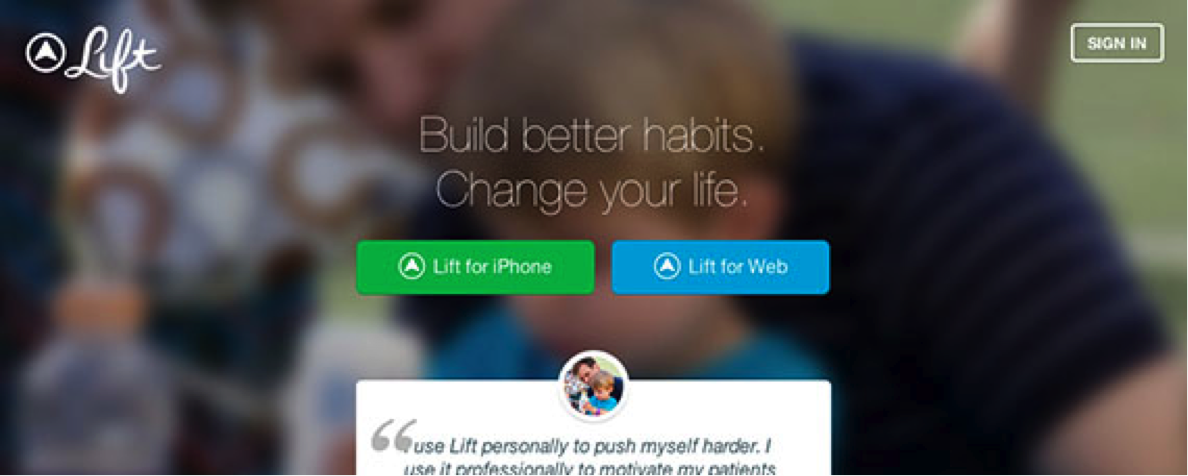
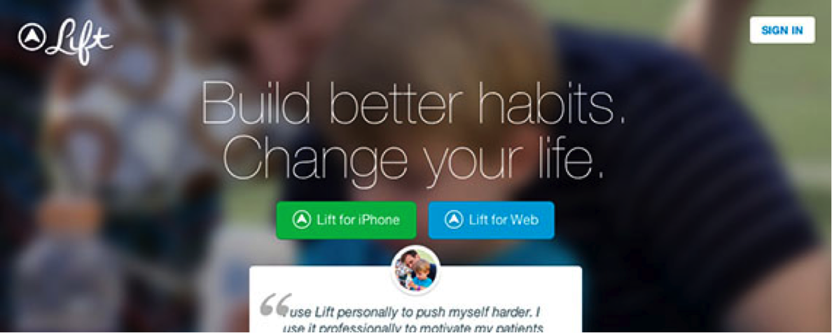
Take note with my example below. This is Lift – a website dedicated to encourage better habits (I should partake in a few).
Can you spot the flaws?
- Helvetica 25 Light at 40px.
- Glancing at the page you will notice the two buttons, but what about the third? Sign in top right.
- Personally the first area I look at are the buttons, and my mind is making the choice of Lift for iPhone or Lift for Web before my mind has figured out what Lift actually is.
Now look at this second screenshot, where I have modified it slightly.
- Helvetica 25 Light at 70px. As intended, this font weight is for big type.
- The sign in button has a hover state which looks more like a button than it’s non-hovered state. This makes for a better visual cue to sign in.
- With the increased font size and less padding on the buttons, the message of Lift is instant and becomes the focus.
Lessons learned?
It’s about striking the balance between usability and design, making for an all rounded experience, but keeping in mind accessibility. I am for this push towards simplification and clear messaging as it can make you look and question what is necessary, but I am against the thoughtless adoption of flat design without considering the user experience as ultimately, it’s the user who will use the interface.
Extra links
Courtesy of mark-maker* David Souch.
http://jonyiveredesignsthings.tumblr.com/
http://www.webdesignerdepot.com/2013/06/has-flat-design-made-our-sites-too-simple/
About markmaking*
markmaking*
mark-making* is an award-winning creative agency specialising in branding, campaigns and communications