Creative insights: a Strong (Customer Authentication) campaign

Marianne interviews Creative Director Nic, Senior Account Manager Laura, Senior Designers David and Meg, and Copywriter Chloe about our recent project for Nationwide.
Q. Tell me a bit about the background of the project?
An industry-wide regulation change is being introduced within the financial sector this year to improve security and help reduce fraud: Strong Customer Authentication (SCA). SCA would affect the way people shop online: requiring two-step authentication more often for online shopping and internet banking. As a member-focused building society, Nationwide not only needed to make its members aware of the upcoming changes but wanted to make sure their members were prepared to avoid any potential pain points.
There were a number of members who used Nationwide branches for whom Nationwide didn’t hold an up-to-date mobile number and who weren’t using online banking. Both of which are needed for the new two-factor authentication when online shopping and using the Internet Bank.

Q. What was the aim of the project?
Nationwide needed to make its members aware of the upcoming changes, why SCA was being introduced, and how it would affect them. They also wanted to educate their employees so that they were aware of the changes and, in turn, could support members.
Our brief was to create a dual campaign: an external campaign for members and an internal one for employees. To receive the newly required authorisation codes, member contact details must be up-to-date. Therefore, the campaign’s main CTA needed to prompt (or for employees to encourage) members to update their contact details before SCA came into full effect. This would help to avoid potential pain points at a later stage and make the transition both smoother and easier for members.
Nationwide also wanted the campaign to encourage members to use the banking app, as the simplest way to complete the two-factor authorisation, manage money, and make payments. Not forgetting members who don’t have either the banking app or use a mobile phone for authorisation and who Nationwide also wanted to address, offering their support and assistance in getting ready for SCA.
This project required us to convey a lot of information and multiple messages with clarity, while also highlighting the key CTA. Part of our challenge was to distinguish this campaign from other comms and make it clear that this was an industry-wide change while remaining characteristically Nationwide.
Q. What was the biggest challenge?
David: We had a number of different layers of messaging, so the biggest challenge was to make sure we were being consistently clear and concise: both visually and the way in which we introduced the campaign.
Q. Tell me a bit more about the creative process and how we got to the final design?
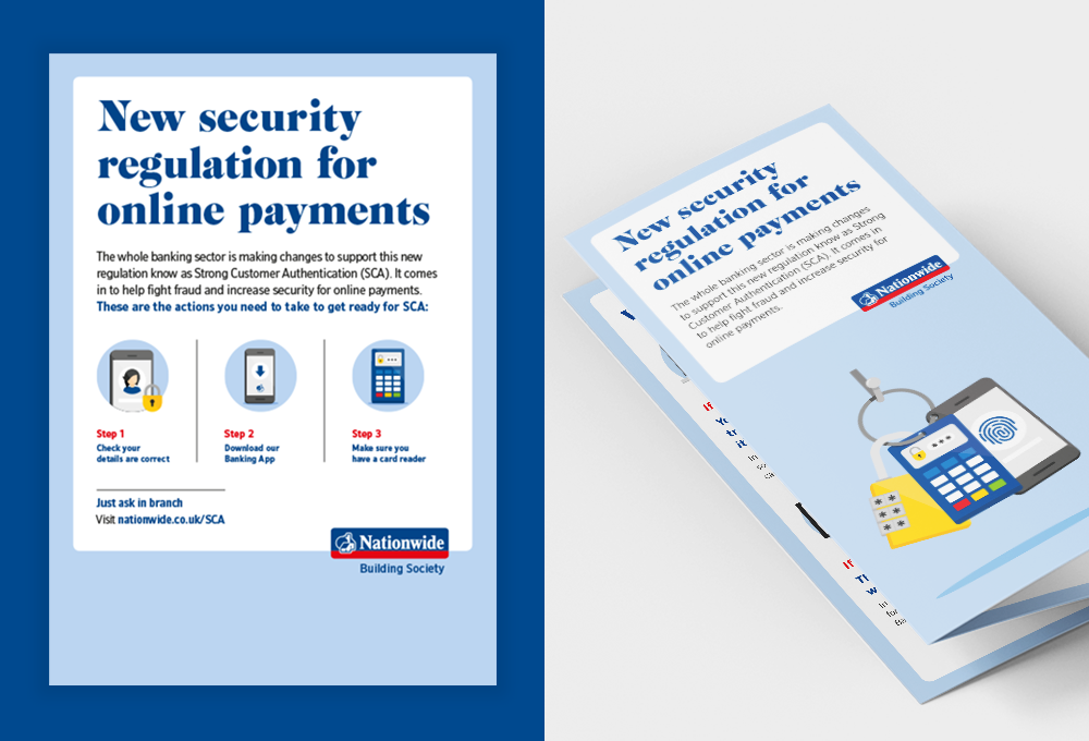
The Nationwide brand is characterised by real member and lifestyle photography. This campaign needed to feel different from usual Nationwide comms, as it’s a service message via a regulatory change delivered by Nationwide. We chose a graphic route so as to achieve this visually, and effectively differentiate the campaign.
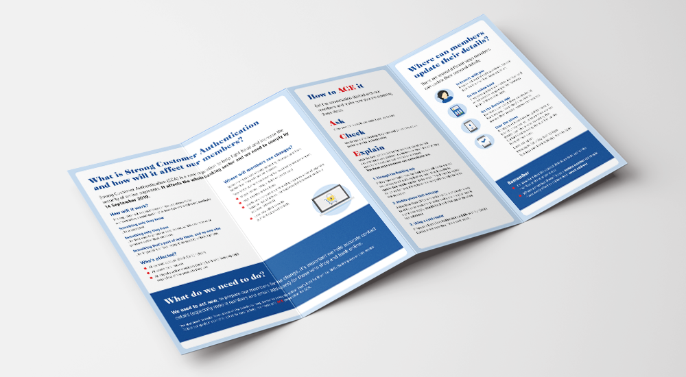
We created distinctive graphic icons which represented different aspects of the SCA authentication process, focusing on a padlock element. These would be used throughout and beyond the campaign so that they became familiar: associated with, and instantly recognisable as, comms about SCA. The graphic icons were designed to be functional: a way to present the new authentication process as memorable steps and push the required actions to the forefront. For the internal campaign, we also created an acronym “ACE” (ask, check, explain), to prompt employees to talk to members about SCA.
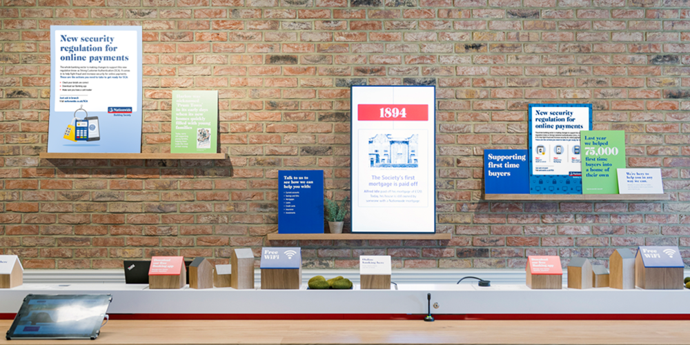
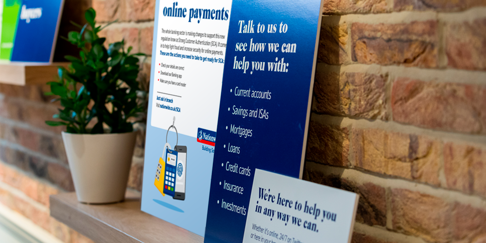
The campaign was a simple solution to a complex challenge. We brought the internal and external comms under one coherent overarching campaign while keeping the two distinct from one another. The internal-focused campaign worked to educate employees, and the external to raise awareness among members about the changes while also reassuring them that Nationwide is there to help. The dual campaign was clearly distinguishable from previous Nationwide campaigns by the new graphic style, it was also on-brand and maintained the Nationwide tone of voice throughout.

Q. How do you feel about the final result?
David: I really love where we ended up with this. Sometimes it’s the simplest ideas that overcome the biggest hurdles and turn out to be the most effective. I’m delighted with the final solution.
Laura: I’m very proud of the team: this project has since been referenced by a number of other colleagues within Nationwide as an example of work to aspire to.

Q. What was the most enjoyable aspect of this project?
Laura: Getting to a solution that worked across both audiences (internal and external) was really satisfying – seeing the layers of different messaging come together into one simple, coherent, and effective campaign.
“A big thank you to mark-making*… This is the first time we’re using graphics instead of lifestyle imagery on such a large-scale external campaign. We’re all very pleased with the result.”
– Spencer Clarke, Director of Customer and B2B Marketing, Nationwide Building Society
About markmaking*
markmaking*