How to create timeless artwork like Saul Bass
The Title Design of Saul Bass from Ian Albinson.
It’s amazing how some classic designs can survive the test of time. I was inspired to write this post after listening to our art director, Russ, tell stories of Saul Bass design style, and it was hard not to have his enthusiasm rub off on me. So, I decided to learn more about this great man (Bass, not Russ).
Many have tried to copy the stylish approach of Saul Bass, just to find out that his genius is not able to be replicated. The redesigns of his work were simply never good enough and lacked the minimal and stylish look of Saul’s typography, colours, and symbols.
Yet there are many other things that we can learn from this artist and visual communicator, who cared about making things beautiful, even if no one else cared. If Saul Bass managed to make a movie title sequence a piece of art in its own right, then there is nothing stopping us making any of our own projects masterpieces themselves. Here are some things we can learn from this influential graphic designer and his testament to good design.
Don’t be afraid of the word, risk
Much of Saul’s work was just that: risky.
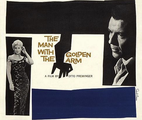
Saul Bass didn’t just revolutionise thinking in design but also changed the way we enjoy cinematography. It’s hard to believe that before Saul Bass’s time the projections were so dull that once the movie was finished, the curtains were pulled back immediately. Bass created intrigue by making the title sequences more remarkable. This is particularly true of the design for the ‘The Man with the Golden Arm’, were showing the cut-out arm caused a sensation. Let’s face it, at this time, talking about drug use was seen as a topic a taboo (and still is to some extent). The colour block combined with a powerful image of an animated black paper-cut-out of a heroin addict’s arm reinvented the movie title sequence, making it a form of art and transforming the way that movies began ever since.
Saul Bass wasn’t just an artist who contributed to the first several minutes of some of the greatest movies in history; in my opinion, his body of work qualifies him as one of the best film-makers of this, or any other time.
Steven Spielberg
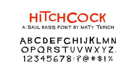
Think of the font
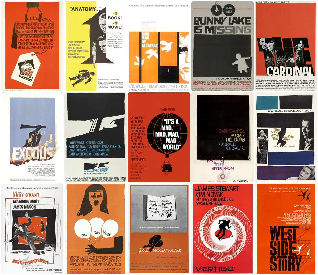
Bass grew tired of following formulas so he decided to abandon them in favour of his own graphics by becoming a ‘godfather of typography’. Dramatic cuts and treating text became part of his distinctive character, which we can admire in his title sequences, film posters, and corporate logos. Feed your mind and find inspiration with this wonderful collection of Bass movie title stills.
Be original
Saul Bass’s technique is a great example of less may be better. Good design doesn’t need to throw as much information as it can at the audience; sometimes, focusing attention on one element can strengthen the impact rather than overwhelm it. This feature is very characteristic of Bass’s designs, which often have very little text.
Bold reductions, flat colour, and imagery were often treated as a logo or symbol and were seen as a tool to make the design stronger and more memorable.
The screen has found in Saul Bass the creative artist capable of distracting the spectator from his own immediate experience . . . . Those who know him see Bass constantly in love with the well-presented image, marvelously modulating each emotion, and with a sensibility perfectly balanced by a sense of humour.
Raymond Gid
Have a good relationship with the client
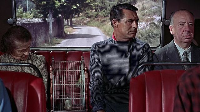
Saul Bass is rightly remembered for his design skills but what also helped him stand out in people’s memories was his good relationships with his clients – especially important for Bass as this allowed him more freedom with his ideas. Like Johnny Depp and Tim Burton films, it was not a coincidence that Hitchcock used Bass for so many of his film poster designs. The partnership between both of them, a designer and a client, deserves to be known, as it became a good marriage of many creative ideas.
Understand the style
Saul is a tremendous talent. A real artist who captures real feelings. He went much further than anyone could have imagined in visualising key scenes. And on top of that, he came up with a most powerful graphic image for the ads.
Kirk Douglas
Keeping your original intentions in the design is important, as they help your work stand out and be a reflection of your own character and personality. Saul Bass art style and influence were and still are, astonishing, and we will always remember him for his originality and problem-solving approach to design.
By Kasia Piekut
About markmaking*
markmaking*