‘Blanding’ – What, Why and How to Avoid It.
What is blanding?
‘Blanding’ isn’t a new thing, but my sense is it’s on the rise. Brands within a category, looking and sounding much like each other. And, somewhat ironically, it’s often most apparent amongst the self-proclaimed challengers supposedly disrupting the status quo.
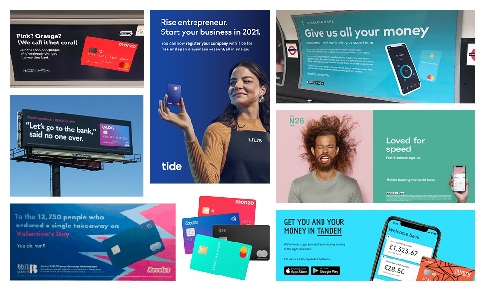
Take the consumer fintech world. Brands claiming to be breaking new ground, bucking convention, offering innovative and alternative solutions to existing problems, only for their individuality to evaporate in a sea of similar typography, colours, ad styles, imagery and language.
We see it everywhere.
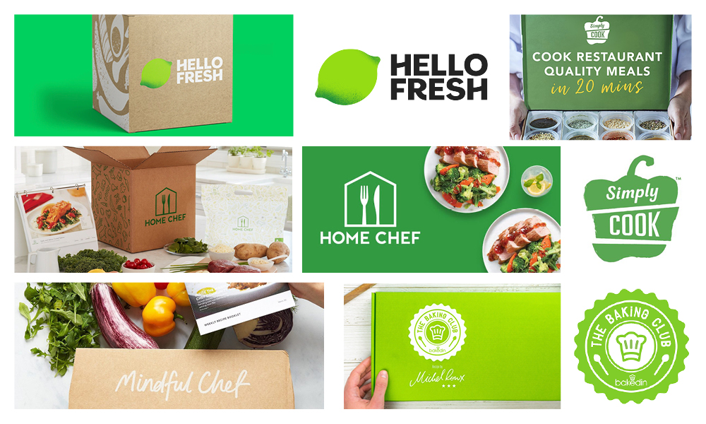
Last week while preparing a family meal (yes, it has been known) using one of the many home meal kit brands we’ve been trying over the last year, it struck me just how alike the various brand identities are.
Blanding design means that the look and feel of these brands share such similar characteristics that no matter how good the rigatoni caprese, I’d be hard pushed the following week to tell you which meal kit brand it hailed from. (Note: Mindful Chef has recently refreshed its identity to lead with blue – good move!).
It’s easy to criticise, and that’s not the intention of this piece. The intention is to demonstrate that it happens, understand why it happens, why it’s a problem, and how you can avoid it. It happens, so let’s look at why. You can find out even more about blanding and how to avoid it in our B2B branding guide.
Trends, lions and laziness
A brand’s identity should reflect and reinforce its positioning. What that brand stands for and why it matters.
It follows then that every brand identity should be different.
The reality is that design, just like music or fashion, follows trends. Form doesn’t always follow function. The proliferation of digital channels and UX design has certainly played its part in the recent rise of bland identities.
In the drive to make the user experience as easy, accessible and intuitive as possible, rules and conventions naturally follow.
Inevitably graphic design becomes homogenised and one brand’s design language, with its sans serif type, extra line spacing, pastel colour palette and flat colour application, blends seamlessly into the next.
Usability driving design at the expense of meaning, individuality and difference. Solving that conundrum is one for another time.
So trends have something to answer for, but there is perhaps a deeper, more instinctual element at play here. Our natural desire to want to fit in, to belong, to conform, not to stand out. Standing out is risky. The lone gazelle that does that is the first picked off by the hungry lion. Suppressing natural survival instincts, however committed to your brand and its success you are, is a big ask. But you have to. Being devoured by the biggest cat in the jungle is unlikely, but extinction is a genuine possibility.
And dare I say it, perhaps sometimes there’s also a degree of laziness involved. Just as defining a truly differentiated and compelling brand positioning takes time and effort, so too does developing an effective creative strategy. Not everyone recognises that or is prepared to put in the graft. Easier to do what everyone else is doing, right? Easier yes. Dangerous, definitely.
Blandness stunts growth
The empirical evidence is there. It’s enough just to be perceived as different – you don’t even have to be quantifiably different.
Either way, not being the same, or perceived as the same, as everyone else, is critical to business growth and increasing brand value.
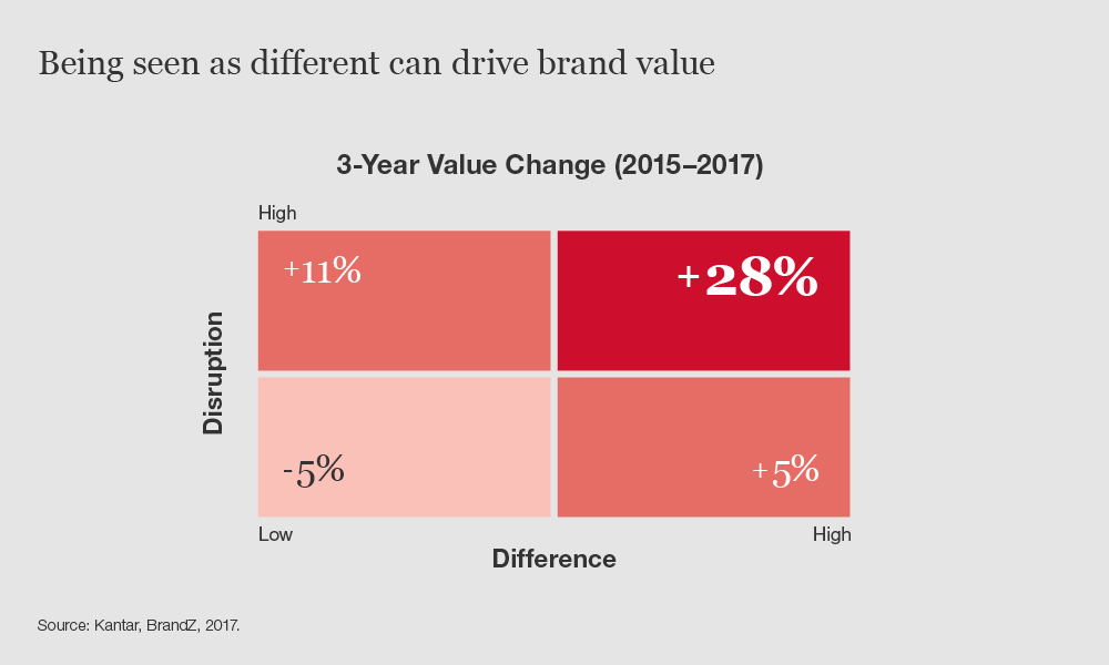
A study by Kantar and BrandZ in 2017 showed that brands considered highly ‘disruptive’ and ‘different’ experienced an increase in brand value of more than 28% over a three year period, compared to a 5% drop for those brands considered less so.
People will pay a premium for brands they see as different too.
In another study, Kantar again, with Millward Brown, loyalty card data showed a willingness amongst consumers to pay 22% more for brands considered to be highly different and meaningful compared with those considered to be lacking in those areas.
Differentiation AND Distinctiveness
These are your weapons in the battle against bland.
Why the emphasis on AND? Because this taps into a current and polarizing debate, with two opposing camps. One flying the flag for ‘differentiation’, the other for ‘distinctiveness’. I’ll be clear on the difference shortly, but with over 25 years experience of brand creation and brand building, we’re talking about two sides of the same coin – a coin with a common enemy – blandness.
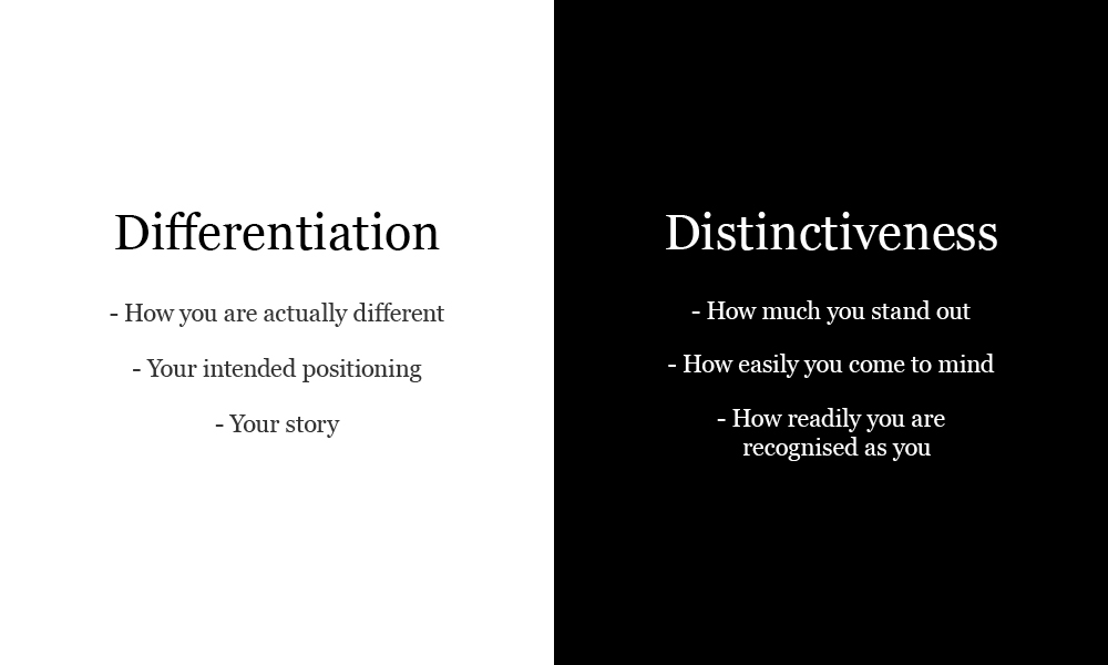
Historically, within marketing, the emphasis has always been on differentiation, because differentiation is fundamental to the idea of positioning. What is it that we offer that differentiates us in the mind of our target customer? How does what we do meet their needs in a way no others do? What do we want consumers to think when they think of us?
Through difference we narrow our competitive field, and the greater the value of that difference to our target customer the less price sensitive they become, enabling higher margins. It’s the essence of marketing strategy.
Those in the distinctiveness camp argue that that’s all very well and good, but really how different (and sustainably different) are you, and in a world where replication and imitation can be swift and easy. There is something in that. But differentiation, or relative differentiation, at some level, in some form is what will ultimately separate your brand and make it the one the customer picks.
But, and here’s the point, first you need to make it into the consideration set. If you’re not at the table, there’s no chance of winning. And that’s where distinctiveness comes in.
Distinctiveness is about brand stand out and salience. Visibility and mental availability. Coming to mind at a point of purchase. You may be the perfect solution, but if you don’t come to mind, you’ll not have the chance to prove it. But distinctiveness is more than that. It’s about being recognised as you and not confused or mistaken for another.
Just like the meal kit example earlier. ‘Let’s get the one with all the ingredients provided and is a B-Corp. I love their stance on social responsibility as well as the delicious Morocan tagines. Which one was it again, Home Chef, Simply Cook…?’. Strong differentiation, weak distinctiveness, and a problem.
Distinctive brand assets
Enter brand codes, elements, assets. They amount to the same thing. Sensory cues synonymous with the brand name. Proxies for the brand name.
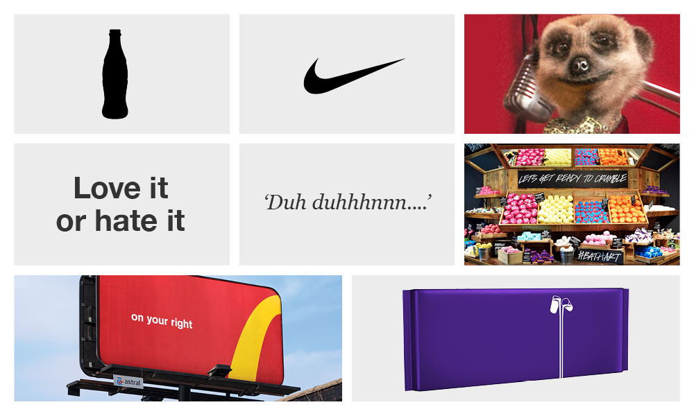
See the curvaceous bottle shape and you know it’s Coke.
The dynamic ‘swoosh’, instantly it’s Nike.
An aristocratic meerkat with russian accent, that’s Comparethemarket.
Love it or hate it, either way it’s Marmite.
‘Duh Duhhhnnnnn…’ I hear that and I’m ready for the latest offering on Netflix.
A swoop of gold/yellow on a backdrop of red and some people might start salivating (not me, plays havoc).
The smell of a Lush store.
Can’t see a thing. Ah, I must be in Hollister.
These examples of distinctive assets illustrate their multi-sensory nature. They allow for flexibility and creativity in an environment with an increasing number of channels at the marketer’s disposal. Sometimes displaying the brand name isn’t an option, more often it’s simply not the best option. Using an asset other than the brand name can be way more effective.
Take Cadbury’s ‘no words’ campaign. In support of Age UK highlighting the issue of loneliness among the elderly, Cadbury’s removed all words from its Dairy Milk packaging. The effect is striking. Presented with just the purple and the glass-and-a-half illustration (the latter to reinforce differentiation perhaps), Cadbury’s comes to mind more readily, and more powerfully, than if the actual brand name was in situ.
How’s your distinctive asset mix looking?
A structured and rigorous approach to evaluating your brand assets is optimal, but even a quick self-assessment can be revealing. What are your distinctive brand assets? Have you got any? How strong are they?
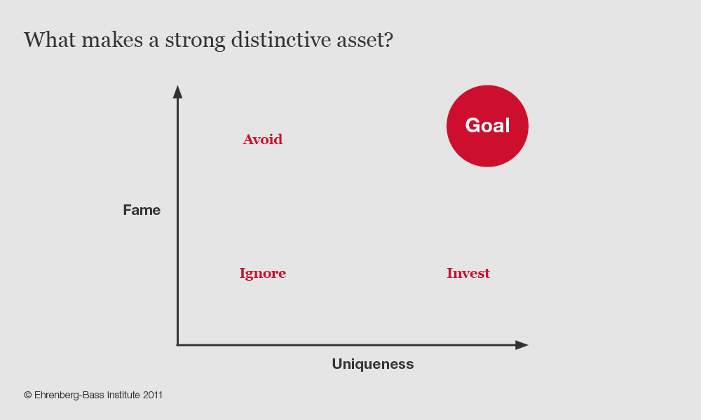
To answer that question consider firstly how well-known in your category a particular asset might be, then consider how readily attributable to your brand name that asset is. ‘Fame’ and ‘Uniqueness’ (Romaniuk, Ehrenberg-Bass Institute, 2011) are the key metrics. Evaluating each asset through that lens will help you identify where potential lies, where to invest, what might be missing, and what to drop.
And for smaller brands?
This is where differentiation, and in particular distinctiveness, gets really interesting. The examples of distinctive brand assets I’ve given are all for well-known brands. Consumer-facing retail brands, with TV level advertising spends. What about those a tier or two below? And B2B? Is there still merit in building distinctive brand assets? Time for a short story…
‘I don’t like orange’
Back around 2006-ish, reflecting on the visual identity of The Mortgage Works, the intermediary-facing specialist mortgage division of Nationwide, a senior marketer, had some personal views. To which the individual was of course fully entitled. Nonetheless, it’s very dangerous territory and typifies many of the biggest challenges faced when building distinctive assets. Boredom, aesthetic preferences, the need to be seen to be making changes, these are the common obstacles to successfully creating distinctiveness, because consistency is a key driver in that success.
We knew back then that dropping orange on a whim was not a strategic move, even before the term ‘distinctive brand asset’ was even coined, and pushed back (always risky for an agency, but part of the job description). Long story short, orange remained and has become integral to The Mortgage Works’ brand asset palette, coupled with a unique illustration style.
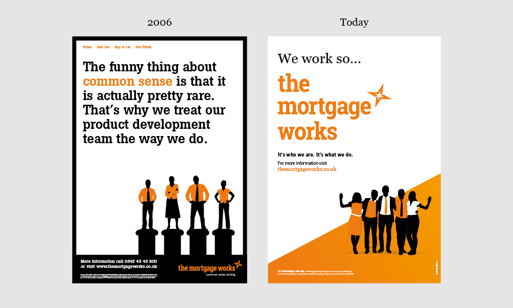
An investment in building distinctiveness, alongside a focus on differentiation (The Mortgage Works stands apart through its on-going commitment to supporting intermediaries), has resulted in the specialist lender becoming the UK’s number one. Ongoing research by BVA BDRC shows The Mortgage Works as consistently receiving market-leading scores for brand recall and unprompted willingness to recommend.
Play the long game
The antithesis of blanding branding are what we call Magnetic Brands. With their extraordinary and enduring attraction they understand both the importance of being different and standing out in a way that is recognisably them. They go way beyond their commodity in pursuit of meaning, and drive visibility and recognition through relentlessly building distinctive brand assets.
Blanding is quick and easy. Brand building takes time. That means being strategic and disciplined. Not just in bringing clarity and focus to how you are different and how to articulate and live that difference, but also with respect to creating and leveraging your distinctive assets.
So choose your assets wisely, prioritise which and how you invest in them, execute them creatively and protect them at all cost, knowing that the point at which you are bored with them, is probably the point at which they are just beginning to deliver real returns.
Do that and we’ll make this bland new world a thing of the past.
About Alastair
Alastair Williams
Founder & Creative Director