A new identity for Hydrogeologists Without Borders
The background
Everyone is familiar with the classic ‘borehole moment’ you often see in charity ads, where joy is brought to water-deprived communities, finally provided local access to the essential, life-sustaining resource that most of us take for granted.
It’s an incredible moment to witness and a life-changing event for the inhabitants of those communities. But creating that moment, and making sure that water security lasts, requires thorough research, expert planning and ongoing management. That’s where Groundwater Relief comes in.
Groundwater Relief is a voluntary body of hydrogeologists and groundwater professionals. They help charities to deliver successful, sustainable water projects all over the world.
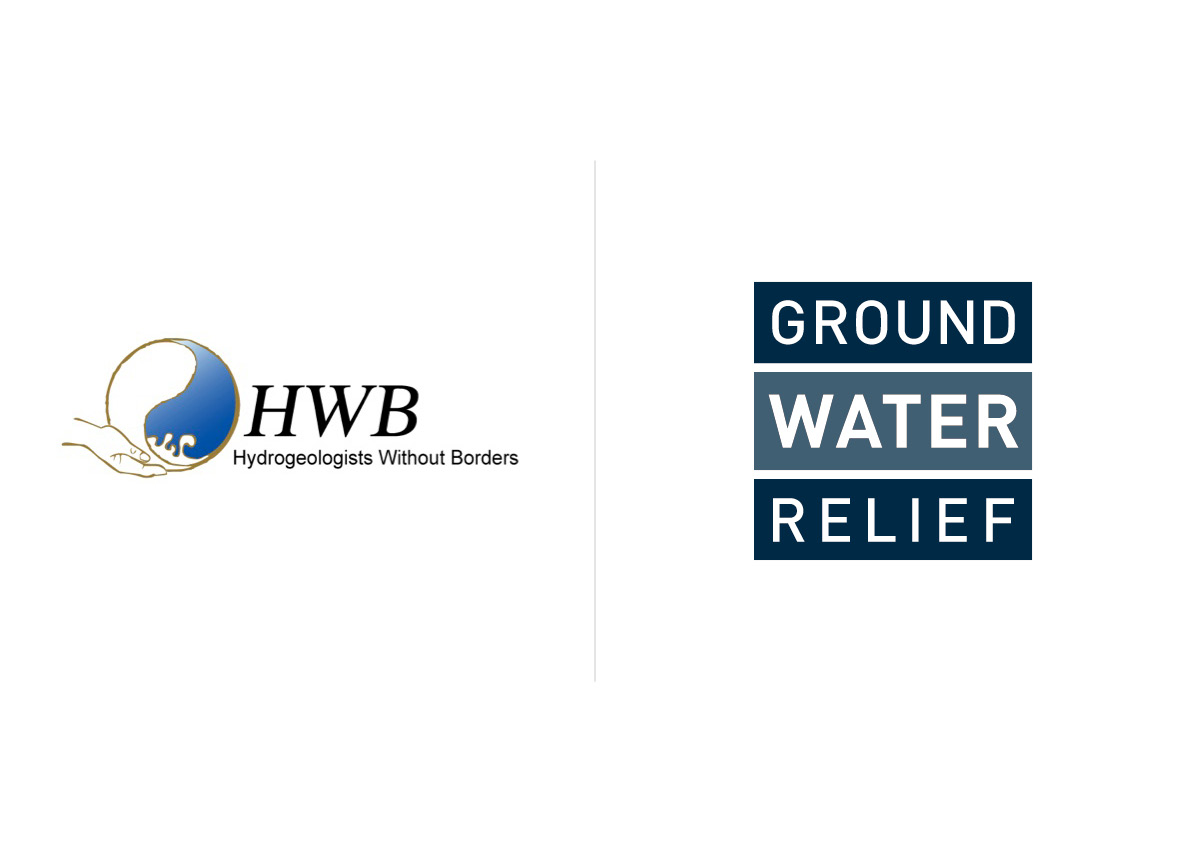
New name – what a relief
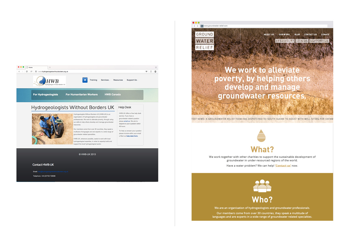
Groundwater Relief came to us as Hydrogeologists Without Borders UK. Technically speaking, that name had a decent Ronseal factor, but it was a bit of a mouthful. They wanted to rebrand, developing both their identity and website to better support their application for charity status, and to raise their profile in the not-for-profit community they serve.
After some initial research and consultation, Groundwater Relief was chosen as the moniker to take them forward, denoting their field and function just as clearly as before, but in slightly less technical terms.
Marque
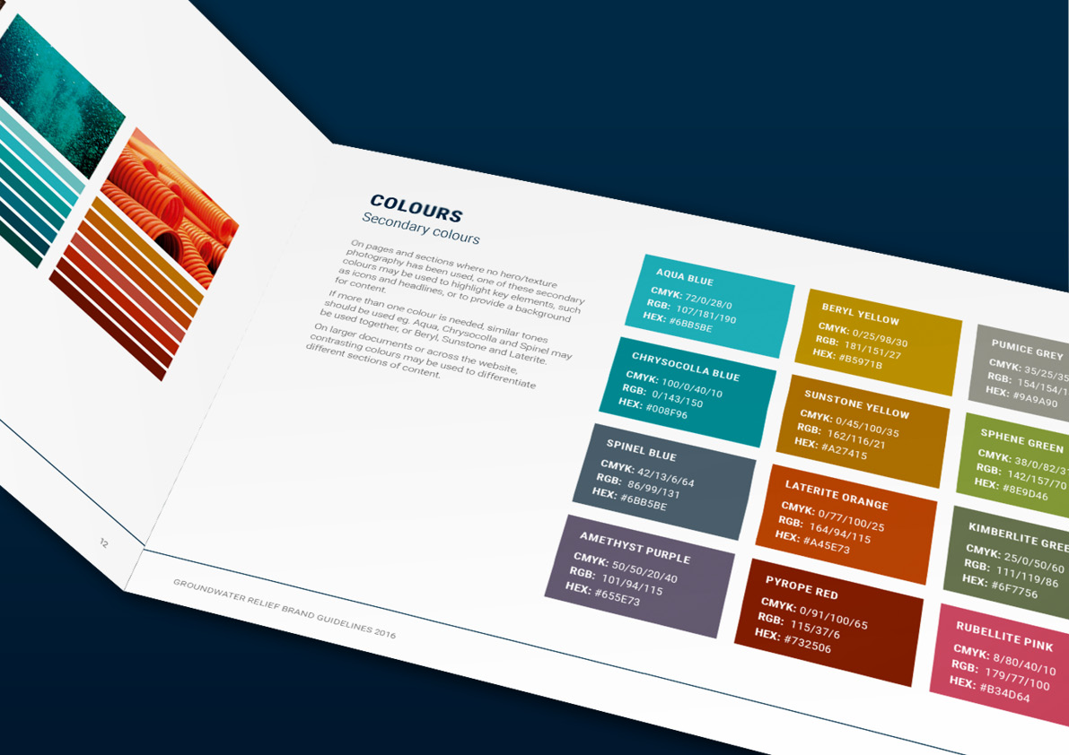
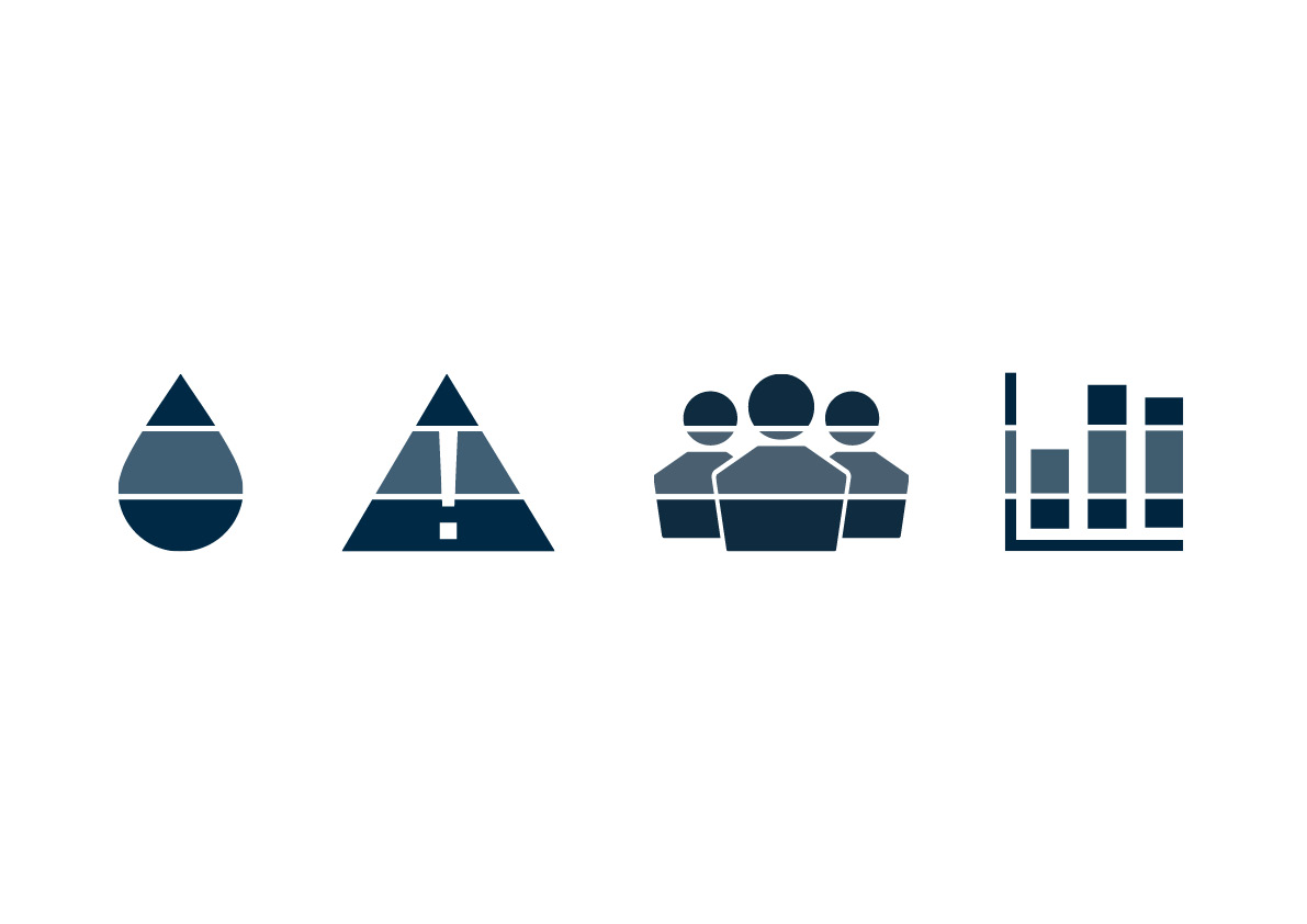
The logo was designed to build on this – a bold and confident mark to represent their broad expertise and the strength of their capabilities. The marque is composed of strata (layers) that make a strong visual reference to the physical nature of their work. The central stratum is translucent and evocative of water – the sweet spot that their teams all over the world are looking for.
Our initial presentation of this route was met with the highest praise a designer could ask for – ‘A hydrogeologist would enjoy that’.
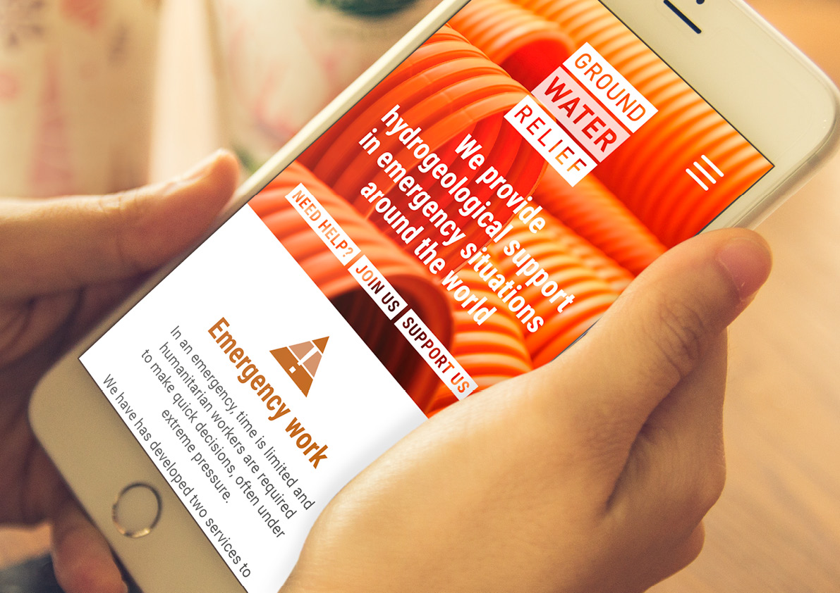
The strata theme was rolled out through the design of the website and brand assets, with distinctive striped icons, web pages built in layers and a colour palette that takes different depths of tone from relevant imagery.
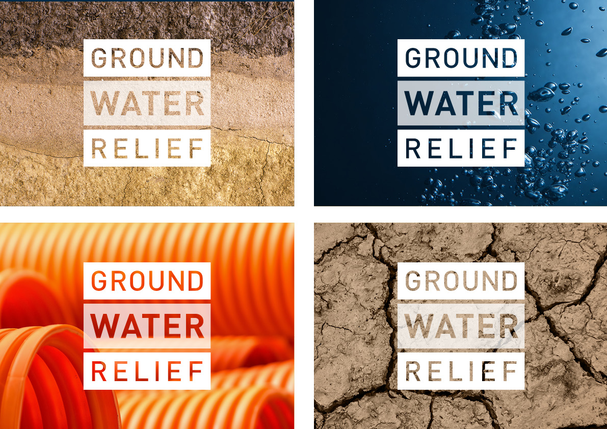
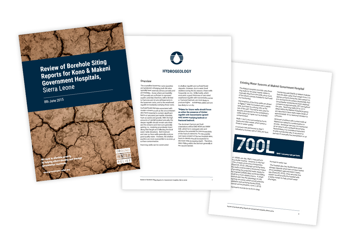
Photography
We proposed a selection of bold, textured photography that reflects Groundwater Relief’s technical expertise and detail-oriented approach. The final set of templates and guidelines provide new consistency across branded communications and improve not only the aesthetics but the accessibility of the charity’s dense groundwater reports.
What’s next?
We’re looking forward to seeing this new ID rolled out online in the not-too-distant future.
About markmaking*
markmaking*
mark-making* is an award-winning creative agency specialising in branding, campaigns and communications